
Bright Tinsel Text Effect
In this tutorial, we are going to use some brushes, Layer Styles, and different blend modes, to create a super fun looking tinsel-like text effect.
The Final Result

Tutorial Details
- Software Used : Photoshop
- Version : CS5 Extended
- Time : 0:30 – 0:45
Resources
- Moons and Stars 17 Brushes by Ashqtara.
- soft bokeh texture by night-fate-stock.
Step 1
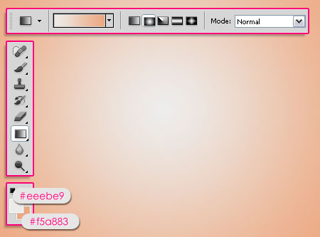
Create a new 1024 x 768 px document. Set the Foreground color to #eeebe9, and the Background color to #f5a883, then, create a Radial Gradient from the center of the document to one of the corners.
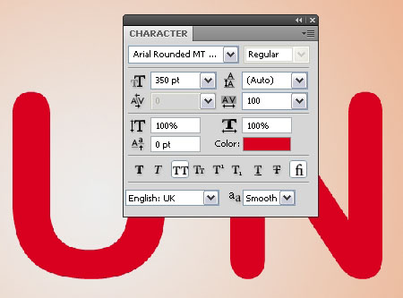
Create the text using the font Arial Rounded MT Bold in All Caps. The Size is 350 pt, and the Tracking value is set to 100 px to avoid overlapping.
Step 2
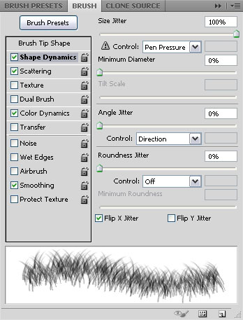
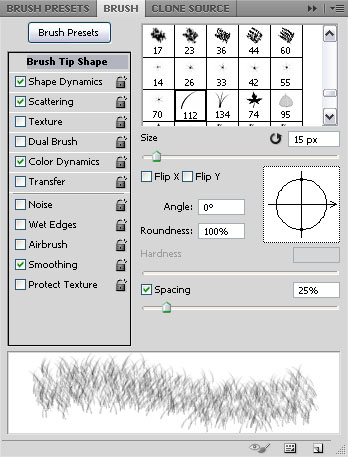
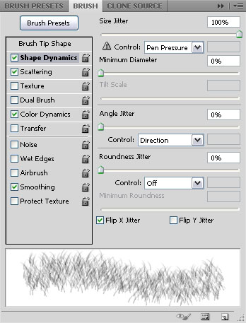
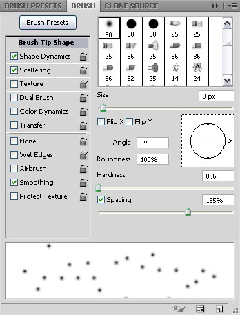
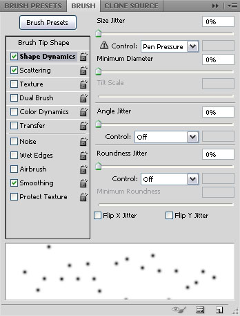
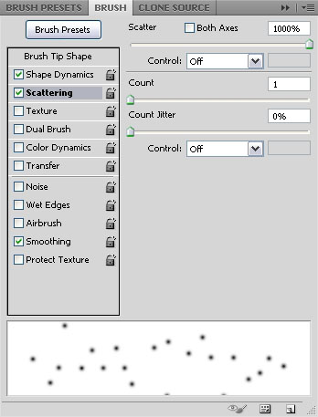
Open the Brush panel (Window -> Brush), pick the Dune Grass brush tip, and change the Settings as shown below:
Brush Tip Shape
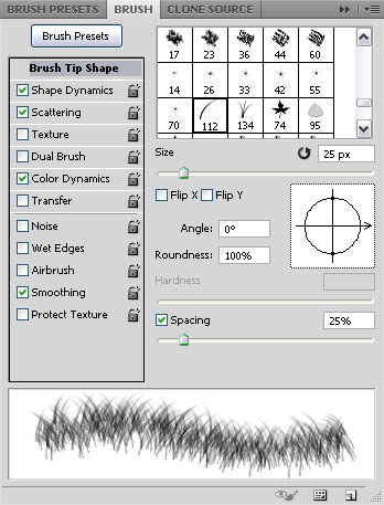
Shape Dynamics
Scattering
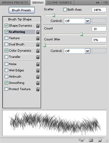
Color Dynamics
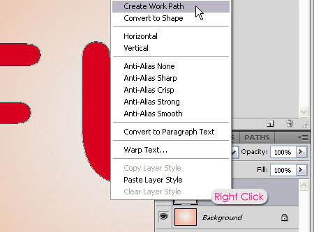
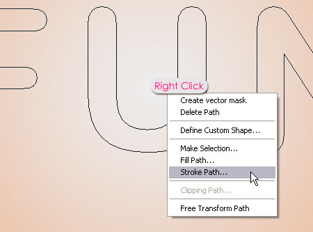
Right click the text layer and choose Create Work Path.
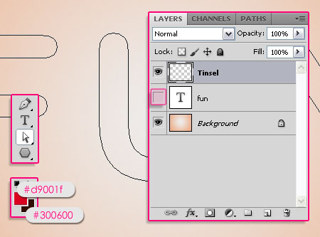
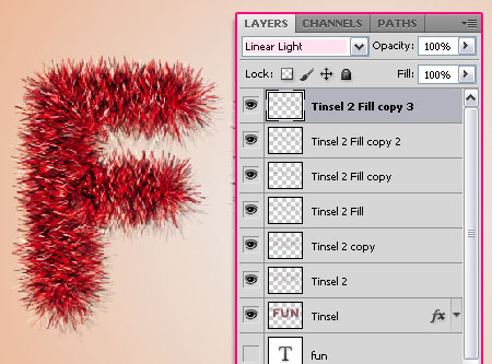
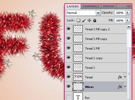
Create a new layer on top of all layers and call it Tinsel. Make the text layer invisible by clicking the eye icon next to it, and pick the Direct Selection Tool. Set the Foreground color to #d9001f, and the Background color to #300600.
Right click the path and choose Stroke Path.
Choose Brush from the Tool drop down menu and make sure that the Simulate Pressure box is un-checked.
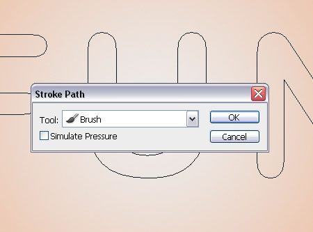
This will stroke the path with the brush you’ve just modified. You can hit Enter to get rid of the Work Path.
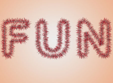
Using the same brush, fill in the middle part of the text that was not covered with the stroke. Try not to overdo it.
It’s ok to have some empty areas as well, so there’s no need to go back and forth on the same area, because this will ruin the texture.
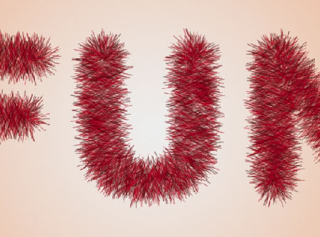
Step 3
Double click the Tinsel layer to apply the following Layer Style:
– Drop Shadow
- Opacity : 18%
- Distance : 15
- Size : 0
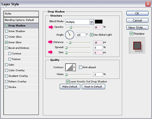
– Inner Glow
- Blend Mode : Linear Light
- Color :
#9d1c24
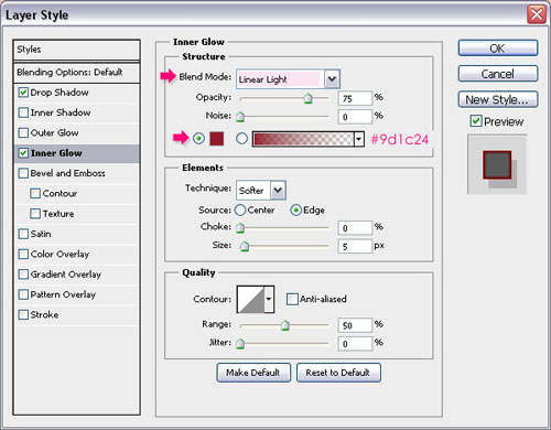
This will add a subtle red glow.

Step 4
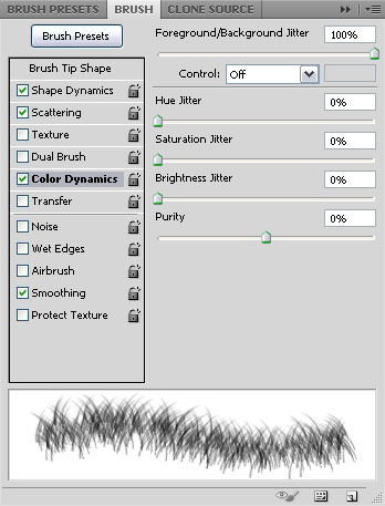
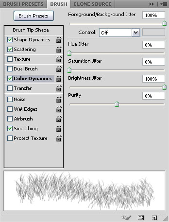
Open the Brush panel (Window -> Brush) and pick the Dune Grass brush tip once again, then change the settings as shown below:
Brush Tip Shape
Shape Dynamics
Scattering
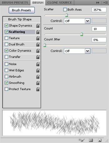
Color Dynamics
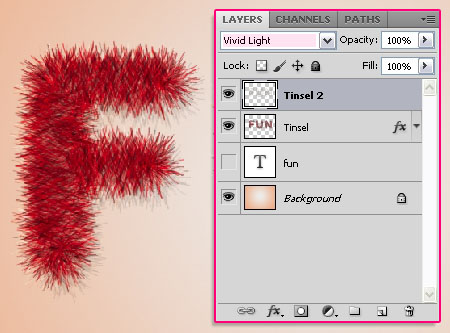
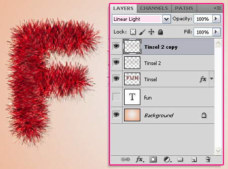
Right click the text layer and choose Create Work Path. Create a new layer on top of all layers and call it Tinsel 2. Set the Foreground color to #ffffff, and the Background color to #300600. Stroke the path with the new brush and hit Enter/Return to get rid of the Work Path.
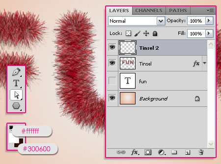
Change the Tinsel 2 layer’s Blend Mode to Vivid Light.
Duplicate the Tinsel 2 layer and change the copy’s Blend Mode to Linear Light. This will make the stroke more vivid.
Step 5
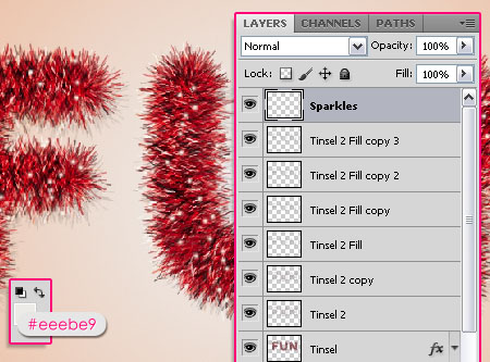
Create a new layer on top of all layers and call it Tinsel 2 Fill. Use the same brush you created in the previous step to fill the middle (empty) part, just like you did in the end of Step 2.
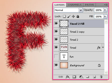
Change the Tinsel 2 Fill layer’s Blend Mode to Hard Light.

Duplicate the Tinsel 2 Fill layer.
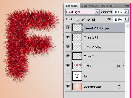
Duplicate the Tinsel 2 Fill copy layer, and change its Blend Mode to Linear Light.
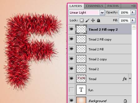
Duplicate the Tinsel 2 Fill copy 2 layer. The duplicated layers with the different Blend Modes will help create a nice bright texture for the Tinsel.
Step 6
Choose a soft round brush, and modify its Settings in the Brush panel (Window -> Brush) as shown below:
Brush Tip Shape
Shape Dynamics
Scattering
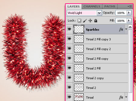
Set the Foreground color to #eeebe9. Create a new layer on top of all layers and call it Sparkles, then start painting some dots all over the Tinsel.
Double click the Sparkles layer and apply an Outer Glow Layer Style:
– Outer Glow
- Blend Mode : Vivid Light
- Color :
#ffffff
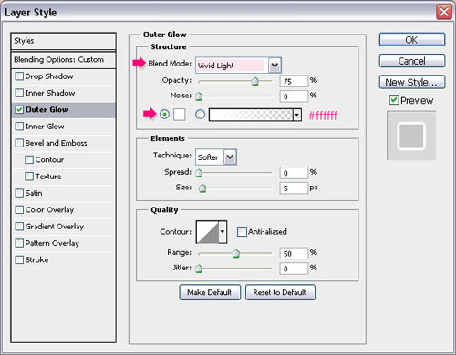
Change the Sparkles layer’s Blend Mode to Vivid Light.
Step 7
Create a new layer on top of all layers and call it Stars.
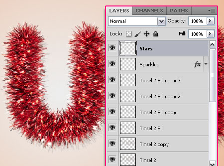
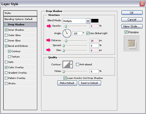
Double click the Stars layer to apply the following Layer Style:
– Drop Shadow
- Opacity : 9%
- Distance : 10
- Size : 0
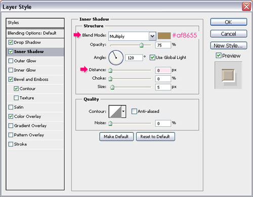
– Inner Shadow
- Color :
#af8655 - Distance : 0
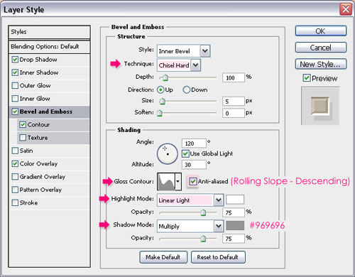
– Bevel and Emboss
- Technique : Chisel Hard
- Gloss Contour : Rolling Slope – Descending
- Check the Anti-aliased box
- Highlight Mode : Linear Light
- Shadow Mode – Color :
#969696
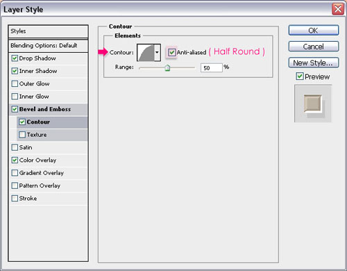
– Contour
- Contour : Half Round
- Check the Anti-aliased box.
– Color Overlay
- Color :
#aca294
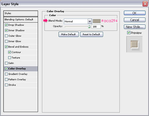
Use a star brush from the Moons and Stars 17 Brushes pack to add some stars around the Tinsel.

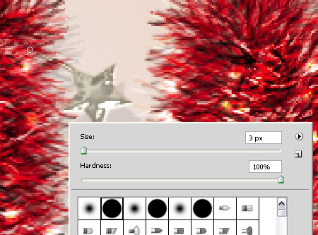
Create a new layer below all Tinsel layers and call it Wires. Copy and paste the Stars layer’s Layer Style to this layer. (Right click the Stars layer -> Copy Layer Style, then Right click the Wires layer -> Paste Layer Style.)
Choose a hard round 3 px brush, and add some wires to attach the stars to the Tinsel. Choose the closest points to attach.
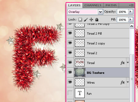
Place the soft bokeh texture on top of the Background layer, resize it to fit, and change its Blend Mode to Overlay.
And that’s it! Hope you enjoyed the tutorial.
Did you enjoy this post? Please consider donating to help us cover our server costs.


Such a beautiful and most of all realistic effect! I will try it, thanks for sharing 🙂
Thank you so much 🙂
Hope yours turns out great 😉
Que genial esta muy buen tutorial, sigan asi! 🙂
Glad you liked it.
Muchas gracias for the comment 🙂
That’s great! Thanks!
You’re welcome.
Thanks for the comment.
good tools
Thanks 🙂
Wow! Just what i needed for my Christmas logo!
Cool!
Thanks for the comment.
It is indeed FUN to learn this!
Thanks a lot! Glad you had fun with it 😉
Cheers 🙂
great tutorial! thanks
You’re welcome.
Thanks for the comment 🙂
Maybe the most marvelous and easy_to_do filter I’ve ever done. Thanx a lot and keep publish such nice tutorials.
Wow! Thanks a lot!
So glad you liked it and found it easy to follow.
Cheers 🙂
What a great tutorial !! Thank you for the great work you have done
Glad you liked it.
Thank you so much for the comment 🙂
Hi. Thanks for this tut. I’m going to make my Christmas cards this way. One question. Can you also explain what font you used and how to create the “chroom” look of the words “IS GOOD”.
Hello Bert,
The font used is Caviar Dreams. As for the Style, you can apply the same “Stars” style, and maybe play around with it a little bit (like adding Texture to the Bevel and Emboss or so).
Hope this helps.
Thanks a lot for the comment 🙂
wow amazing tutorial!!
Thanks a lot 😀
Thanks for your tutorial…^^
You’re welcome 🙂
Thanks for the comment.
Wow great tutorial ! thanks for sharing !
Glad you liked it 🙂
Thank you for the comment.
nice tutorial ………. thanks for sharing !
Thanks for the comment 🙂
Hi, you rocks great tutorial.
But, my results are different :S in the step 3 looks like this
http://i389.photobucket.com/albums/oo339/Tamara_75/lunialbum/Clases/PS/HEscarcha.jpg
🙁 and in the step 4 this is the ressult
http://i389.photobucket.com/albums/oo339/Tamara_75/lunialbum/Clases/PS/Escarchapaso4.jpg
Something is wrong :'( help please
Hello Hayde,
Did you make sure all the brush settings are as shown in the images? Also, if you are using a smaller font size, you might need to decrease the brush size as well.
Hope this helps, but feel free to add a reply if the problem still exists.
Thanks for the comment 🙂
Hi, mine has pretty much the same problem in step 3. the brush doesn’t seem to want to rotate? I have copied your brush settings to the letter, but I still have no idea what I need to change. this is an incredibly realistic effect though!
It most probably is a different font size issue. If you are using the exact same font size as in the tutorial, make sure that under Shape Dynamics – Angle Jitter, the Control value is set to Direction.
Other than that, I don’t think you should have any problems. It’s either the font size or the Direction value (which is responsible for the rotation of the brush along the path).
Hope this helps.
If the issues still exists please feel free to add a reply.
Thanks for the comment 🙂
turns out it was a font size issue, and I hadn’t set the control to direction. Now a different problem has arisen, though, my tinsel is far brighter than it should be because the brush only does one solid colour at a time, instead of jittering the colour throughout the stroke. Any idea why this is happening? I’m stumped 🙁
in Step 4, under Color Dynamics, make sure that both the Foreground/Background Jitter and the Brightness Jitter values are set to 100%. Also, make sure that the Foreground and Background colors are st as in the tutorial.
If you are using Photoshop CS6, you’ll need to check the “Apply Per Tip” box at the top of the Color Dynamics tab.
One last thing to check, is when you select the Brush Tool, make sure that, in the Options bar, the Mode is set to Normal, and that the Opacity and Fill values are set to 100%.
If the problem still exists please feel free to add a reply and a screenshot if possible 🙂
got that same problem! thanks for helping^^
gosh I thought it was exactly the settings as yours^^;;
Glad this was helpful 🙂
Thanks for leaving a comment.
Nice tutorial, I learn a lot of things.
Glad you do 🙂
Thanks a lot for the comment 🙂
Nice flurry tutorial.
Thank you 🙂
i liked it so much great tut
but i cant make the sparkles its not like yours what is the fault 🙂
http://img713.imageshack.us/img713/849/52907709.jpg
Thanks for the comment 🙂
I can’t view the image for some reason, can you please re-upload it to tinypic.com?
Is the problem in modifying the settings or in adding the sparkles after modifying the settings?
thx very much i did it, it was somthing in the brush setting 🙂
but i have another question please, how to do this background ,i mean the big bubbles, please help me 🙂
sry again i did it i didnt see it in the tut
again thx very much for ur help 🙂
and i will upload my pic here after its done
thx 🙂
this my pic thank u 4 helping me to make this 🙂
http://i48.tinypic.com/3536o9g.jpg
Glad the problem was solved.
Absolutely beautiful outcome.
Thanks for the comment and the link 🙂
Hi: When I go to merge the layers to save as a .png. I lose the effects. Any suggestions? Thank you. Fabulous tutorial.
Are you trying to save the effect with a transparent background instead of the original one?
If not, then most probably you are merging the layers one by one. Try to select them all (all the layers you have), then merge them (Layer -> Merge Layers). But you don’t need to merge them anyway. You can go to Save As, then choose PNG from the Format drop down menu in the Save As dialog box.
Hope this helps. Please feel free to add any other queries you have.
Superb tutorial…Such a great and complicated looking result is made so simple with this awesome tutorial.. Too good.
Here is my result
http://s10.postimg.org/kkd0ioc8p/bright_tinsel.jpg
Beautiful outcome! Really well done 🙂
Thank you so very much for the nice comment and for the link.
hey tuts… the soft bokeh texture by =night-fate-
stock. is being deleted… can you give another link for replacement?
Seems like it, unfortunately!
But here’s a link to a similar one.
You might need to adjust the Hue/Saturation values to something around 10 and -55, and then you can reduce the texture layer’s Opacity value after changing its Blend Mode if you want to make it more subtle.
Hope this helps.
thanks..
thanks..
this is a beautiful text effect tutorial for celebration that I ever make..
Glad you like it.
Many thanks for the kind words 🙂
What a great tutorial! If only they all were like this… Step by step, very clear and precise.
And with great result: http://bit.ly/1e8NFU8 (first slider)
Thank you so much.
I absolutely LOVE the outcome and the use of the effect! Very well done 🙂
Thank you so much for the kind words and for sharing your work 😀
the link for the texture are broken
Unfortunately, it was deleted by its owner. Please check this reply for a similar texture’s link.
Feliz Natal = Merry Christmas (Brasil) <3 :p
Awesome! Thank you for sharing your outcome 😀
Your tutorial was featured in the Amazing Christmas Inspired Photoshop Text Tutorials collection:
http://www.psd-dude.com/tutorials/resources/amazing-christmas-inspired-photoshop-text-tutorials.aspx