
30 Script Fonts You’ll Fall in Love With
If you want to take your design to the next levels, then you should

Simple Floral Text Effect Using the “Mia Charro Graphics Bundle”
The Mia Charro Graphics Bundle by TheHungryJPEG.com includes 12 of Mia’s fantastic products. Valued

45 Free Amazing Digital Paper and Pattern Packs
Digital paper and patterns are very versatile. They can be used for different purposes
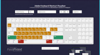
The Interactive Adobe Keyboard Shortcut Mapper
Adobe applications such as Photoshop, InDesign and Illustrator are used every day by thousands

20 Best Free Light/Thin Fonts
Light or thin fonts are commonly used in minimal and clean designs. They are
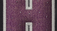
Stuffed Wool Text Effect
Using textures with layer styles is a great way of achieving some cool effects.
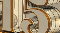
Shiny Reflective 3D Text Effect in Photoshop CC 2014
2015 is almost here, so it’s time for the annual New Year’s 3D text
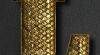
Glam Gold Text Effect + Free PSD Download
Classic, simple and elegant text effects don’t go out of style. This tutorial will
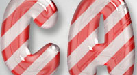
Glossy Candy Cane Text Effect + PSD Download
It’s December, and it’s time for an awesome candy cane text effect! This tutorial
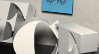
3D Letters on a Shelf Text Effect in Photoshop CC
This tutorial will show you how to use Photoshop CC’s Shape Attributes and 3D

Simple 3D Snow Writing Text Effect
This is a very quick and simple tutorial that will show you how to
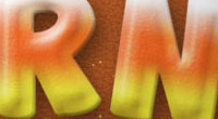
Candy Corn – Inspired Text Effect
This is a simple fun tutorial that will show you how to use Layer
25 Awesome Free 3D Text PSD and Action Files
The use of 3D text is a great addition to almost any design project.
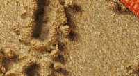
Sand Writing Text Effect
Create a summery sand writing text effect from scratch in Adobe Photoshop. Check out
30 Best Free Fresh Sans Serif Fonts
Sans serif fonts are widely used in design projects, whether for headlines, body texts,