Embossed Metal Tag Text Effect
Posted by textuts | On 10 February, 2014 | In Inspired , Simple Photoshop Text Effect TutorialsThis tutorial is a quick easy one, that will show you how you can use shapes and layered Layer Styles to create a simple embossed metal tag-inspired text effect.
The Final Result
Tutorial Details
- Software Used : Photoshop
- Version : CS6 Extended
- Time : 0:30 – 0:45
Resources
- Delicious font.
- Dark Wood Teture by elemis.
- Dark Brushed Metal by halfthelaw.
- gradient-shapes for Photoshop by ilnanny (Load the METALS.grd file).
Step 1
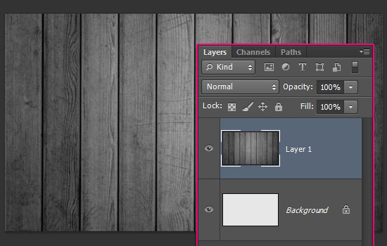
Create a new 800 x 461 px document, then place the Dark Wood Teture image on top of it.

Make sure that the Snap option is active (View > Snap). Activate the Rulers by going to View > Rulers, then click and drag the horizontal ruler at the top to create a horizontal guide.
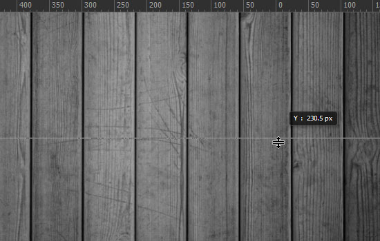

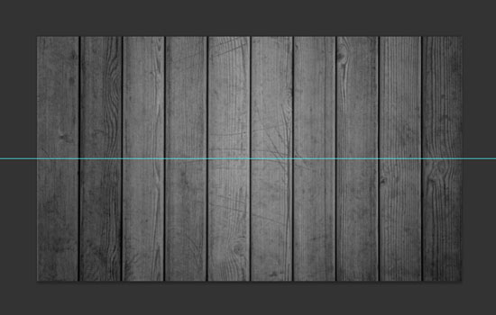
Drag the guide to the center of the document. It will automatically snap to the center if the Snap option is active.

Step 2
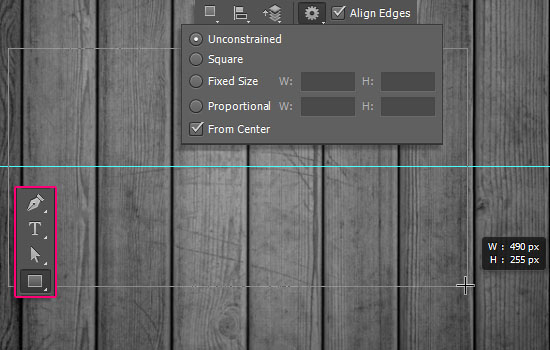
Pick the Rectangle Tool, and in the Options bar, click the Geometry Settings icon, and check the From Center box. This will help you align the center points of the shapes we’re going to create next.
Place the mouse cursor in the document’s center (over the guide), then click and drag to create a 490 x 255 px rectangle.

The rectangle’s color should be set to #adadad.
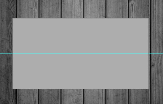

Pick the Add Anchor Point Tool, then click once to add a point in the middle of each vertical side (left and right).
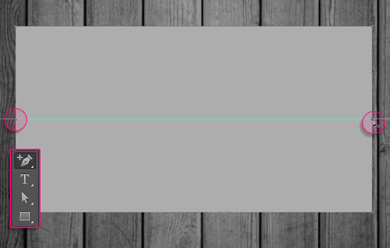

Use the Direct Selection Tool to click and drag to select both points you added.
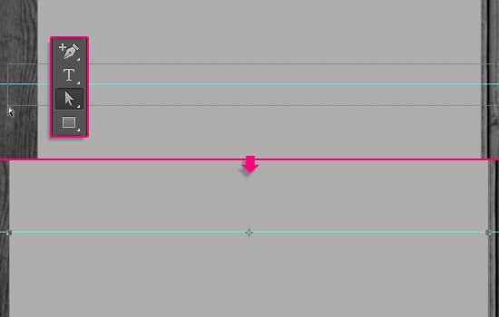

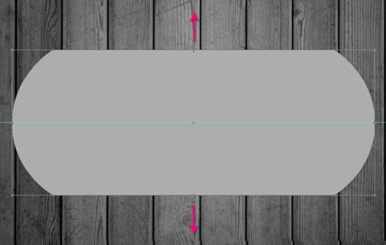
Go to Edit > Transform Points > Scale. Then press and hold the Alt/Option key, and drag one of the vertical sides outwards. The Alt/Option key will move the opposite side in the opposite direction, so you’ll end up dragging both sides outwards at once.
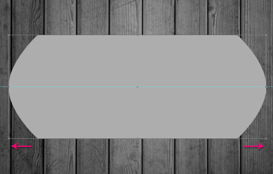

Do the same to drag the horizontal sides outwards as well.
Because only two points were selected, this step will make the rounded sides get wider.
Once you like the shape, hit the Enter/Return key to accept the changes.

Pick the Ellipse Tool, check the From Center box, and choose the Subtract Front Shape option.
Place the mouse cursor over the guide near the right side of the shape you created, then press and hold the Shift key, and click and drag to create a 25 x 25 px circle.
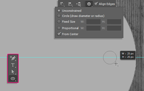

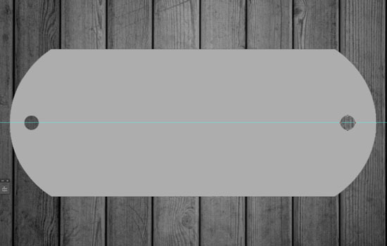
Do the same for the other side.
You can use the Rectangular Marquee Tool to draw a rectangle between the two anchor points (of the shape and the circle), and check its Width (through the Window > Info panel for < CS6 versions), to make sure that both circles are symmetrically aligned.

Step 3
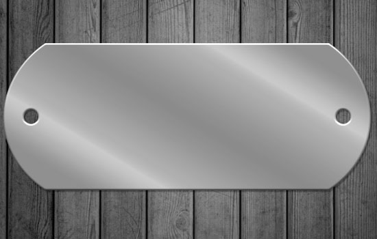
Double click the shape layer to apply the following Layer Style:
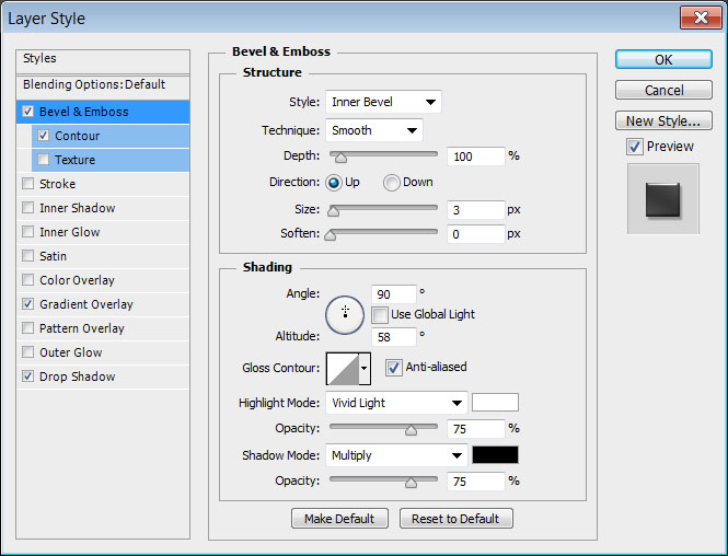
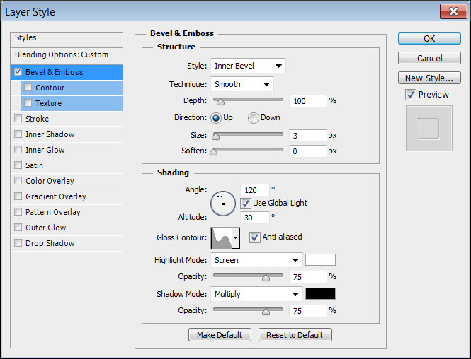
– Bevel and Emboss
- Size : 3
- Uncheck the Use Global Light box
- Angle : 90
- Altitude : 58
- Check the Anti-aliased box
- Highlight Mode : Vivid Light
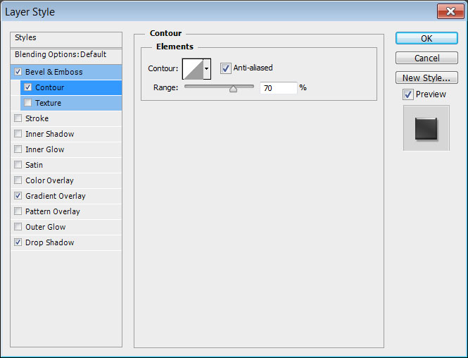
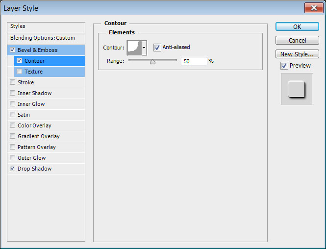
– Contour
- Check the Anti-aliased box.
- Range : 70%
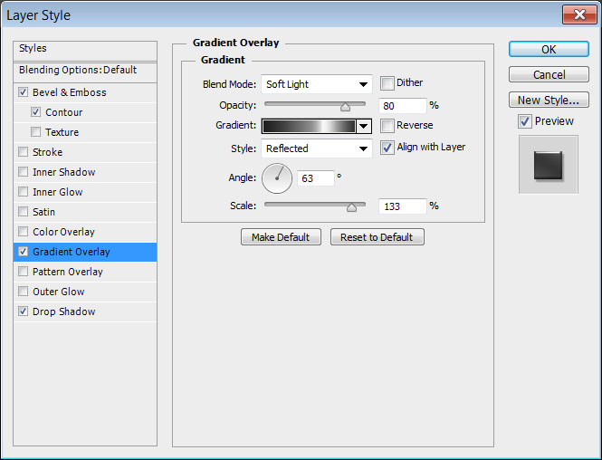
– Gradient Overlay
- Blend Mode : Soft Light
- Opacity : 80%
- Style : Reflected
- Angle : 63
- Scale : 133%
- Use the stove pipe 120 gradient from the Gradients pack (the METALS.grd file).
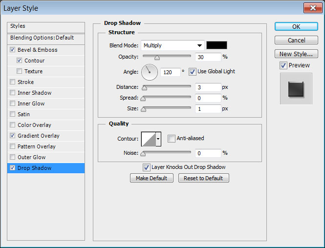
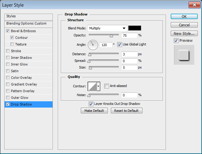
– Drop Shadow
- Opacity : 30%
- Distance : 3
- Size : 1
This will style the shape.

Step 4
Use the Direct Selection Tool to select all the anchor points of the shape.
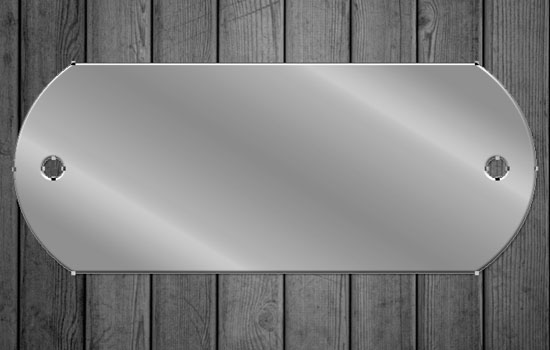

Place the Dark Brushed Metal texture on top of the shape layer, then Ctrl/Cmd + click the shape layer’s thumbnail to create a selection.
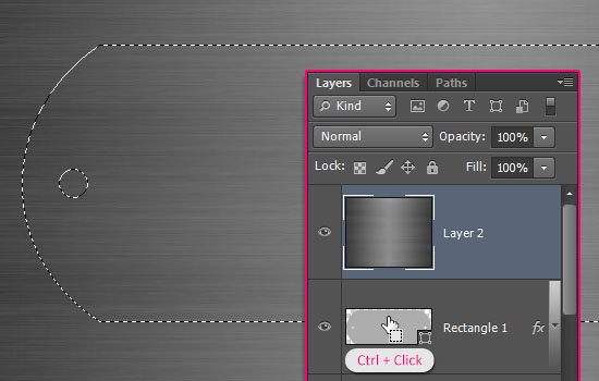

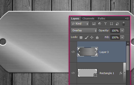
Press Ctrl/Cmd + J to duplicate the selection into a new layer, change that layer’s Blend Mode to Overlay, and delete the original Dark Brushed Metal texture’s layer.

Step 5
Create the text in All Caps using the font Delicious. The font Size is 70 pt and the color is #b5b5b5.
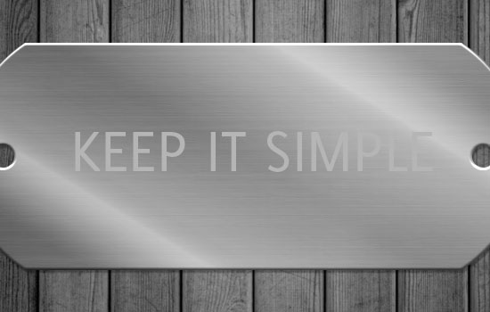

Duplicate the text layer and change the copy’s Fill value to 0, then duplicate the copy layer.
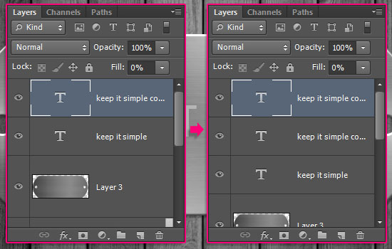

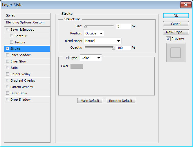
Double click the original text layer to apply a Stroke effect:
– Stroke
- Size : 3
- Color :
#b5b5b5
Right click the styled text layer and choose Rasterize Layer Style (or group it (Layer > Group Layers) then merge it (Layer > Merge Group) for < CS6 versions).
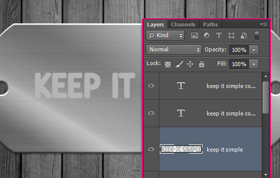

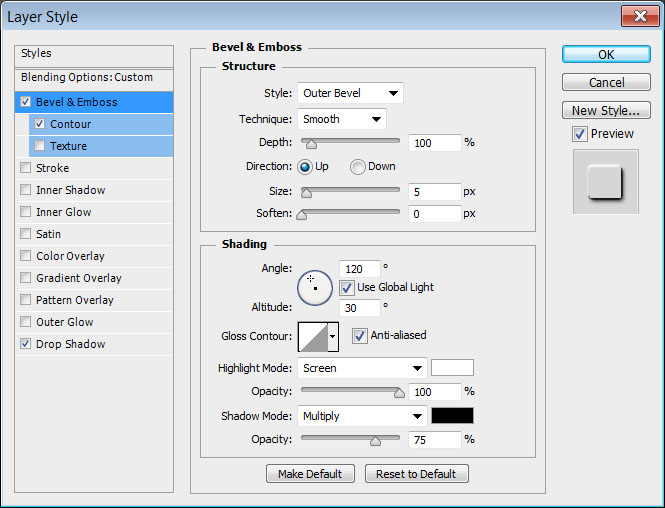
Double click the same layer again to apply a Bevel and Emboss effect.
- Style : Outer Bevel
- Size : 3
- Uncheck the Use Global Light box
- Angle : -149
- Altitude : 26
- Gloss Contour : Cove – Deep
- Check the Anti-aliased box
- Highlight Mode : Vivid Light
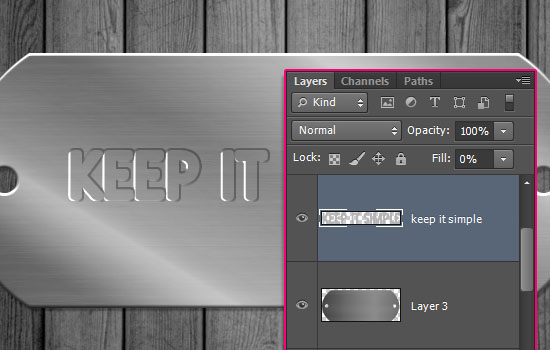
Change the layer’s Fill value to 0. This will style the first text layer.

Step 6
Double click the first copy text layer to apply the following Layer Style:
– Bevel and Emboss
- Style : Outer Bevel
- Check the Anti-aliased box
- Highlight Mode – Opacity : 100%
– Contour
- Contour : Cove – Deep
- Check the Anti-aliased box.
– Drop Shadow
- Distance : 3
This will style the second text layer.
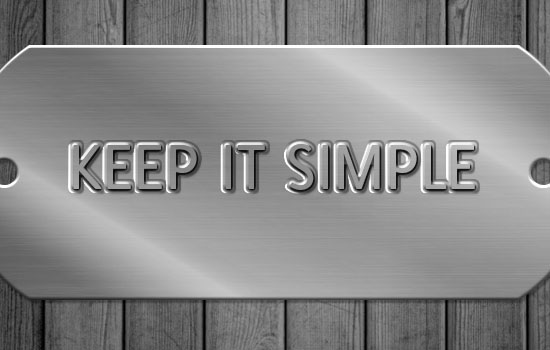

Double click the second copy text layer to apply a Bevel and Emboss effect:
- Size : 3
- Check the Anti-aliased box
- Gloss Contour : Rolling Slope – Descending
This will style the last text layer. Each layer builds the effect up a bit more, and intensifies the highlights and shadows.
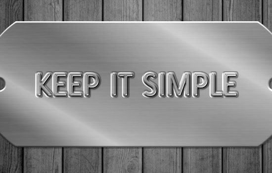

Step 7
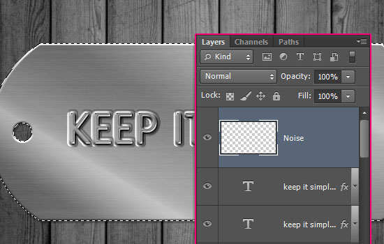
Ctrl/Cmd + click the shape layer’s thumbnail once again to create a selection, then create a new layer on top of all layers and call it Noise.

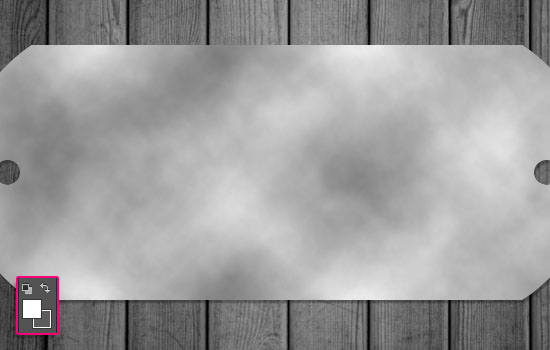
Set the Foreground color to #e7e7e7 and the Background color to #5c5c5c, go to Filter > Render > Clouds, then go to Select > Deselect to get rid of the selection.

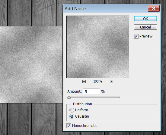
Go to Filter > Noise > Add Noise. Set the Amount to 5, the Distribution to Gaussian, and check the Monochromatic box.

Change the Noise layer’s Blend Mode to Soft Light, and its Opacity to 50%.
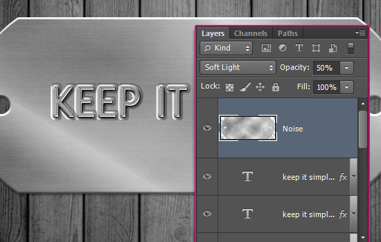

Save a file, then Save it as another copy, as we’re going to flatten the image, and it’s always a good idea to keep a copy of the original layers.
So once you’ve done that, go to Layer > Flatten Image.
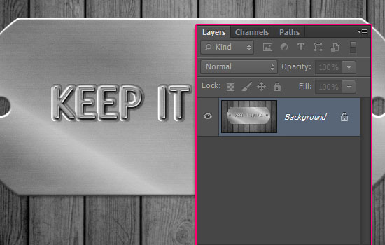

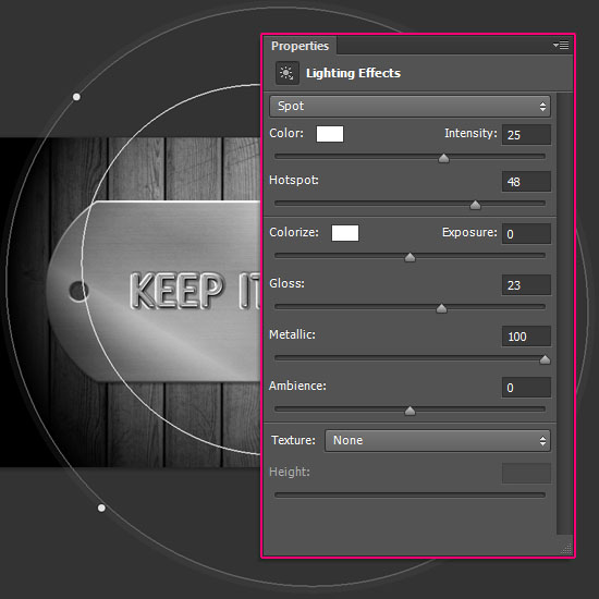
Go to Filter > Render > Lighting Effects, and use the values below.

You can click and drag the ellipses’ edges and points to create the shape you like.
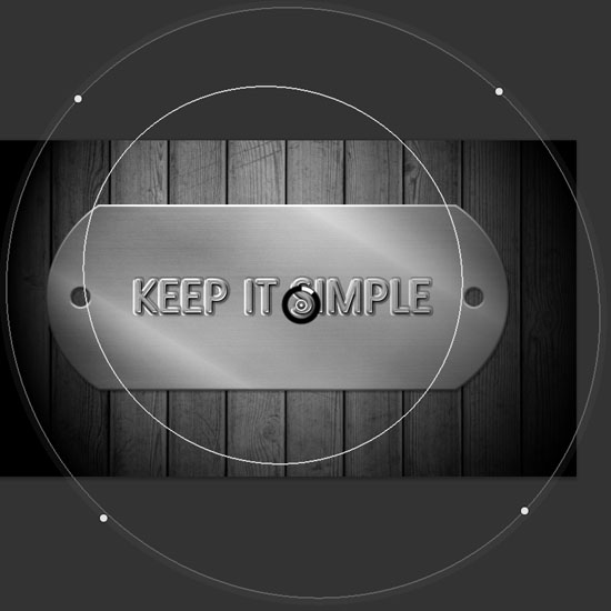

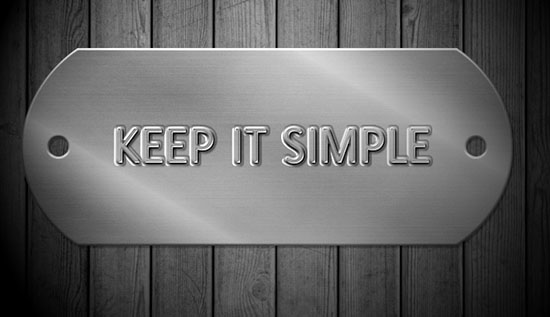
The Lighting Effects will add a bit more more realistic touch to the effect.
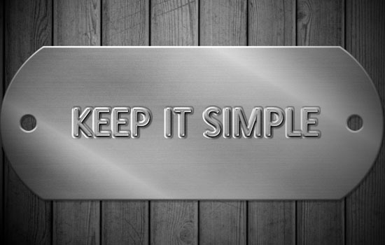

And you’re done!
Hope you enjoyed the tutorial and found it helpful 🙂
Did you enjoy this post? Please consider donating to help us cover our server costs.




It may be ‘simple’ but it’s a great effect. As always, thanks for sharing! 🙂
Very glad you like it 😀
Many thanks for the kind comment 🙂
This is realy cool – you come up with the coolest tutorials 🙂 thank you
That’s so kind of you to say ^_^
Thanks a lot for the comment 😀
cool tutorial….. thanks
you’re welcome 🙂
Thanks for the comment.
This is totally amazing. Steps are easy to follow .. Thanks much
Glad you found it so!
Thanks a lot for the kind words 🙂
really nice tutorial
Thank you 🙂
HOW to make sure that both circles are symmetrically aligned?
You can use guides for that, by adding two vertical ones at the edges of the tag, and two more where you want the center points of the circles to be. That will help you measure the distance between the tag’s edges and the circles’ center points.
Hope this helps. Please feel free to leave any other questions you have 🙂
This tutorial helped me create a logo for a music band. Thank you Rose 🙂
Sounds great!
Thanks a lot for the comment 🙂
You’re always welcome. 🙂
WOW…. REALLY AWESOME TUT…. THANKS
Glad you like it 🙂
Thanks a lot for the comment.
Thanks for sharing a very good one.
Glad you like it.
Many thanks for the comment 🙂
very awesome post and I have found very useful. Thanks for all of interesting text effects.