Simple Abstract Text Effect
This is a very simple 3-step way to create a really nice abstract text effect, using a couple of Filters and a Layer Style.
The Final Result
Tutorial Details
- Software Used : Photoshop
- Version : CS5 Extended
- Time : 0:30 – 0:45
Resources
- Dan font.
Step 1
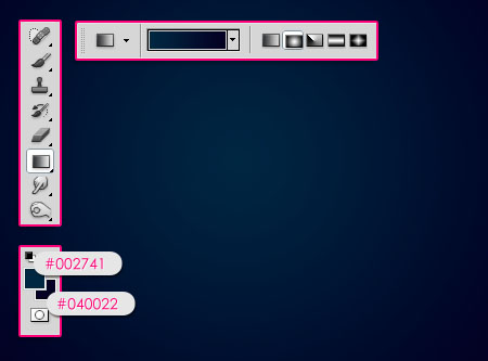
Create a new 1024 x 768 px document. Set the Foreground color to #002741 and the Background color to #040022. Pick the Gradient Tool, choose the Foreground to Background gradient, and click the Radial Gradient icon in the Options Bar. Then create a radial gradient from the center of the document to one of the corners.

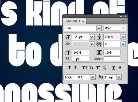
Create the text using the color #ffffff. The font used is Dan, and the Size is 220 pt. If your text is long, you might need to adjust the Leading value to decrease the spaces between the lines.

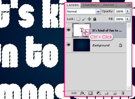
Press the Ctrl/Cmd key and click the text layer’s thumbnail to create a selection.

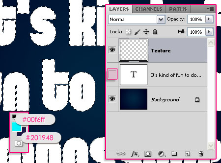
Set the Foreground color to #00f6ff and the Background color to #201948. Create a new layer on top of the text layer and call it Texture, then make the text layer invisible by clicking the eye icon next to it.

Step 2
In this step, we will apply a couple of Filters to create the abstract texture.
First, go to Filter -> Render -> Clouds. Then go to Select -> Deselect to get rid of the selection.
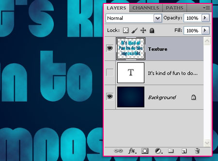

Next, go to Filter -> Render -> Fibers. Set the Variance to 10 and the Strength to 2.
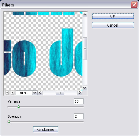

You can change the Zoom value (from the drop down menu or using the icon) to make sure that you like the color distribution, if not, you can click the Randomize button until you like the result. Then click OK.
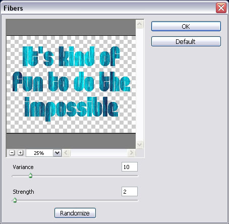

You should get something like this.
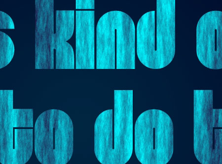

Finally, go to Filter -> Artistic -> Palette Knife. Change the Stroke Size to 25, the Stroke Detail to 3, and the Softness to 0.
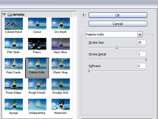

And we’re done with the texture.
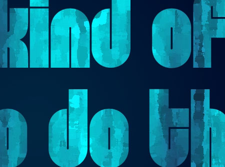

Step 3
In this step, we will apply a simple Layer Style to add a bit of depth to the text, so that it doesn’t look flat.
Double click the Texture layer to apply the following effects:
– Drop Shadow
Just use the default values.
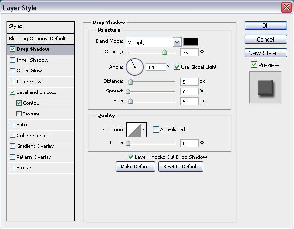

– Bevel and Emboss
- Depth : 800
- Size : 1
- Gloss Contour : Shallow Slope Valleys
- Check the Anti-aliased box
- Highlight Mode : Vivid Light
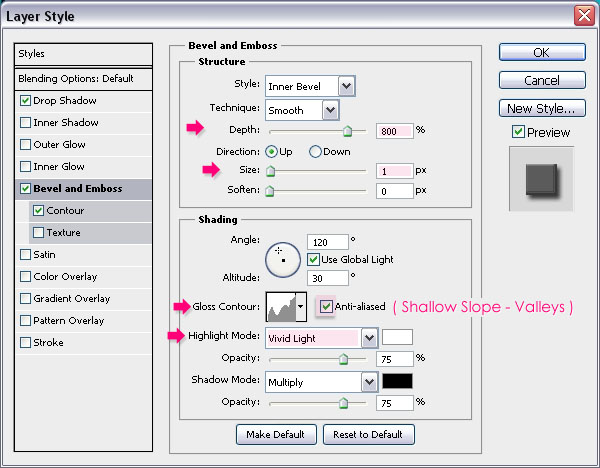

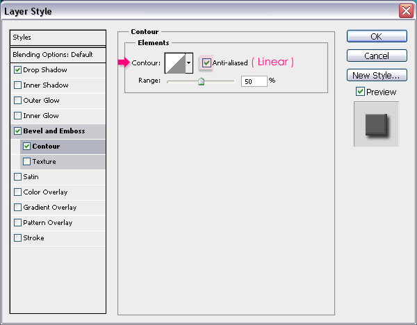
– Contour
Just check the Anti-aliased box.

That’s it! You can use different shades of colors if you like as well.


Hope you enjoyed this super easy tutorial.
Did you enjoy this post? Please consider donating to help us cover our server costs.



Hey man.. Thanks for this tutorial..
I’m a girl, but thanks for the comment 🙂
thanks for the tutorial.
You’re welcome.
Thanks for the comment.
I did this for my class Perfect A 100% 😀 RHS Rules!!! >:D Tutorial is Really Good c: Next time make rather than saying “* the size of the final result image is 1024 * 768” Just tell them to make a new document and use Web by 1024×768. It confused me for a minute lol Other than that Thanks 😀
Hello Bryan,
Glad you liked the tutorial and found it useful.
Thank you so much for the feedback as well, will try to make this point clearer in the next tutorials.
Thanks once again for the comment 🙂
Regards.
Thank you very much.
I’m a web designer and your tutorial is useful for me.
And have a question:
Do you work only graphic?
(if my sentences are mistake excuse me.because I’m a Persian and my original language is Farsi “Persian”).
By the way have a good time.
You’re welcome.
No problem at all. Actually I am mainly a graphic designer, so I use Photoshop to do a couple of other things besides the text effects presented here 🙂
Thank you very much, and have a good time as well.