Colorful Sparkling Glass Text Effect
This is a super easy tutorial that will show you how to use basic Filters and simple Layer styles to create a bright colorful glass text effect.
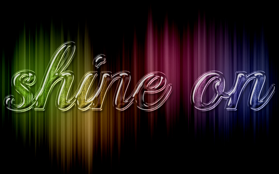
The Final Result
Tutorial Details
- Software Used : Photoshop
- Version : CS6 Extended
- Time : 0:30 – 0:45
Tutorial Details
- Playball font.
Step 1
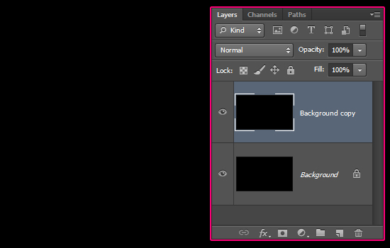
Create a new 1250 x 750 px document, fill the Background with Black, then duplicate the Background layer.

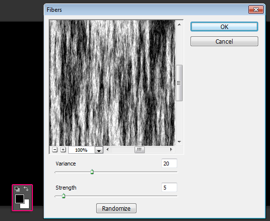
Set the Foreground and Background colors to Black and White, then go to Filter > Render > Fibers. Change the Variance to 20 and the Strength to 5.

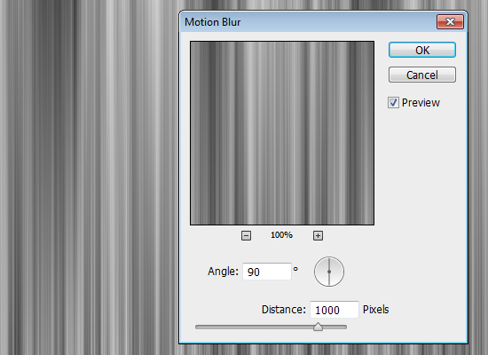
Go to Filter > Blur > Motion Blur. Change the Angle to 90 and the Distance to 1000.

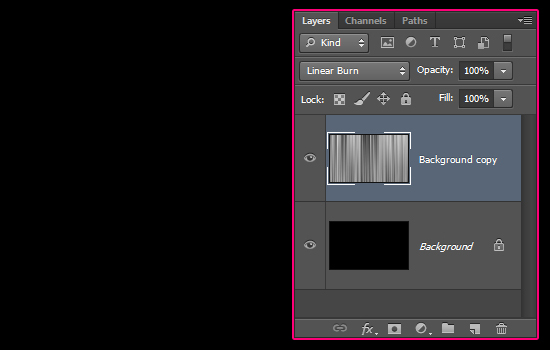
Change the Background copy layer’s Blend Mode to Linear Burn. This will not create any effect for now, but it will once we add the colors later on.

Step 2
Create the text in white using the font Playball and the font Size 250 pt.
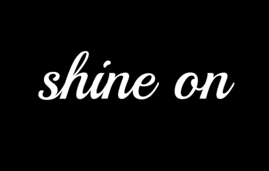

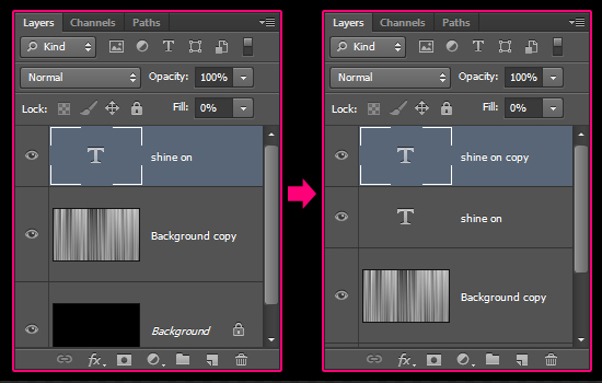
Change the text layer’s Fill value to 0, then duplicate it.

Step 3
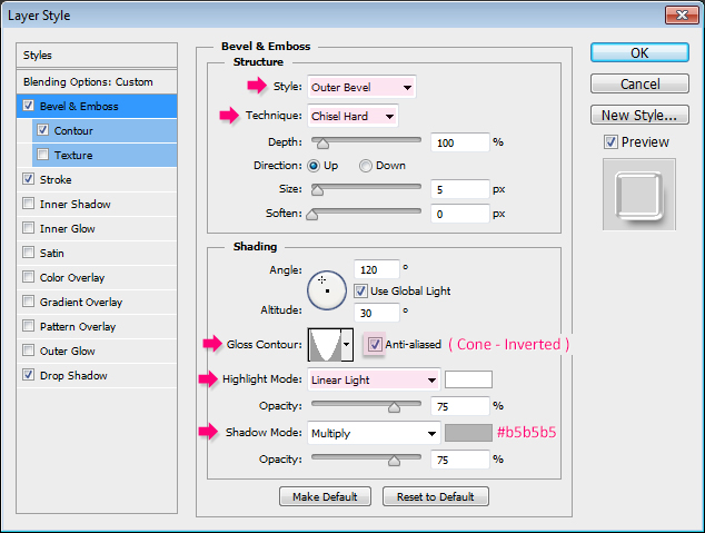
Double click the original text layer to apply the following Layer Style:
– Bevel and Emboss
- Style : Outer Bevel
- Technique : Chisel Hard
- Gloss Contour : Cone – Inverted
- Check the Anti-aliased box
- Highlight Mode : Linear Light
- Shadow Mode – Color :
#b5b5b5
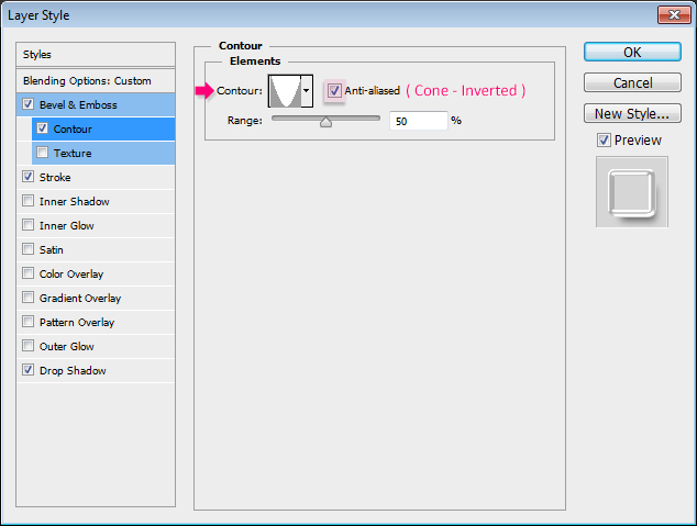
– Contour
- Contour : Cone – Inverted
- Check the Anti-aliased box.
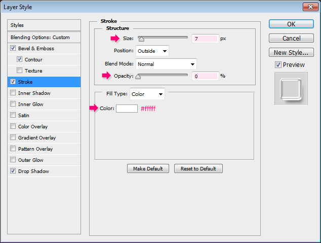
– Stroke
- Size : 7
- Opacity : 0%
- Color :
#ffffff
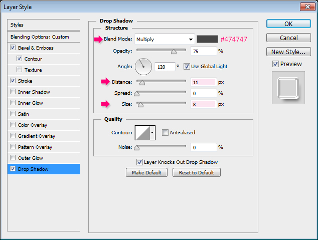
– Drop Shadow
- Color :
#474747 - Distance : 11
- Size : 8
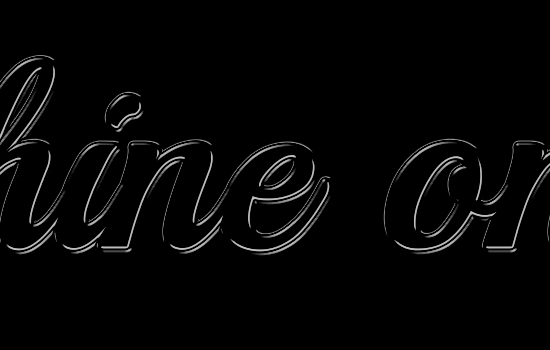
This will create the first layer of the glass effect.

Step 4
Double click the copy text layer to apply the following Layer Style:
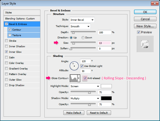
– Bevel and Emboss
- Size : 13
- Gloss Contour : Rolling Slope – Descending
- Check the Anti-aliased box
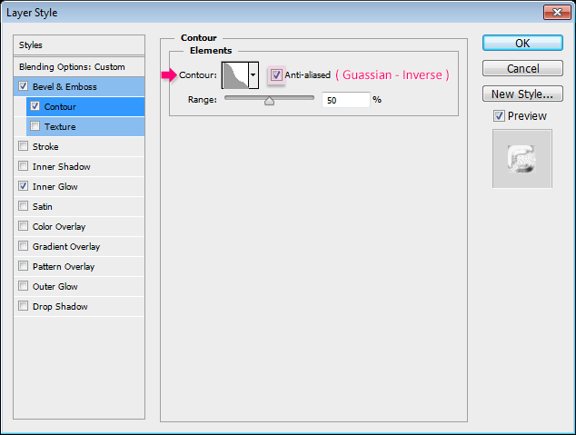
– Contour
- Contour : Guassian – Inverse
- Check the Anti-aliased box.
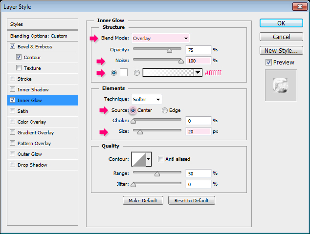
– Inner Glow
- Blend Mode : Overlay
- Noise : 100%
- Color :
#ffffff - Source : Center
- Size : 20
The Noise value will add a subtle sparkling effect to the text when the colors are added. You can decrease the value if you want a more clear-looking glass/result.
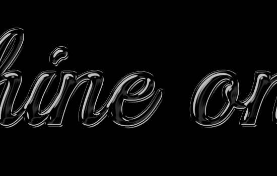
This will create the second layer of the glass effect.

Step 5
Pick the Brush Tool, choose a big soft round brush, and set the Size to a value around 450 px. Then, create a new layer between the two Background layers and call it Color.
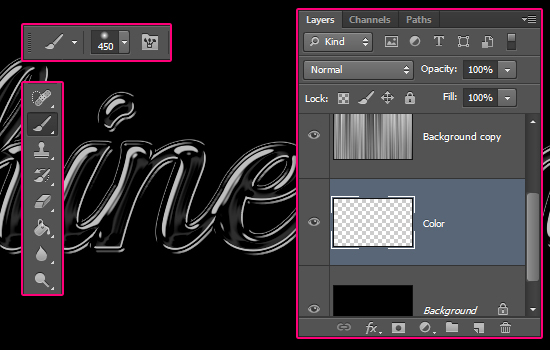

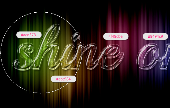
Next, you’ll need to pick different Foreground colors, then for each one, click once behind the text to add dots of color. Make sure to choose lighter colors as they will create a better effect.
You can increase or decrease the brush size if needed as well.
The colors used in the tutorial are shown below, but you can choose any other colors you like.

And that’s it! Very simple, but bright and fun.
Hope you enjoyed the tutorial 🙂
Did you enjoy this post? Please consider donating to help us cover our server costs.




This was fun and very easy 🙂 I did it in just about 15 minutes. Thank you for this tut.
Glad you liked it!
Thanks a lot for the comment 🙂
This tutorial is genuinely super easy … Thank you!!
It sure is!
Thank you for leaving a comment.
very nice tutorial.. thanks. 🙂
here’s my try out..
http://oi44.tinypic.com/o6fgw9.jpg
Cool! Nice to see it on a different font. This is one of the tutorials that can work with a wide variety of fonts, which is always a good thing.
And I really like all the colors you used. Well done.
Thank you very much for sharing your results; always fun to check them out indeed.
I like this! It’s really simple, but nice. I love textuts.com/.
More tutorials, please.
We love you too 🙂
Thanks a lot for the kind words.
Very nice!I like it.
Really glad you do 🙂
Thank you for the comment.
this is really good one….
great website… 🙂
thanks,
Glad you like it 🙂
Thanks a lot for the comment.
Thank you for the article, quite useful and nice! However, I don’t have that ‘Gaussian – Inverse’ contour in this PS CC, I wonder how to get it?
Glad you like the tutorial.
As for the contour, please check the last Note (right before Step 1) to see how to load it.
Hope this helps.
Thanks a lot for the kind comment 🙂
It’s simple. Very nice. So clean.
Great to know you liked it 🙂
Many thanks for the comment.
Very Nice…
Thanks a lot. 🙂
Glad you like it 😀
Thanks a lot for the comment.
Wow! Thank you very much 🙂
I just created an awesome wallpaper.
That’s great to know!
Thanks a lot for the amazing comment 🙂
Hello, thanks a lot for this tutorial, it’s very nice and beautiful *o*
The most hard was to try to read the tutorial cuz i’m French, hope to see more tutorials from you THANKS THANKS THANKS <3
Very happy to know you enjoyed it 🙂
You can always use Google Translate to translate the tutorial, and comment with any questions you have as well.
Many many thanks for the amazing comment 🙂
Love this. Modified the text and end bit though to create a 2014 New year card. You can use a gradient or colour overlay instead of painting the individual colours. Have to experiment with the % scale but effect is still the same. Easier to change colours just by changing the gradient/colour overlay. I used #f7c972 which gave it an antique goldy/bronze look.
Thanks again:D
That’s a great idea! Using a brush gives you more control over placing the colors, but a gradient overlay is definitely an easy to create and modify option as well.
Thanks a lot for the awesome tips and for the kind comment 🙂
Omg! Its V Nice 🙂
Thanks a lot 🙂
Thanks a lot, just now i created a glass effect in photoshop.
thank u very much
That’s really cool!
Thank you for the comment and for sharing your work with us 🙂
Whoa this is amazing
Thanks you 🙂 nice pic
Glad you like it 🙂
Thanks for the comment.
Great stuff. I’m new to creative software and have been working on Illustrator only. The Shine On effect is exactly what I’ve been wanting to do and I don’t see anything of that quality in an Illustrator tutorial. Can you tell me if Illustrator is capable of the same effect?
This is a Layer Style-based text effect, so Photoshop is the easier and better way to go.
The tutorial is a simple/basic one, so if you give it a try using Photoshop you’ll most probably be able to get the effect easily 😉
You can leave any questions you have here and we’ll make sure to answer them as well 🙂
Thanks for the comment.,
nice work,. can u please add the psd file and asl file in each text effect tutorials.
Thanks for the comment.
Unfortunately, we’ve been selling the files for a while, so we cannot post them for free download. But we’re thinking of selling them in packs some time soon.
Sorry about that, and thank you once again.
ok. thanks for consider my query
No problem 🙂
Too good for new
Thank you 🙂
I just started on Photoshop text effects… I just made this and although I couldnt figure out how to make the inverse of Gussian for like 30 mins it turned out amazing
Very good outcome!
You can get the contour by loading it. Please check this link to see how to do so.
Thanks for the comment 🙂
Beautiful outcome!
Thanks a lot for the comment and for sharing your work 🙂
Very nice! Thank you dear
I find it hard to believe that you do not include information for creating Gaussian inverse at the point it is talked about in the tutorial. I followed your directions to find the answer from the other comments about this and I got zip zero nada. I used to think Willie Wonka was a jerk but now you win hands down. Thanks for the waste of time.