
Colorful Stuffed Text Effect
This tutorial explains how to create a nice colorful stuffed-like text effect, using a simple pattern, and a couple of layer Layer Style. This tutorial can be adopted to look like fridge magnets.
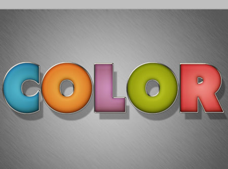
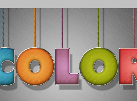
The Final Result

Tutorial Details
- Software Used : Photoshop
- Version : CS5 Extended
- Time : 0:45 – 1:30
Resources
- Tondu font.
- Metal Texture 2 by goldberry2000.
Step 1
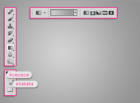
Create a new 1024 x 768 px document. Set the Foreground color to #cecece and the Background color to #949494. Pick the Gradient Tool, choose the Foreground to Background gradient, and click the Radial Gradient icon in the Options Bar. Then create a radial gradient from the center of the document to one of the corners.
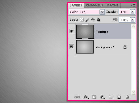
Place the Metal Texture 2 on top of the Background, then change its layer’s Blend Mode to Color Burn, and its Opacity to 40%.
Step 2
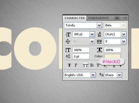
Create the text in All Caps using the color #f4edd2. The font used is Tondu and the Size is 300 pt.
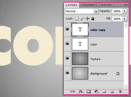
Duplicate the text layer. We will use the first text layer to create the stroke, and the second one to create the main stuffed effect.
Step 3
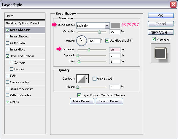
Double click the original text layer to apply the following Layer Style:
– Drop Shadow
- Color :
#979797 - Distance : 38
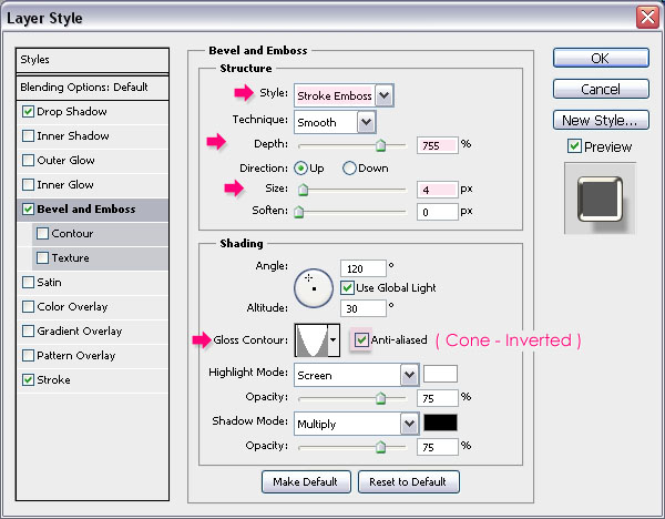
– Bevel and Emboss
- Style : Stroke Emboss
- Depth : 755
- Size : 4
- Gloss Contour : Cone – Inverted
- Check the Anti-aliased box
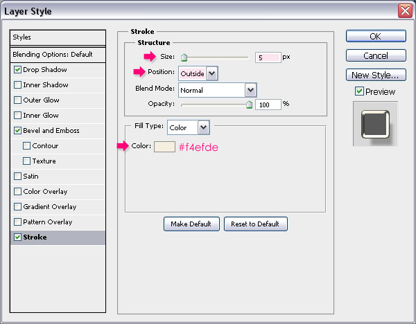
– Stroke
- Color :
#f4efde

Step 4
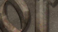
Now, we are going to create a simple pattern. So create a new 5 x 5 px document with a White background. Then, pick the Rectangular Marquee Tool and click the Add to selection icon in the Options bar.
Create 1 x 1 px squares diagonally through the document as shown below.
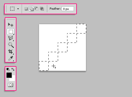
Fill the selection with Black, and press Ctrl/Cmd + D to get rid of the selection.
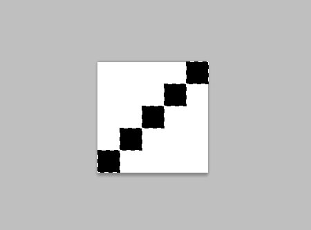
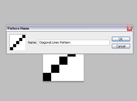
Go to Edit -> Define Pattern, and type in a name for the pattern.
Step 5
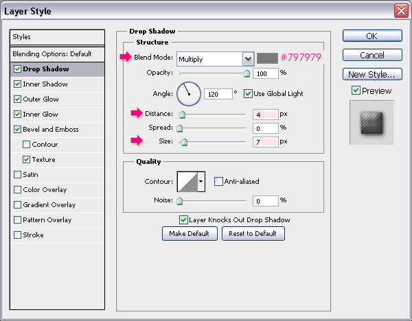
Back to the original document, double click the copy text layer to apply the following Layer Style:
– Drop Shadow
- Color :
#797979 - Distance : 4
- Size : 7
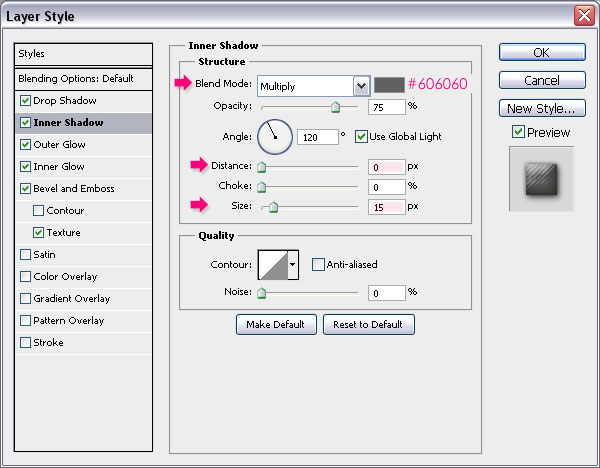
– Inner Shadow
- Color :
#606060 - Distance : 0
- Size : 15
– Outer Glow
- Blend Mode : Multiply
- Color :
#9c9696
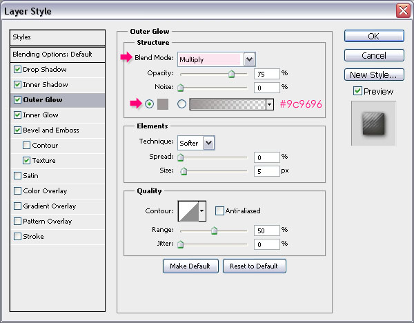
– Inner Glow
- Blend Mode : Multiply
- Color :
#d1d1d1

Both Glow effects are used to intensify the shadow effects by changing their Blend Modes to Multiply.
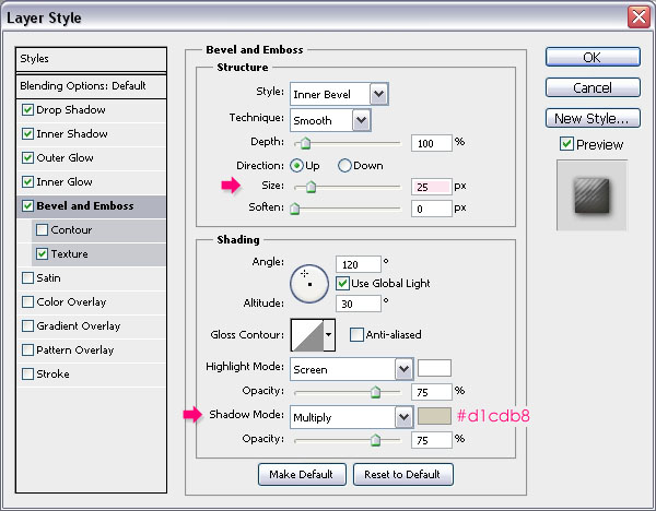
– Bevel and Emboss
- Size : 25
- Shadow Mode – Color :
#d1cdb8
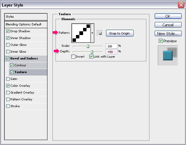
– Texture
- Pattern : The Diagonal Lines pattern
- Depth : 5%
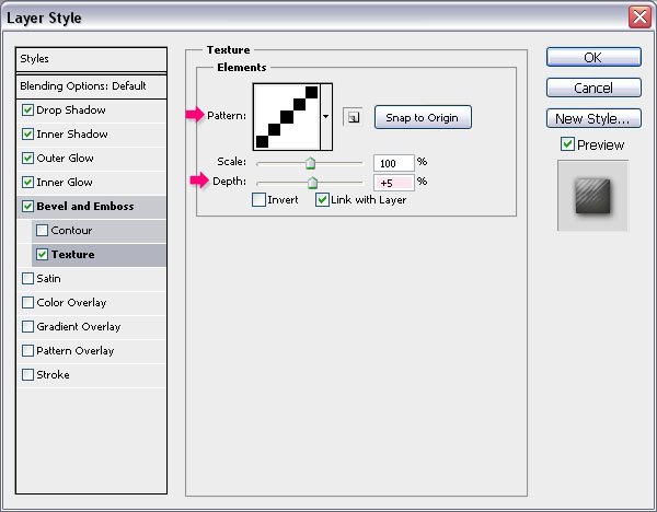
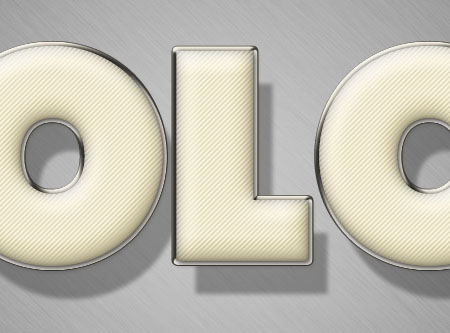
This will give the text the stuffed look.
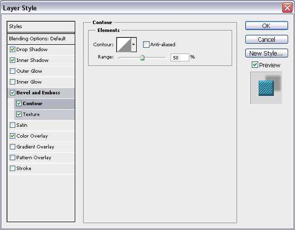
Step 6
Press the Ctrl/Cmd key and click a text layer’s thumbnail to create a selection.
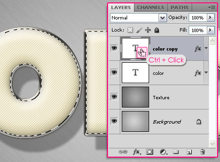
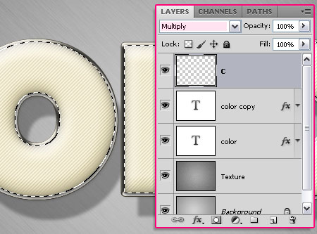
Next, we’ll be filling and applying different layer style values for each letter separately. So start with the first letter, create a new layer on top of all layers and rename it to whatever letter you’ll be working with, and change the new layer’s Blend Mode to Multiply.
Pick the Rectangular Marquee Tool and click the Intersect with selection icon in the Options bar. Then, draw a selection around the letter you want to work with.
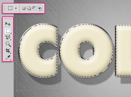
The letter will be selected separately.

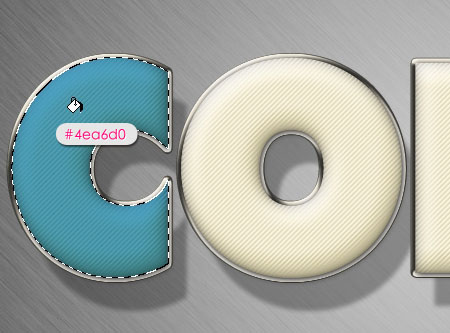
Fill the letter with any color you like. Here, the color used is #4ea6d0.
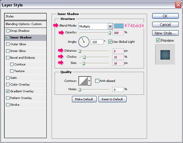
Step 7
Double click the letter’s fill layer (in this case, C), to apply the following Layer Style:
– Inner Shadow
- Color : Choose a color that suites the letter’s fill color, here, the color used is
#74b6d4 - Opacity : 100%
- Distance : 0
- Choke : 15
- Size : 18
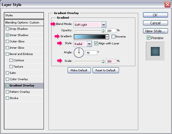
– Gradient Overlay
- Blend Mode : Soft Light
- Style : Radial
- Scale : 150%
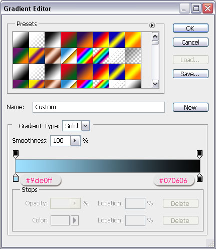
- Click the Gradient box to create the gradient
For the gradient, you’ll need two colors. the color to the right is #070606 (this one will be used with all the other colors), and the color to the left is any color that goes with the letter’s fill color. You can try different colors and check the preview, then choose whatever color you like. The color used here is #9de0ff.
This will make the letter’s fill look more vivid.

Repeat the previous steps to each one of the remaining letters.
(Select the whole text (Ctrl/Cmd + click a text layer’s thumbnail), use the Rectangular Marquee Tool to isolate the letter you want to work with, create a new layer and change its Blend Mode to Multiply, fill the selection with any color you like, apply the Layer Style for the letter using suitable colors for the Inner Shadow and the color to the right in the Gradient, and you’ll get some bright colorful letters.)
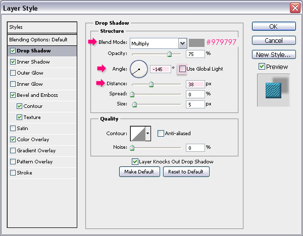
Step 8
Set the Foreground color to #d7d0c0 and pick the Line Tool. Set the Weight to 7 in the Options bar, and create a line behind the text layers as shown below.
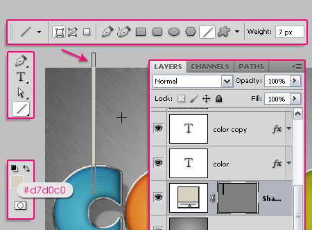
Double click the line shape layer to apply the following Layer Style:
– Drop Shadow
- Color :
#979797 - Uncheck the Use Global Light box
- Angle : -145
- Distance : 38
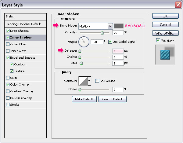
– Inner Shadow
- Color :
#6a6a6 - Distance : 0
– Bevel and Emboss
- Highlight Mode : Overlay
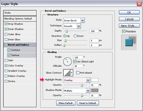
– Contour
Use the default values.
– Texture
- Pattern : The Diagonal Lines pattern
- Depth : 50%
– Color Overlay
Choose a color that matches the letter’s color. Here, the color used is #347c9e.
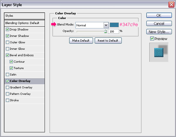
This is what you should get.

Step 9
Duplicate the line shape layer, and move the copy to the right in order to place it behind the next letter.

Double click the copy layer to change the Color Overlay to a new color that matches the new letter’s color. Here, the color is set to #e57e2e.
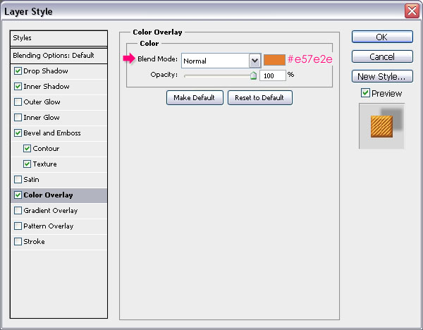
You can change the shape’s fill if you don’t want to apply a color overlay, but using the color overlay includes the fill in the layer style, which makes copying it to other elements easier.

Do the same for the rest of the letters.
And you’re done! Hope you enjoyed the tutorial and found it useful
Did you enjoy this post? Please consider donating to help us cover our server costs.

love your tuts! they’re very easy to follow and the outcome always is great 🙂
Thank you so much, I really appreciate it 🙂
Wonderful-Thanks for sharing it
You’re welcome.
Thanks for the comment 🙂
Great look
Thanks a lot 🙂
As said before, your tuts are very understandeble
Thanks a lot
Thank you for the comment, I really appreciate it.
It’s so nice, and your instructions are so clear to follow!
Thanks a lot for the tutorial 😀
Glad to know that.
Thank you so much for the comment.
This is my first tutorial of this kind, and I understood the options used, i´m going for the next one. thanks a lot
That’s great to know!
Have fun with all the tutorials 🙂
Thanks for the comment.
excellent design and creative effects in this tutorial.
Thanks a lot for the comment.
Easy and nice tutorial.
Thank you 🙂
Helloe Rose it will be great if u publish ur source file. It will be better for begginer.
You can buy the source file here if you like. All the PSD source files are available for paid download as well.
You can check the store page for now, and later on each tutorial will include the source file paid-download link.
Hope this helps 🙂
Erm… store page not working?
Sorry about that!
We are working on the store for the near future. But right now, there is no store.
You can still leave any queries you have though, and we’ll be glad to help.
How do you load the diagonal thingy coz i can’t make it load to the textures please reply!
You do not need to load it, once you define it as a pattern it will automatically show in the patterns palette. Just click the arrow next to Pattern in the layer styles dialog box and scroll down, you’ll find the pattern there.
Hope this helps. If the problem still exists please feel free to add a reply.
Very useful tutorial, thanks 😉
Glad you found it so.
Thanks for the comment 🙂
very good ,go on sir.
Thanks for the comment.
(I’m a girl 🙂 )
sorry,cute girl.
No problem ^_^
I keep getting stuck on Step 4. How do I create a new 25 x 25 document? I did all the steps correctly except for number 4. What am I doing wrong?
You need to go to File -> New, and enter 25 for both the Width and the Height values (in pixels). And once you’re done with the pattern, just close this one and go back to the original document to continue working.
Hope this helps 🙂
Nice tutorial,Thanks
Thanks for the comment.
great great great tutorial,Thanks a lot Admin !!!
Thank you so much, glad you liked it 🙂
Awesome! Thks for share (:
You’re welcome.
Thanks for leaving a comment 🙂
“So create a new 25 x 25 px document with a White background. Then, pick the Rectangular Marquee Tool and click the Add to selection icon in the Options bar.
Create 1 x 1 px squares diagonally through the document as shown below.” i think this step is can make 5 squares like picture , if make 5 squares like picture u need it 5x5px
You’re absolutely right!
Changed the values in the tutorial.
Thanks for pointing that out.
Your work can be seen even in Ukrain. Thank you.
(sorry my english)
That’s great!
Thanks for the comment.
You tuts are so easy to follow. Thank you.
Glad you find them so.
Thanks a lot for the comment.
I love it !!! I don’t know nothing about photoshop, but I did it 🙂
Thank you.
That’s great! Glad you were able to follow the tutorial.
Thanks for the comment 🙂
Really helpful tutorials…Thanks
Happy you found it so.
Thanks for the comment.
I love it 🙂 Very good job its nice and easy to apply.
well done and thanks you so much…
Great to know you found it easy to follow.
Thanks a lot for the comment 🙂
Adoro cores e mais ainda eficiência. Disponibilizar os recursos para o tutorial e explicar de forma clara o passo a passo sem dúvida facilita e incentiva. Sucesso Garantido! Parabéns!
That’s really so nice of you to say, I’m really glad you enjoyed it and found it easy to follow.
Muito obrigada for the comment 🙂
wow!! amazing tutorial. . are this tutorial can be used in adobe flash cs3? thx
I think you mean Photoshop CS3, because it can be created in CS3 but not in Flash 🙂
Hope this helps.
Thanks for the comment.
Amazing! Cool!
Thanks a lot 🙂
i am stuck in in stop 8 can’t make it
Why not? What happens when you try to do it?
I am also stuck on 8
Please explain what happens when you try to work on that step, what goes wrong?
can you put the code of all the colors you put. thanks a lot
Sure,
C – #4ea6d0
O – #f09450
L – #bf93ad
O – #aab51a
R – #ec6b76
Hope this helps 🙂
Very nice tutorial, and quite easy to follow. Just wondering how you do the ‘Dream in’ Text behind the strings.
Thanks!
You can check the third effect in the Three Simple Elegant Headers Text Effects tutorial, and it will help you understand how to create a similar result.
Please feel free to add a reply if you have any other queries.
Thanks a lot for the comment.
Thank you for your interesting tutorial.
Glad you enjoyed it 🙂
Thanks for the comment.
nice tutorial… i’ll teach this to my students..:)
That’s great to know! Hope they enjoy it 🙂
Thanks a lot for the comment.
Each tutorial just blows my mind! This is the best website/tutorials I have come across. THANK YOU SO MUCH!!!!
That definitely means a lot!
Thank you very much for the amazing comment and for the support.
Regards.
???? ??? ???? ???? ?? ?? ???? ??? ?????
dear Rose
thank you for this nice work.
but I have a problem with creating a pattern!!! could you put the link of pattern?
thanks again
Dear Rose
I have got it. according to your advice above I was try draw the above pattern and I got it, later on I will send my final result.
thanks for ever.
Sorry about the late reply!
Glad the problem was solved though.
Looking forward to seeing your outcome 🙂
Thanks a lot for the comment.
quote (Sorry about the late reply!
Glad the problem was solved though.
Looking forward to seeing your outcome)quote.
welcome to my outcome and your unlimited effort!!
http://www.deviantart.com/messages/#view=feedback
go to submit – sta.sh
Hmm, I don’t seem to be able to access it. Is there a direct link to the final result please?
Dear tuts…
I don’t way the right way of loading the links…
but I think this the right links …
http://sta.sh/029nnadcnjw2
http://sta.sh/0uz7e3g1kfl
http://sta.sh/0rqe4rmz8j6
http://sta.sh/0e8a1rgolrj
I can see them now. Great job indeed!
Thanks a lot for sharing your work, well done 🙂
Thanks for this easy and attractive tutorial…. Nicely explained…
Glad you like it!
Thanks a lot for the kind words 🙂
You sure can, and it’s always interesting to see what can be done with the effects.
Thanks for sharing your amazing work 🙂
Very easy to follow and fun to do