
Leather Text Effect
This tutorial will explain how to use the layer Layer Style to achieve a leather-like text effect, and how to create a nice glossy stroke to add more depth to the final effect.
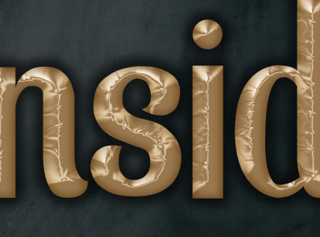
The Final Result

Tutorial Details
- Software Used : Photoshop
- Version : CS5 Extended
- Time : 0:30 – 0:45
Resources
- Spatha Sans font.
- S. Weaver Texture Stock by =redwolf518stock.
Step 1
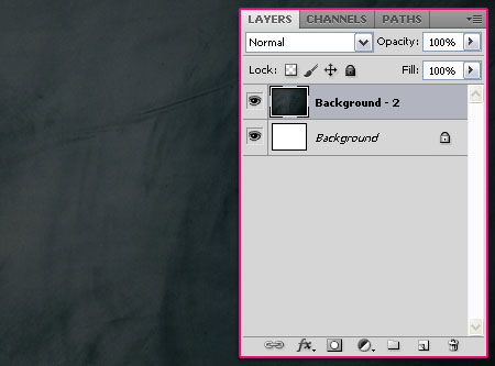
Create a new 1024 x 768 px document. Place the S. Weaver Texture Stock on top of the Background layer. You might need to rotate the image to fit in the document (Image > Image Rotation > 90° CW).
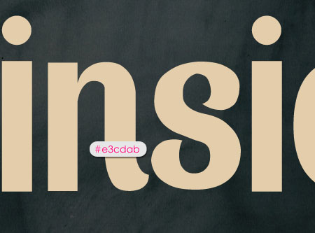
Create the text using the color #e3cdab, the font used is Spatha Sans, and the Size is 370 px.
Step 2
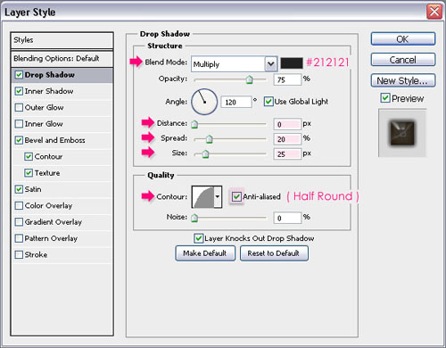
Double click the text layer to apply the following Layer Style:
– Drop Shadow
- Color :
#212121 - Distance : 0
- Spread : 20
- Size : 25
- Contour : Half Round
- Check the Anti-aliased box
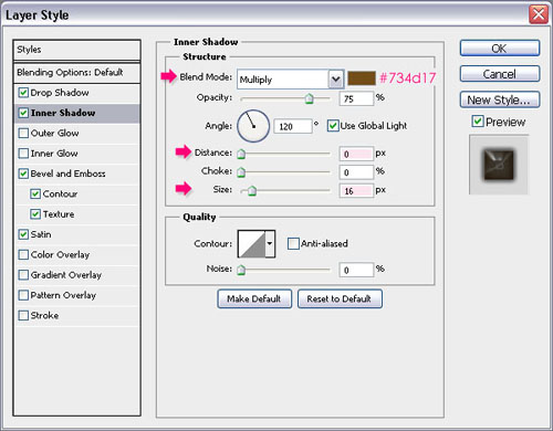
– Inner Shadow
- Color :
#734d17 - Distance : 0
- Size : 16
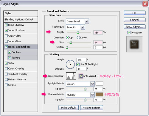
– Bevel and Emboss
- Depth : 450
- Size : 24
- Gloss Contour : Valley Low
- Check the Anti-aliased box
- Shadow Mode – Color :
#907248
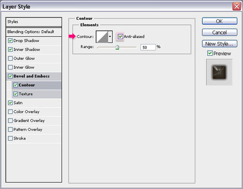
-Contour:
Just check the Anti-aliased box.
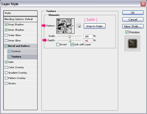
– Texture
- Pattern : Satin
- Depth : 5%
This is the part that gives the text a leather-like feel, as it uses the texture to create the bevel.
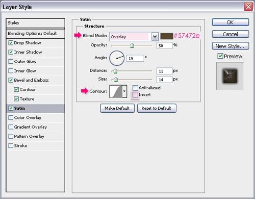
– Satin
- Blend Mode : Overlay
- Color :
#57472e - Un-check the Invert box
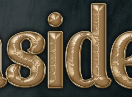
You’re text should look like this:
Step 3
Right click the text layer and choose Create Work Path.
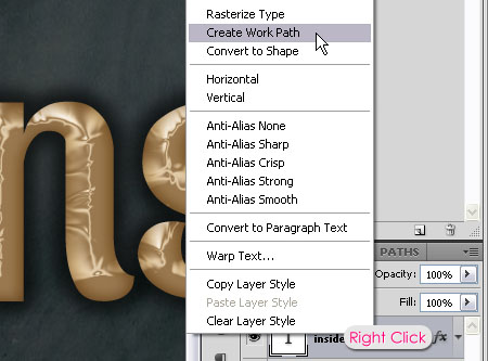
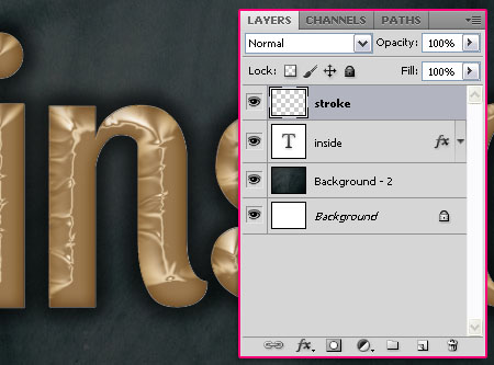
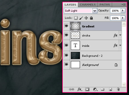
Create a new layer on top of all layers and call it stroke.
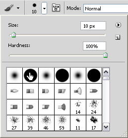
Choose a hard round brush, and set the Size to 10, or whatever value you like (a bigger value will create a thicker stroke).
Set the Foreground color to #9e865b, and pick the Direct Selection Tool. Right click the path and choose Stroke Path.
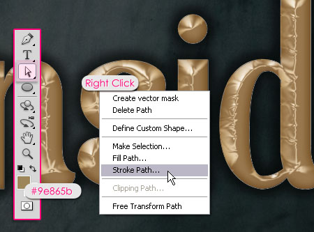
Choose Brush from the Tool drop down menu, and make sure that the Simulate Pressure box is un-checked.
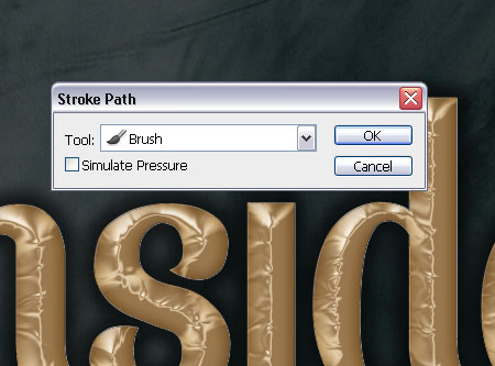
Hit Enter/Return to get rid of the path.

Step 4
Ctrl/Cmd+ click the layer’s thumbnail to create a selection.
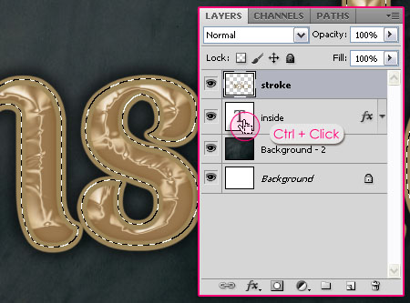
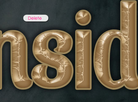
Press the Delete button to get rid of the inner part of the stroke.
Step 5
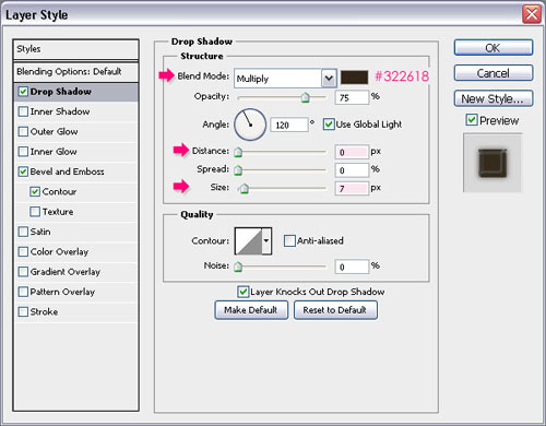
Double click the stroke layer to apply the following Layer Style:
– Drop Shadow
- Color :
#322618 - Distance : 0
- Size : 7
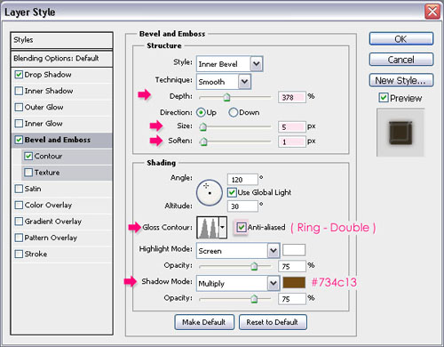
– Bevel and Emboss
- Depth : 378
- Soften : 1
- Gloss Contour : Ring Double
- Check the Anti-aliased box
- Shadow Mode – Color :
#734c13
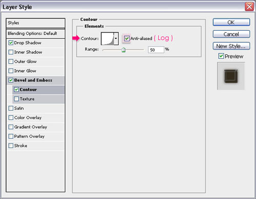
– Contour
- Contour : Log
- Check the Anti-aliased box.
This will create a nice stroke that adds more depth to the text.
Step 6
Finally, this is optional, but it adds a nice final touch to the colors of the effect.
Create a new layer on top of all layers and call it Gradient. Set the Foreground color #797979, and use the Radial Gradient tool to create a Foreground to Transparent Gradient from the center of the document to one of the corners. Don’t forget to check the Reverse box to get the color on the corners.
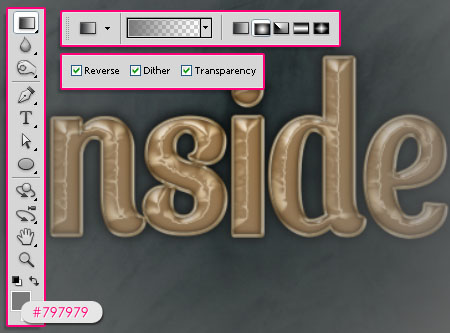
Finally, change the Gradient layer’s Blend Mode to Soft Light.
And this is the final effect.
Did you enjoy this post? Please consider donating to help us cover our server costs.


Thank you so much for your tutorial..^^
Thanks for the support Moai 🙂
thank you so much
I like it
You’re welcome.
Thanks for the comment 🙂
Just tried this tut and I really liked the result. Great instructions. Toda v’shalom Tehillah-Lilly
Al lo davar 🙂
Glad you liked it, thanks for the comment.
Great!
I like it~
Thanks!
Glad you do 🙂