Ombre Text Effect
Ombré is a French word that means “shaded”, and it describes anything that starts with one color and then gradually fades into another. This tutorial explains how to use two simple filters to apply the Ombré effect to a text using the colors you like.
This effect is inspired especially by the Ombré nail art, in which the nails are painted using two or more colors that fade into each other, in a not very smooth transition, since a sponge is used to blend the colors. Then, a shiny top coat is added to the gradient created. (So much beauty talk here! You can google some images if you like, but I think the effect is really nice ^_^).
The Final Result
Tutorial Details
- Software Used : Photoshop
- Version : CS6 Extended
- Time : 0:30 – 0:45
Resources
- Riot Squad NF font.
- blue bokeh texture by beckas.
Step 1
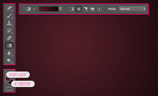
Create a 1024 x 768 px document, set the Foreground color to #501d25 and the Background color to #130709. Pick the Gradient Tool, click the Radial Gradient icon in the Options bar, then click and drag from the center of the document to one of the corners.

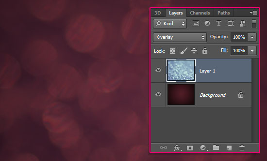
Place the blue bokeh texture on top of the gradient background, resize it as you like, then change its layer’s Blend Mode to Overlay.

Step 2
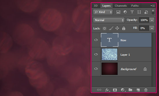
Create the text in White using the font Riot Squad NF. The font Size is 250 px. If you are willing to create more than one line of text, create each one in a separate layer.


Change the text layer’s Fill value to 0.

Step 3
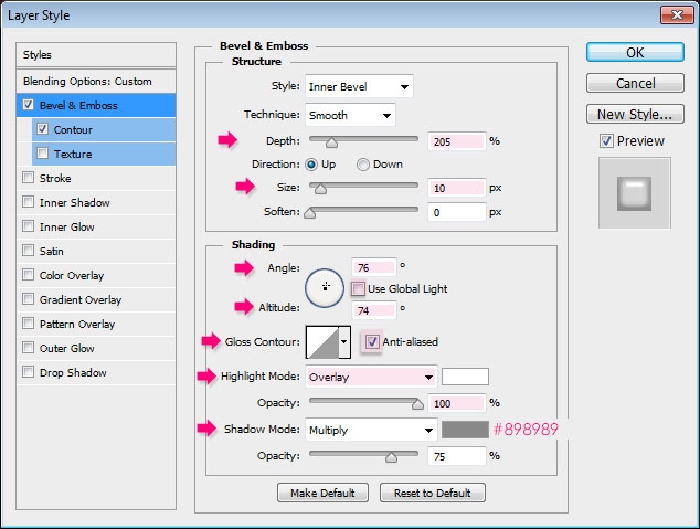
Double click the text layer to apply the following Layer Style:
– Bevel and Emboss
- Depth : 205
- Size : 10
- Uncheck the Use Global Light box
- Angle : 76
- Altitude : 74
- Check the Anti-aliased box
- Highlight Mode : Overlay
- Opacity : 100%
- Shadow Mode – Color :
#898989
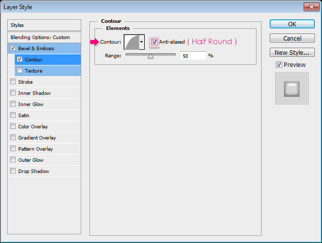
– Contour
- Contour : Half Round
- Check the Anti-aliased box.
This will add a simple glossy looking top to the main effect when it’s created later on.


Step 4
Create a new layer right below the text layer and call it Texture. Pick the Gradient Tool, set the Foreground color to #1b7889, and the Background color to #f6989c.
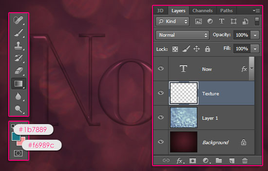

Ctrl/Cmd + click the text layer’s thumbnail to create a selection.
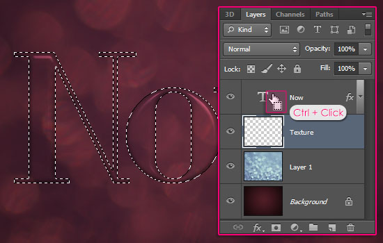

In the Options bar, choose the Foreground to Background gradient fill, and click the Linear Gradient icon. Make sure that the Texture layer is the selected layer, then click and drag from the highest point to the lowest point of the selection vertically.
You can press and hold the Shift key while clicking and dragging to create a straight line.
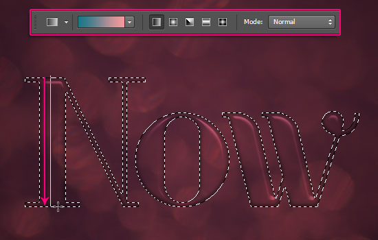

This will create the basic gradient fill. You can use any other colors you like, you can even use more than two colors. But keep in mind that different colors might require different Filter values.
Changing the Filters’ values is very easy, and it is explained at the end of Step 6.
Go to Select > Deselect to get rid of the selection.


Step 5
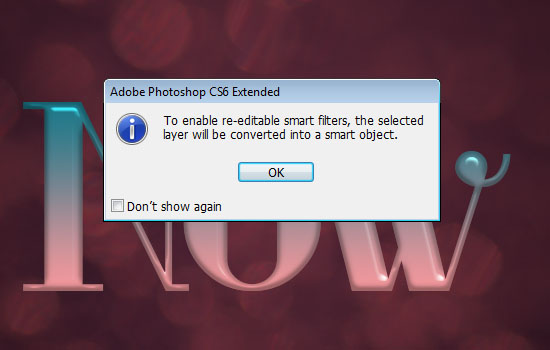
In order to be able to modify the Filters’ values, the Texture layer must be converted to a Smart Object. To do so, select the Texture layer, then go to Filter > Convert to Smart Filters. A dialog box will appear telling you that the layer will be converted into a Smart Object, so go ahead and click OK.

You can notice that the layer now has a small smart object icon in the bottom right corner.
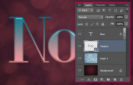

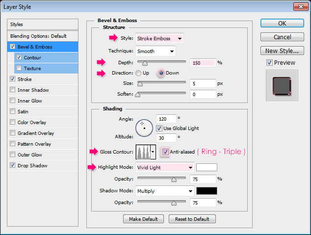
Double click the Texture layer to apply the following Layer Style:
– Bevel and Emboss
- Style : Stroke Emboss
- Depth : 150
- Direction : Down
- Gloss Contour : Ring – Triple
- Check the Anti-aliased box
- Highlight Mode : Vivid Light
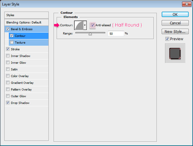
– Contour
- Contour : Half Round
- Check the Anti-aliased box.
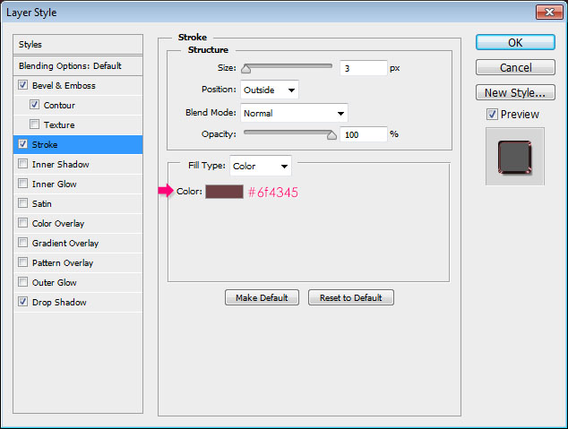
– Stroke
- Color :
#6f4345
You basically need to change the color to a darker shade of one of the original gradient colors. So you can try different colors until you find one that you like.
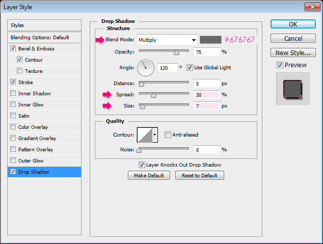
– Drop Shadow
- Color :
#676767 - Spread : 30
- Size : 7
This will add depth to the text.


Step 6
Time to add the Filters. Start by going to Filter > (Filter Gallery) > Brush Strokes > Spatter. Change the Spray Radius to 22, and the Smoothness to 5.
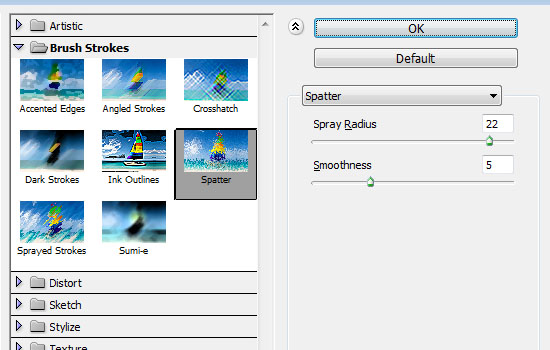

You should get a result similar to this:


Go to Filter > (Filter Gallery) > Brush Strokes > Sprayed Strokes. Change the Stroke Length to 0, and the Spray Radius to 8.
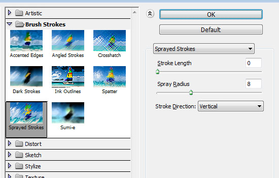

And Voilà! Your Ombré text effect is finished!


As mentioned before, the Filters’ values might need alteration for different colors, so just try to get similar results to the ones in the images for each filter.
And since the Texture layer is a Smart Object, you can expand the Filters’ list by clicking the arrow to the right of the layer, then double click the Filter’s name to modify its values.
Experiment with the different values until you like the effect, or the transition between the colors.
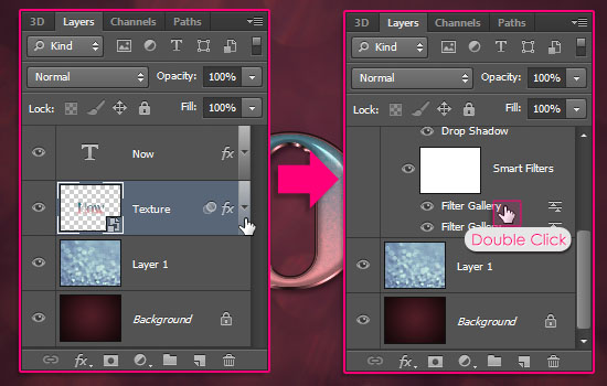

If you are using different font Sizes, then make sure to change both the Layer Style values and the Filter’s values.


Hope you enjoyed this tutorial and found it helpful.
Did you enjoy this post? Please consider donating to help us cover our server costs.




Yeeees, i like this effect, thank you so much for sharing this 🙂 :*
http://i389.photobucket.com/albums/oo339/Tamara_75/lunialbum/Clases/PS/HaydeOmbre.jpg
Very nice and well done outcome 🙂
Glad you enjoyed the tutorial.
Thanks a lot for the comment and the link.
Excellent effect! A well prepared & presented tutorial. Thanks.
Glad you like it.
Thank you very much for the comment.
Nice tutorial, i m so new to comment any thing but this was so help full to me by now. thanks
Glad you found it helpful.
Thank you for the comment, your comments are welcome anytime 🙂
everything worked fine except by step 6. The filter gallery refuses to open
Do you mean that the Filter names are grayed out in the menu? Is the “Texture” layer active (selected) when you try to apply the Filters? Make sure it is, and that you are not in any Transform Mode.
Please feel free to add a reply if the problem still exists.
great job
Thank you.
Thank you very much,the text effect is very nice!
You’re very welcome, glad you like it.
Thanks a lot for the comment.
hi it is very cool tutorials of the day i have seen and i learnt something form this tuts so man keep it up always good work. My big to you for this work Thanks
Glad you did learn something new and found the tutorial useful.
Thank you very much for the kind words and for the support.
Best regards.
Hello, thank you for the nice clear tuto.
You’re welcome.
Thanks a lot for the comment.
just want to say thank you for posting this very easy and helpful tutorial ! 🙂
You’re very welcome! Glad you like it.
Thank you for the comment 🙂
This is amazing a tutorial. Thank you so much.
Happy you like it 🙂
Thanks a lot for the comment.
Your tutorial was fabulous! The whole process was easy to follow and my ending result was just as awesome as I’d have imagined. As a person who has barely used Photoshop, I give you your props! The screen shots are easy to follow, and you kept the “Photoshop lingo” down to a minimum. Thank you so much!
That means a lot! Really glad you liked the effect and found the tutorial easy to follow.
Thank you very much for the amazing comment 🙂
Amazing tutorial!
Can I translate this tutorial into Chinese and show it on the net(Just for learning exchange)?
Thank you!
Sure, just please make sure to link back to the original one 😉
Thank you for the comment 🙂
I got a problem here, when I get to step 3, my result is not like yours. Then I ask my friend for help, he got the same result just like what I made.
All date are the same.
Here comes the picture, that is my review… Thanks for your help!!
Please help!
What I’ve made is base on your data, but I can’t get the image like yours!
I am stuck in the Step 3 now.
Thank you sooooo much!
Are you using the same values as in the tutorial? Can you please go to Image > Image Size, and make sure that the Resolution is set to 72?
If it’s not, then please create a new document, set the Resolution to 72, and retry creating the tutorial.
Hope this helps.
Please feel free to leave a reply if the problem still exists.
Thanks for the comment 🙂
Great Tutorial
Thank you!
Thank you for this tutorial! I learned a lot! 😀 😀
You’re welcome! That’s great to know 🙂
Thanks a lot for the comment 😉
How’s this ? 🙂
Absolutely lovely! I really like the font you used as well 😉
Thanks a lot for sharing your work.
In case anyone else has a problem making the filters look right, make sure you delete all the previously used filters… I only had to do this 4 times before I figured out what was wrong. :s