
Polished Stone Text Effect
This tutorial explains how to use multiple Layer Styles, a cool Gradient Inner Glow trick, and simple filters to create a glossy polished stone-like text effect.
The Final Result

Tutorial Details
- Software Used : Photoshop
- Version : CS6 Extended
- Time : 0:30 – 0:45
Resources
- Piximisa font.
- Black Texture by Ethenyl.
- gradient-shapes for Photoshop by ilnanny.
Step 1
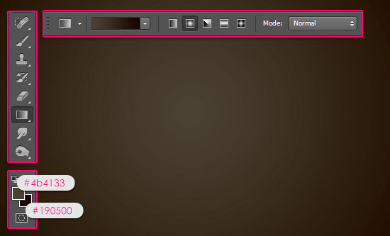
Create a new 1600 x 1200 px document. Set the Foreground color to #4b4133 and the Background color to #190500, pick the Gradient Tool, click the Radial Gradient icon in the Options bar, then click and drag from the center of the document to one of the corners.
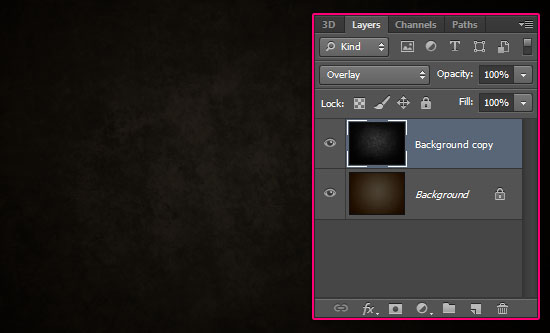
Place the Black Texture image on top of the Background then change its layer’s Blend Mode to Overlay.
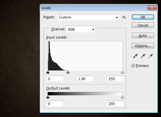
Go to Image > Adjustments > Levels, and change the Gamma value to 1.90 to brighten up the texture a little bit.
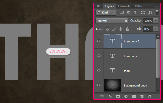
Create the text with the color #7c7c7c. The font used is Piximisa, and the Size is 300 pt. If you have more than one line of text, place each line in a separate layer as we are going to use a Gradient Stroke later on.
Duplicate each text layer two times, so that you have two copies besides the original layer. Then, change the third text layer copy’s Fill value to 0%.
Step 2
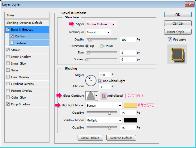
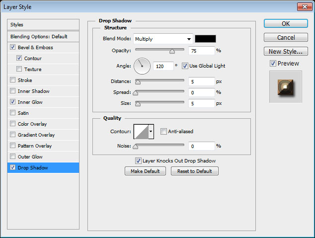
Double click the original text layer to apply the following Layer Style:
– Bevel and Emboss
- Style : Stroke Emboss
- Gloss Contour : Cone
- Check the Anti-aliased box
- Highlight Mode – Color :
#ffd570
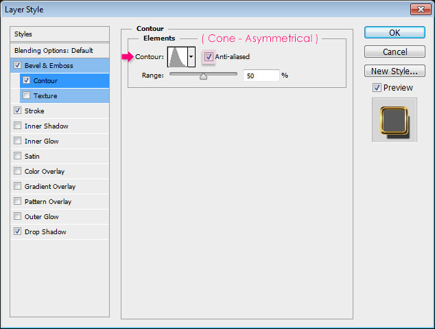
– Contour
- Contour : Cone – Asymmetrical
- Check the Anti-aliased box.
– Stroke
- Size : 5
- Fill Type : Gradient
- Choose the Gold Label 55z gradient from the Goldmedal.grd file in the gradients pack folder.

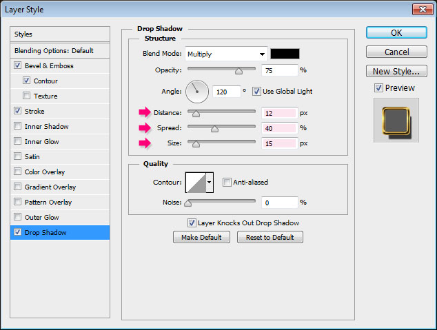
– Drop Shadow
- Distance : 12
- Spread : 40
- Size : 15
This will create a shiny stroke for the text. The cool thing about the Stroke Emboss is that it’s an easier option for creating a simple stroke without the need for creating and stroking work paths then styling them.

Step 3
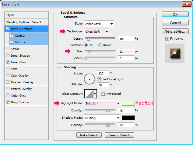
Double click the first copy of the text layer to apply the following Layer Style:
– Bevel and Emboss
- Technique : Chisel Soft
- Size : 21
- Highlight Mode : Soft Light
- Color :
#eaffd4
– Contour
- Check the Anti-aliased box.
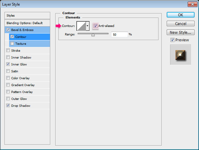
– Inner Glow
- Blend Mode : Vivid Light
- Choose the Gradient fill type using the gradient CSP Agate Gradient XV from the CSP Agate Gradients.grd file in the gradients pack folder.
- Size : 45
- Check the Anti-aliased box

– Drop Shadow
Use the default values.
This will add the main texture to the text without using any filters; just a simple glow trick using the gradient. You can try applying some other gradients to see how they look if you like as well.

Step 4
Double click the second copy of the text layer to apply the following Layer Style:
– Bevel and Emboss
- Depth : 250
- Uncheck the Use Global Light box
- Angle : 11
- Altitude : 37
- Gloss Contour : Cone – Asymmetrical
- Highlight Mode : Vivid Light
- Shadow Mode Opacity : 50%
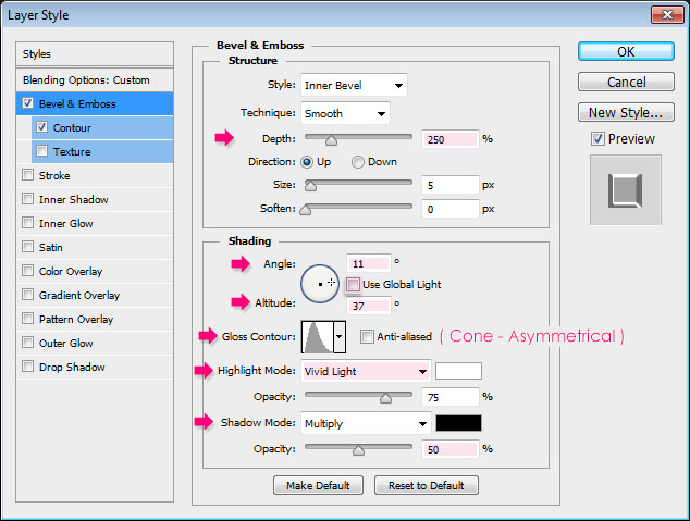
– Contour
- Check the Anti-aliased box.
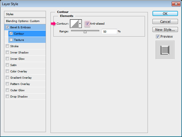
This will add a glossy effect to the text.

Step 5
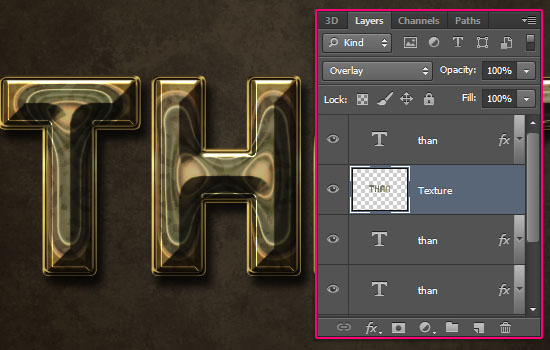
Create a new layer below the second text layer copy and call it Texture. Then set the Foreground color to #213926, and the Background color to #cbb99d.
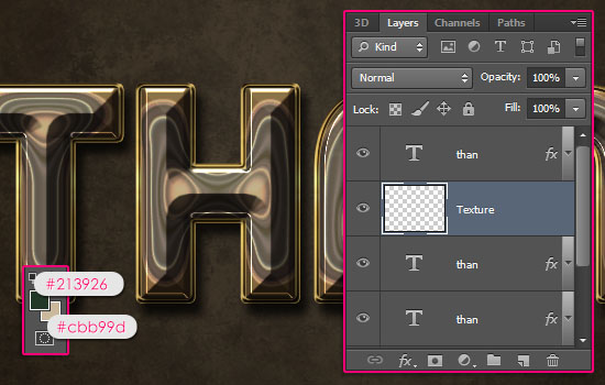
Ctrl/Cmd + click a text layer’s thumbnail to create a selection.
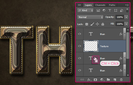
Go to Filter > Render > Clouds, then go to Select > Deselect to get rid of the selection.

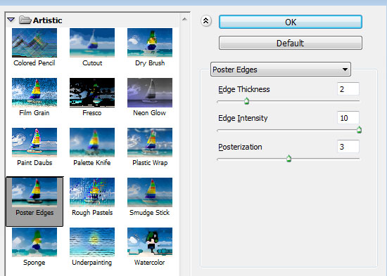
Go to Filter > (Filter Gallery) > Artistic > Poster Edges, and change the values as below:

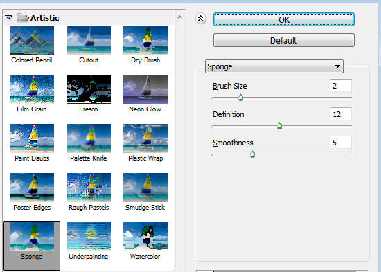
Go to Filter > (Filter Gallery) > Artistic > Sponge, and change the values as below:

Change the Texture layer’s Blend Mode to Overlay. This will add a subtle texture and a nice color to the text.
Step 6
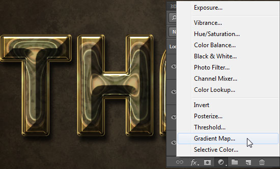
Click the Create new fill or adjustment layer icon down the Layers panel and choose Gradient Map.
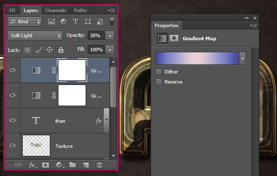
Make sure that the adjustment layer is on top of all layers then change its Blend Mode to Soft Light and its Opacity to 50%.

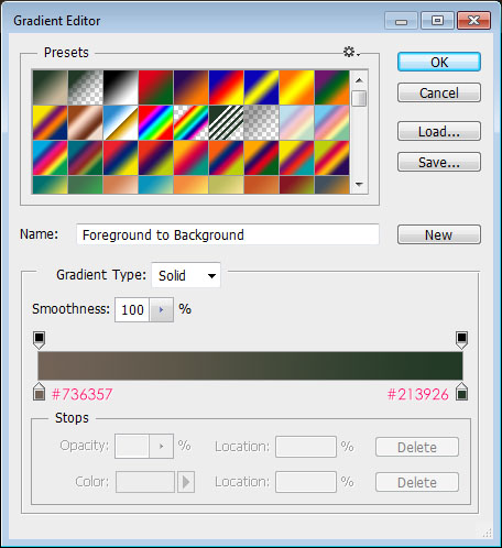
Create the Gradient using the colors #736357 to the left, and #213926 to the right.
Add another Gradient Map Adjustment Layer on top of all layers, and change its Blend Mode to Soft Light and its Opacity to 30%. The gradient used is called Childhood_CC and is found in the BoahmedAllinone.grd file in the gradients pack folder.
The adjustment layers add nice coloring to the final result. Hope you’ve enjoyed the tutorial and found it helpful.
Did you enjoy this post? Please consider donating to help us cover our server costs.


This tutorial is incredible. I will be eternally been grateful by your labor of education. Thank you.
This truly means a lot! I’m always grateful for the support as well.
Thank you for your kind words 🙂
it is very cool tut man you did great work and always keep up like this my best wish always with you it is my first comment of your work……… i learnt mostly text effects tut form your website. which i could not find in other site. against keep it up like good work………………..
That’s great to know. I’m really glad you enjoyed tutorials and found them useful.
Thank you very much for your kind words and for the support, I really appreciate it a lot. – (Just wanna point out that I’m a girl though ^_^) –
Regards.
In step 3, bevel and emboss effect, the anti aliased box is not checked in picture, but is typed to check. Can you correct it? I really liked this tutorial. Thanks so much!
Fixed now!
Thanks a lot for pointing that out and for the comment 🙂
Wish you could show me how to do this in Gimp because it’s a great effect. Gimp has layer effects now but their not quite the same as PS
and i don’t know how to convert GRD to GGR for the right gradients
Andy
I took a look at Gimp before, but never really used it, so I’m not quite sure I can help you with that. Really sorry!
As for the gradients, I think they can be converted somehow using a script… This article might help you know how.
You can always google your questions as well. Hopefully you’ll be able to create this in Gimp.
Thanks for the comment 🙂
Fantastic, the only tutorial with only one error ( I think, ) probably the anti alias thing. I have’nt found one yet with less than half a dozen errors. P.S.If I tried to make a tutorial the mistakes would run into the hundreds. Many thanks Brian
That’s kind of you to say!
Thank you for the comment.
greate tuturiol 🙂
you can also download free fonts from http://www.allfreefonts.net
regards
Alice
nice tutorial