
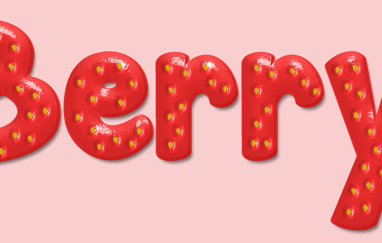
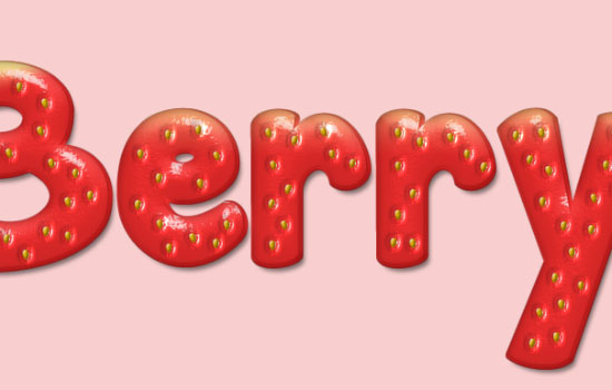
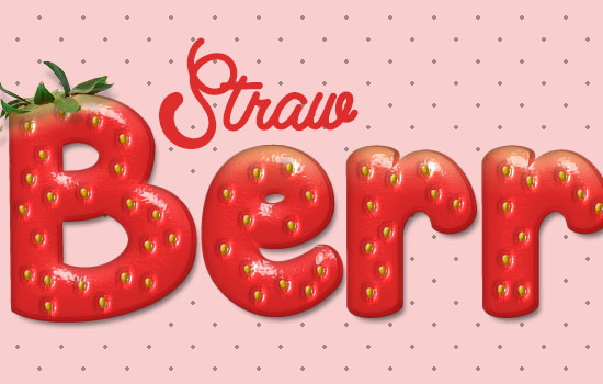
Strawberry-Inspired Text Effect
This tutorial will show you how to create a delicious strawberry-inspired text effect. Many layer style will be used to achieve the main shape and texture, a simple brush will be created for the seeds, and a stock image will be used to add the leaves.
This was suggested by Ivana (IvaxXx on DeviantArt). Thank you for the awesome suggestion, Ivana : )
The Final Result

Tutorial Details
- Software Used : Photoshop
- Version : CS6 Extended
- Time : 0:45 – 1:10
Resources
- Janda Manatee font.
- Soft Wallpaper pattern by Atle Mo.
- Subtle freckles pattern by Atle Mo.
- fruits sen pngs by mossi889.
- Dots and Screentones Print by screentones.
- Clear Line font.
Step 1
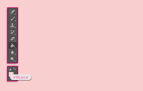
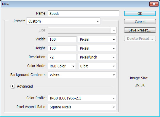
Create a new 1024 x 768 px document. Set the Foreground color to #f8cece, then use the Paint Bucket Tool to fill the canvas with that color.
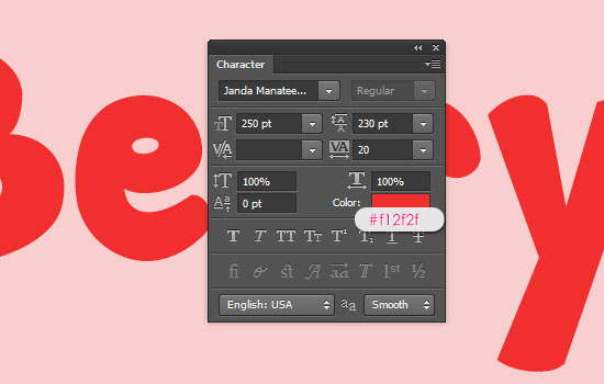
Create the text using the font Janda Manatee. Set the font color to #f12f2f, the font Size to 250 pt, and the Tracking value to 20 to increase the spacing between the letters.
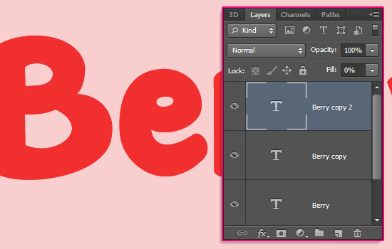
Duplicate the text layer twice so that you have 2 more copies. Change the second copy layer’s Fill value to 0%.
Step 2
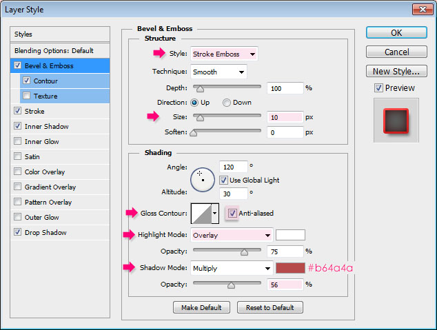
Double click the original text layer to apply the following Layer Style:
– Bevel and Emboss
- Style : Stroke Emboss
- Size : 10
- Check the Anti-aliased box
- Highlight Mode : Overlay
- Shadow Mode :
- Color :
#b64a4a - Opacity : 56%
You’ll see the difference when you apply the Stroke effect in a minute.
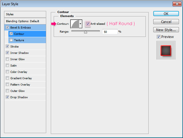
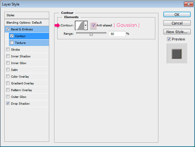
– Contour
- Contour : Half Round
- Check the Anti-aliased box.
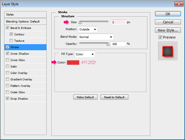
– Stroke
- Size : 3
- Color :
#f12f2f
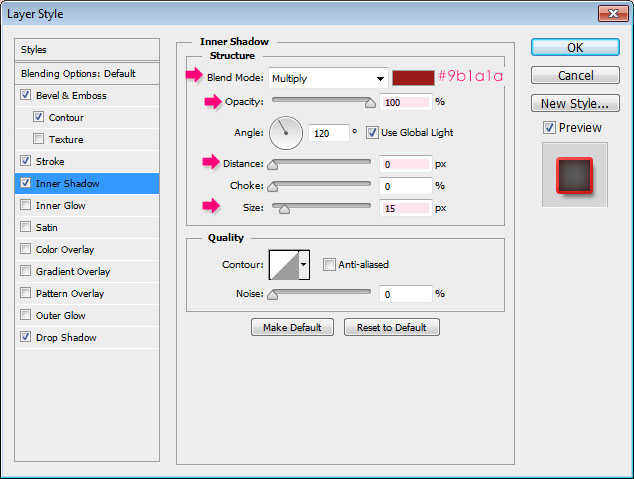
– Inner Shadow
- Color :
#9b1a1a - Opacity : 100%
- Distance : 0
- Size : 15
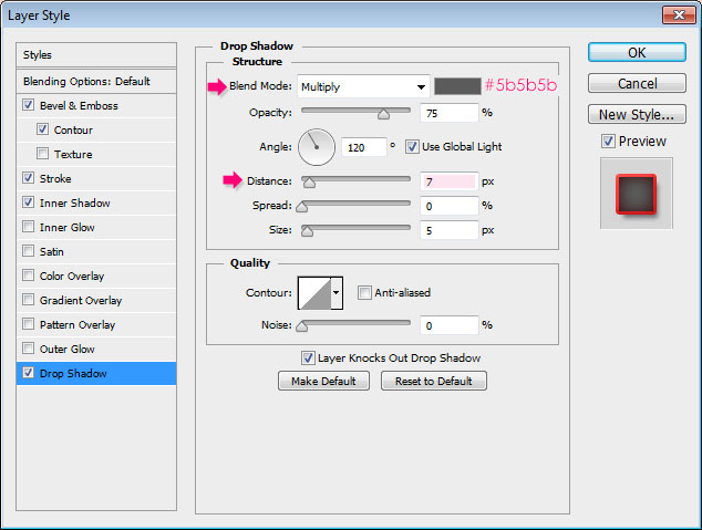
– Drop Shadow
- Color :
#5b5b5b - Distance : 7
This will add an outer stroke that we’re going to use to add dimension, and some subtle shadow.

Pick the Move Tool, then press the Right Arrow key twice, and the Down Arrow key twice, to move the stroke 2 pixels to the right and two pixels down.

Step 3
Double click the first copy text layer to apply the following Layer Style:
– Bevel and Emboss
- Size : 21
- Uncheck the Use Global Light box
- Angle : 68
- Altitude : 64
- Gloss Contour : Log
- Check the Anti-aliased box
- Highlight Mode – Opacity : 50%
- Shadow Mode :
- Color :
#742b2b - Opacity : 25%
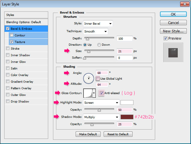
– Texture
- Pattern : Soft Wallpaper
- Depth : 50%
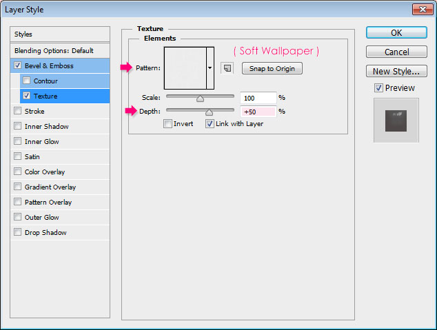
This will create the first layer of the strawberry texturing.

Step 4
Double click the second copy text layer to apply the following Layer Style:
– Bevel and Emboss
- Size : 18
- Uncheck the Use Global Light box
- Angle : 77
- Altitude : 42
- Check the Anti-aliased box
- Highlight Mode : Overlay
- Opacity : 70%
- Shadow Mode – Opacity : 0%
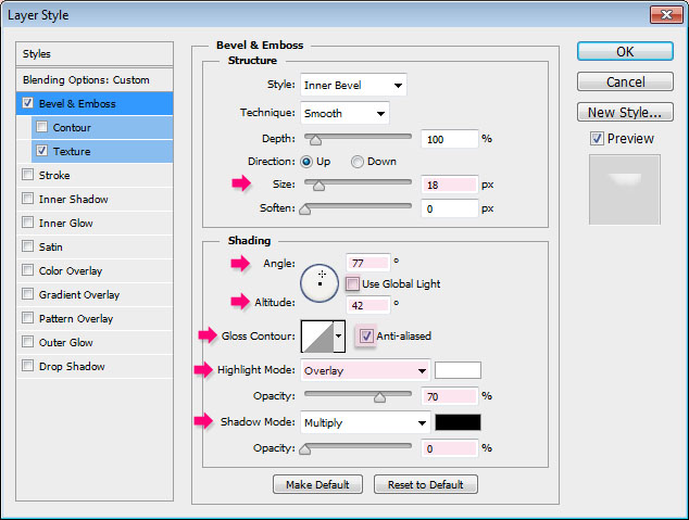
– Texture
- Pattern : Soft Wallpaper
- Depth : 20%
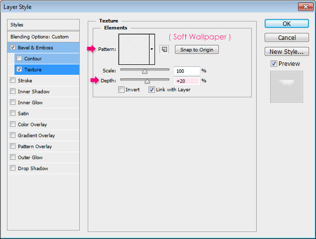
This will create the second layer of the strawberry texturing.

Step 5
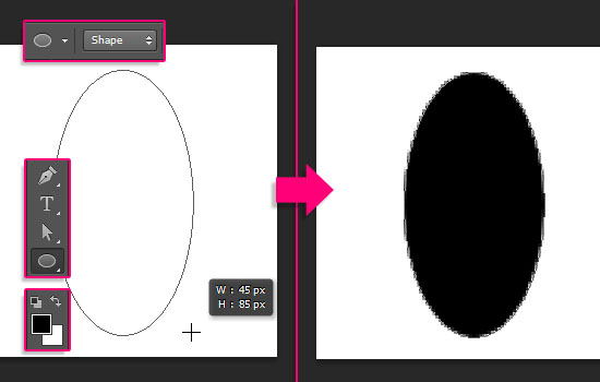
Create a new 100 x 100 px document.
Pick the Ellipse Tool, and choose Shape in the Options bar. Set the Foreground color to Black, then click and drag to create a 45 x 85 px ellipse.
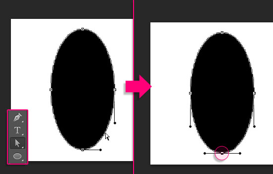
Pick the Direct Selection Tool, then click the ellipse path to view the anchor points. Then, click the point at the bottom.
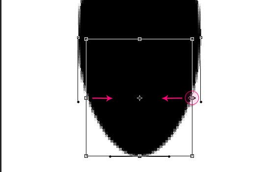
Go to Edit > Free Transform Points. Then, press and hold the Alt/Option and Shift keys, and click and drag the right side of the transform box towards the center.
Because of the Alt/Option key, both sides will be transformed together.
Once you like how that part looks, hit the Enter/Return key to accept the changes and get out of the Free Transform Mode.
With the Direct Selection Tool still active, click and drag to select the two points on the ellipse’s sides. Go to Edit > Free Transform Points, press and hold the Alt/Option + Shift keys, then click and drag outwards to widen that part. Hit Enter/Return, then press the Up Arrow key to move those points a little bit upwards.
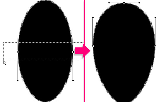
Continue modifying the seed shape until you like it.
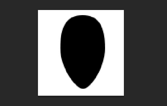
When done, go to Edit > Define Brush Preset, and type in a name for the brush.
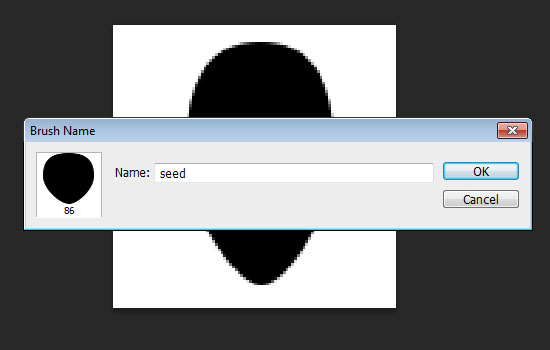
You can save the file if you like, then close it and go back to the original document.
Step 6
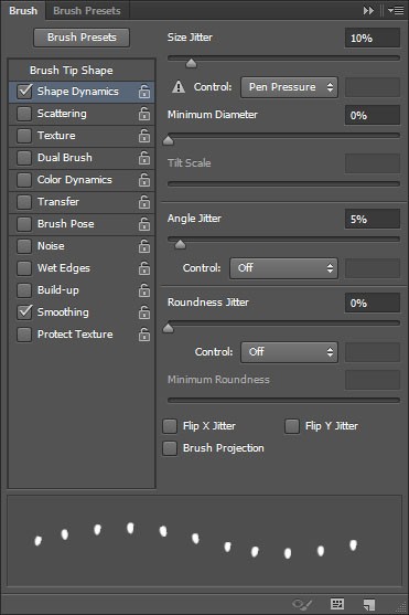
Open the Brush panel (Window > Brush), then choose the seed brush and modify its Settings as shown below:
Brush Tip Shape
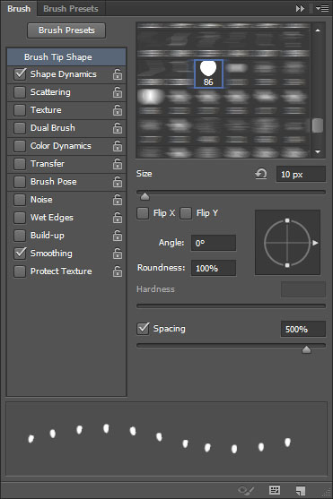
Shape Dynamics
Create a new layer on top of all layers, call it Seeds, set the Foreground color to #d9a907, then start adding the seeds inside the text.
Here’s an interesting fact: The seeds are the actual fruit, not the red part, and they are called “achenes”!
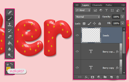
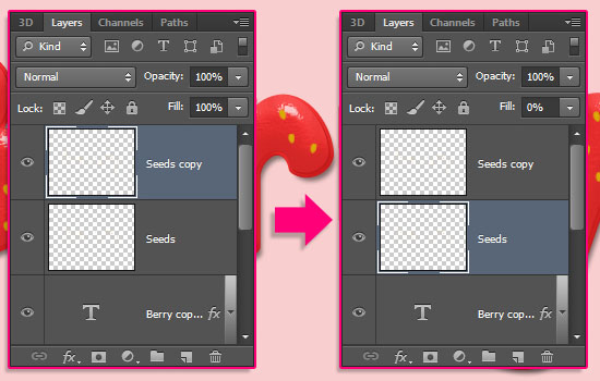
Make sure the seeds are spread evenly, and that they are not very close to each other. Once you’re done, duplicate the Seeds layer, and change its Fill value to 0%.
Step 7
Double click the Seeds layer to apply the following Layer Style:
– Bevel and Emboss
- Style : Pillow Emboss
- Uncheck the Use Global Light box
- Angle : 162
- Altitude : 58
- Check the Anti-aliased box
- Highlight Mode : Vivid Light
- Opacity : 90%
- Shadow Mode – Opacity : 50%
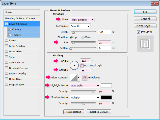
– Contour
- Contour : Rounded Steps
- Check the Anti-aliased box.
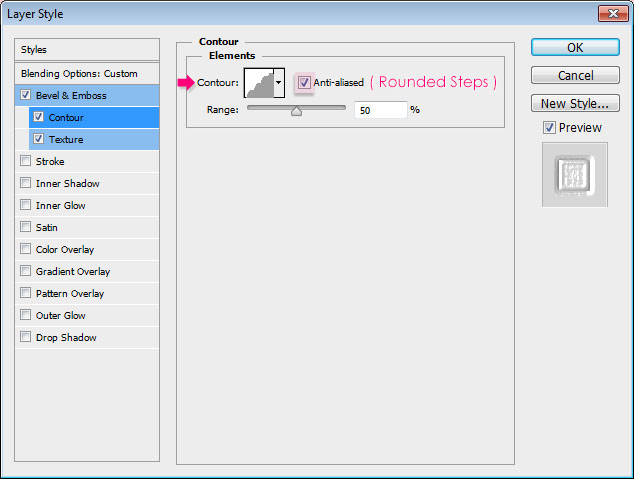
– Texture
- Pattern : Subtle Freckles
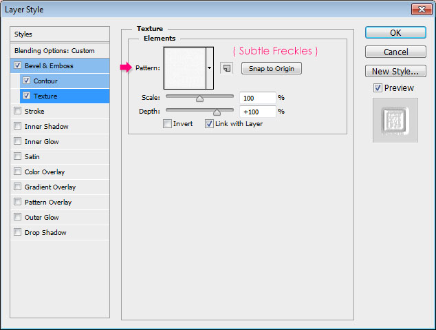
This will create the area that surrounds the seeds (the cortex).
Step 8
Double click the copy Seeds layer to apply the following Layer Style:
– Bevel and Emboss
- Size : 2
- Uncheck the Use Global Light box
- Angle : 130
- Altitude : 48
- Shadow Mode – Color :
#68671c
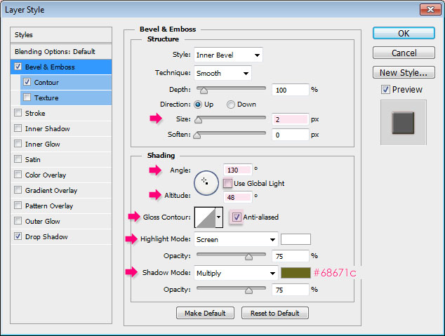
– Contour
- Contour : Gaussian
- Check the Anti-aliased box.
– Drop Shadow
- Color :
#771e1e - Distance : 0
- Spread : 3
- Size : 3
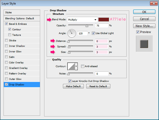
This will style the seeds.

Step 9
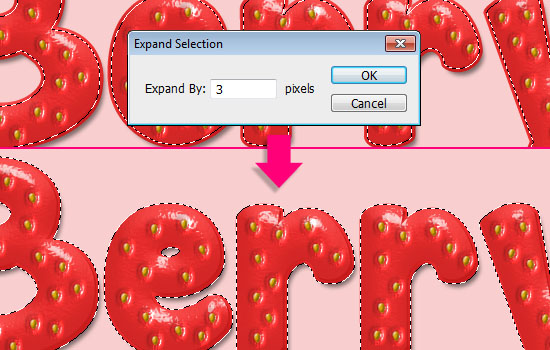
Ctrl/Cmd + click the original text layer thumbnail to create a selection.
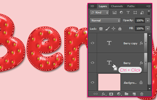
Go to Select > Modify > Expand, and type in the value 3. It is the same Stroke value applied to the original text layer. So we’re basically creating a selection based on that stroke.
Create a new layer on top of all layers and call it Inner Shadow.
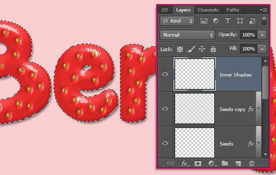
Fill the selection with White.
Change the Inner Shadow layer’s Fill value to 0, then double click it to add an Inner Shadow effect.
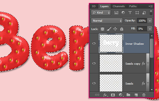
Change the Opacity to 50%, the Distance to 0, and the Size to 10.
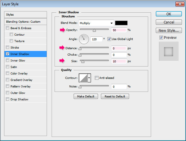
This will add an inner shadow to the text, which helps add depth and define the edges a bit more.

Step 10
This step is optional, as we’re going to create some unripe parts at the top.
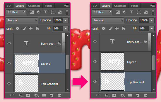
Create a new layer between the two text layer copies and call it Top Gradient, then fill it with White.
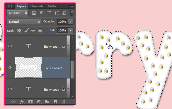
Since a Gradient Overlay effect will be used to create the unripe parts, different Settings will be used for the upper case and lower case letters. So it’s better to separate the letters first.
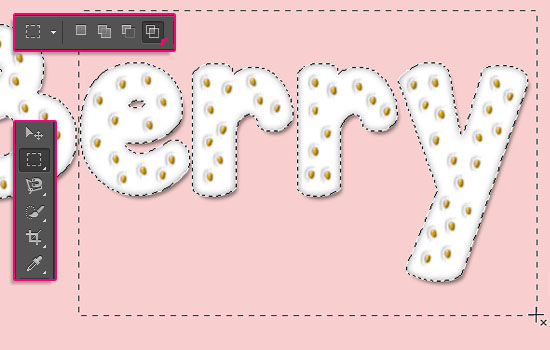
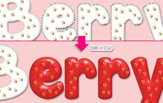
Pick the Rectangular Marquee Tool, and click the Intersect with selection icon in the Options bar. Click and drag to create a rectangle around the lower case letters.
The upper case letter will be deselected. Go to Edit > Cut to remove the lower case letters.
Go to Edit > Paste Special > Paste in Place, to paste the lower case letters in their original position, but in a different layer, called Layer 1.
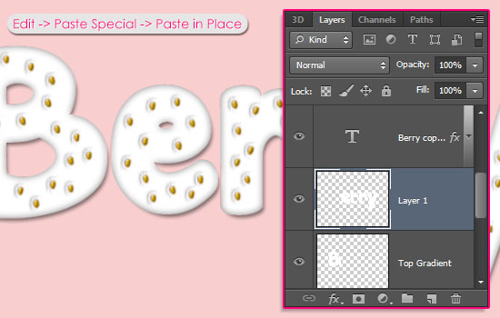
Change both layers’ Fill values to 0.
Step 11
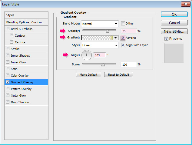
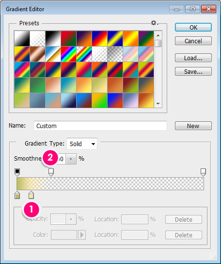
Double click the Top Gradient layer to apply a Gradient Overlay effect:
- Opacity : 75%
- Angle : 103
- Check the Reverse box
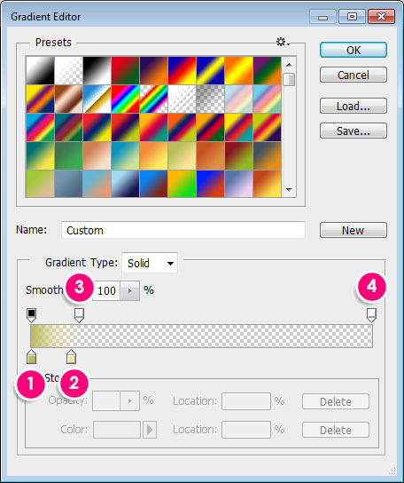
- Click the Gradient box to create the gradient
You can add and Opacity Stop by clicking over the gradient bar, and a Color Stop by clicking below it.
Start by choosing the Foreground to Transparent gradient preset, then modify it and add more stops as below:
– Color Stops
- # – Color – Location
- 1 –
#bcbc5c– 0 - 2 –
#fbe599– 12
– Opacity Stops
- # – Opacity – Location
- 3 – 0 – 14
- 4 – 0 – 100
This will apply the gradient to the upper case letter. Notice that the Angle value is the one responsible for slightly tilting the gradient to the left. This is where we’re planning to add the leaf later. So you might want to try different values if you have different letters or want to place the leaf somewhere else.

Now right click the Top Gradient layer, choose Copy Layer Style, then right click Layer 1, and choose Paste Layer Style.
Double click Layer 1 then change the Opacity to 35% and the Angle to 90. Click the Gradient box to modify some values.
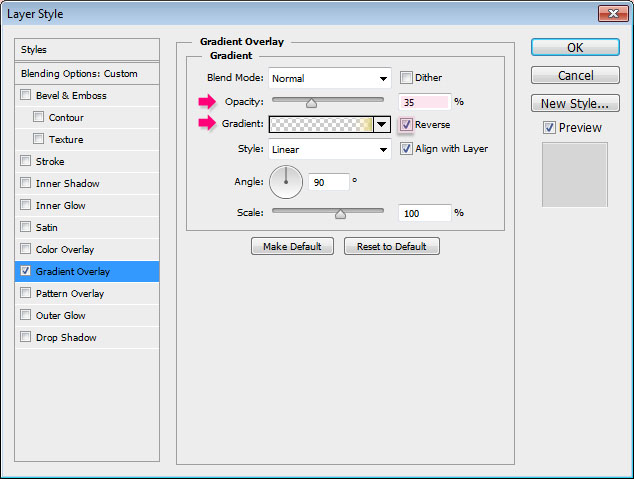
Change the Location of #1 to 8, and #2 to 18.
This will apply a lighter gradient to the lower case letters.
Step 12
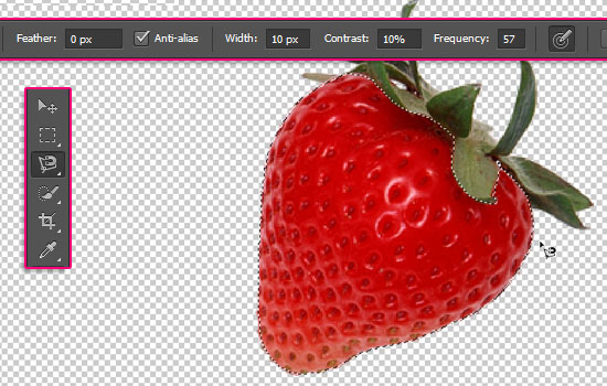
Open the fruits sen pngs image, then use the Rectangular Marquee Tool to select the first strawberry from right (or any other one you prefer).
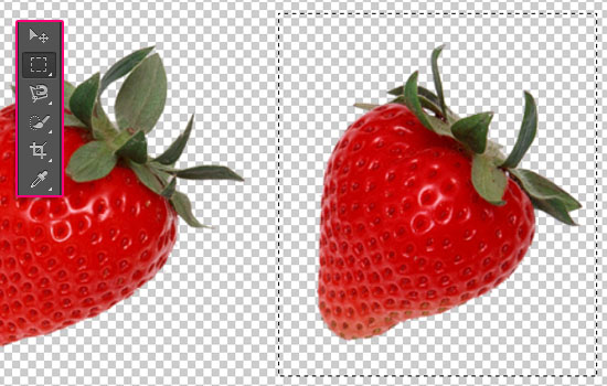
Press Ctrl/Cmd + J to duplicate the selected strawberry in a separate layer. You can make the original image invisible by clicking the eye icon next to its layer.
Pick the Magnetic Lasso Tool, then select the Strawberry (as it’s much easier than selecting the leaf part).
Just click once on the edge, then drag, and the points will be added automatically. If needed, you can click to add points manually. Finish at the start point to create the selection.
Go to Edit > Copy, then back to the original document.
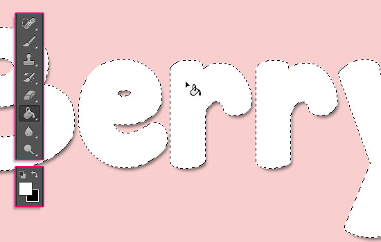
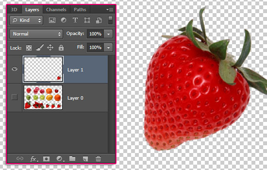
Go to Edit > Paste. You might see that there are still some parts of the strawberry, just use the Eraser Tool to remove them.
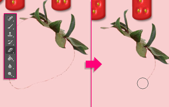
Go to Edit > Free Transform, then resize, rotate, and place the leaf on the first letter. Hit Enter/Return to accept and get out of the Free Transform Mode.
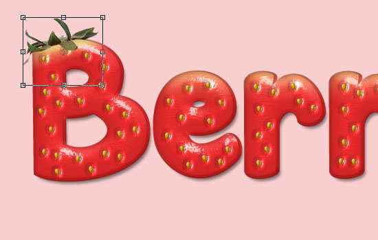
Double click the leaf layer and apply a Drop Shadow effect:
- Opacity : 23%
- Uncheck the Use Global Light box
- Angle : 106
- Distance : 10
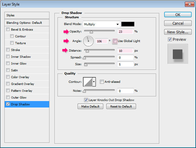
This will add some shadow to the leaf.

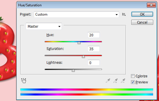
Go to Image > Adjustments > Hue/Saturation, change the Hue to 20, and the Saturation to 35.
Step 13
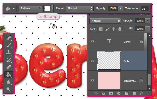
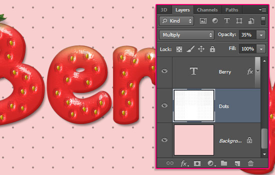
Create a new layer right on top of the Background layer, call it Dots, pick the Paint Bucket Tool, choose Pattern in the Options bar, then fill the background with one of the Dots and Screentones Print patterns. The one used here is 3-40.bmp.
Change the Dots layer’s Blend Mode to Multiply, and its Opacity to 35%.
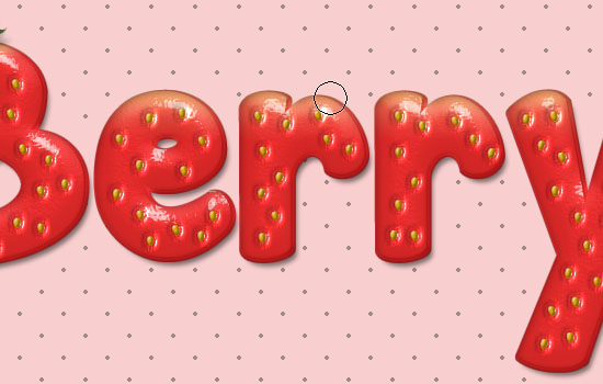
If you like, you can use the Eraser Tool to remove the dots that touch the text’s edges. Don’t delete so many to avoid creating so many empty areas.
Step 14
Finally, you can add the Straw word on top using a different font, like Clear Line.
The color is #de2d2d and the Size is 100 pt.
Double click the Straw text layer and apply a simple Drop Shadow by changing the color to #f8cece.
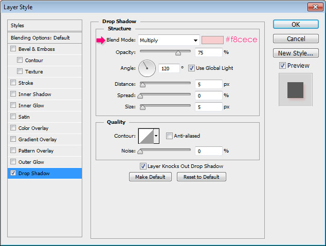
The pink shadow adds a nice touch instead of a dark one, since the font Size is small compared to the main Berry text.
You can erase the dots around the word Straw as well.
And that’s it! Hope you enjoyed the tutorial, and found the tips and tricks helpful.
Feel free to leave a comment telling us what your favorite fruit is, we’d like to create some more fruity text effects inspired by your answers.
Thanks once again to Ivana 🙂
Did you enjoy this post? Please consider donating to help us cover our server costs.


Awesome! nice tutorial and nice suggestion from IvaxXx 🙂
Best regards!
AleexDee
Very glad you like it 🙂
Thanks for the comment.
I love this. So cute.
Thank you so much.
Thank you very much for the kind words, they always mean a lot 🙂
points that are used in this picture?
I think you mean the dots pattern? I just found a similar pack that has a .pat file, so I replaced the one in the resources section and updated Step 13 with the used pattern’s name, which is “3-40.bmp”.
Hope this answers your question.
I think I have found it! Thank you!
No problem 🙂
really enjoyed this, great effect, thanks 🙂
Glad you did.
Thank you very much for the comment 🙂
Very so cute.
I like it.
Glad you do 🙂
Thanks a lot.
This was so easy to follow and I loved the results. Thank you!!
Great to know that!
Thanks a lot for the nice words.
can You make my website logo please I’m your fan and i daily visit your site but i have photoshop cs6 but i don’t have time like this please if you can.
make logo with this name ( Urdu9 )
please if you can
You can go ahead and use any effect you like.
There are some easy but really nice effects that can be done pretty fast, like the three headers one and the simple wallpaper one, and a lot more under the Simple category.
Hope this helps.
Thank you very much for all the support.
It was his great, mine was too pretty, I’m learning even more with your tutorials … CONGRATULATIONS! Keep it up! ??
That’s amazing to know!
You can share your result with us by linking to it in a comment if you like 🙂
Thank you very much for the kind words.
Regards.
Great Tutorial really enjoyed it!
Glad you did.
Thanks a lot for the comment.
I love this effect! Thanks for posting.. Maybe you can do something like a Kiwi effect 🙂
Kiwi is a nice idea, will make sure to work on that some time soon 😉
Thank you very much for the comment 🙂
Wow, gorgeous! Your tutorials are very clean and clear. The results are stunning. You must be a great teacher.
That truly means the world to me!
Very happy to know you enjoy the tutorials and find them helpful.
Thank you very much for the kind words.
Wow… that’s so amazing… Like it
& Love to make it…
You make it so easy…
That’s great to know!
Glad you liked it and found it easy to follow.
Thanks a lot for the comment.
Most Welcome…
& this site become my One of Favorite website….
That really means a lot!
Many thanks for all the support 🙂
My Pleasure Sir… 😀
How generous you are to post such a great tot.
Thank you so much
You’re very welcome 🙂
Many thanks for your kind words.
Thqnks for this tuto ^^.
My réalisation : http://i.imgur.com/KzzEcBe.png
Nice! That’s a darker version of the effect, but still looks great.
Thanks a lot for the comment and for sharing your work.
Hi Rose,
Here is a screenshot of my document. My seeds aren’t showing like they should be. I’ve read the tutorial through and attempted it twice, but my results are always the same. Thank you for your advice.
Hey Ginger 🙂
Is the “Inner Shadow” layer’s Fill value set to 0%?
What happens when you actually use the Brush Tool and click to add the seeds?
Did you make sure to use the mentioned Fill and color values for the seeds?
Also, please go to Image > Image Size, and make sure that the Resolution values is set to 72. If not, then you might need to create a new document, set the Resolution value to 72, and recreate the effect.
Hope this helps. Please feel free to leave a reply with any updates or other questions you have.
Thanks for the comment 😉
My resolution was set to 300 in the beginning and my flow was set too low when trying to make the seeds. After adjusting those two things I was able to get a good result. Thank you! 🙂
Glad the problem was solved 😀
Thanks for the comment.
I could not find soft wallpaper pattern and subtle freckles 🙁 Please help..
Are the links not working? Because they’re working fine for me.
But if you mean a .pat file, then that’s not available. You’ll need to un-zip the downloaded file, open the .png image in Photoshop, then go to Edit > Define Pattern.
Hope that helps. If the problem isn’t solved though, please feel free to add more details or screenshotsof the issue.
Gracias por el tutorial me he vuelto gran fan de tu pagina.
http://ginamonkr.wix.com/ginamonkr#!Helado-de-fresa/zoom/ckra/imageurt
Absolutely beautiful design :D!
Very glad you like the tutorials.
Muchas gracias for the lovely comment 🙂
Hello! very cute tutorial. I loveee Strawberries 🙂
I don’t understand this part though.
“Pick the Move Tool, then press the Right Arrow key twice, and the Down Arrow key twice, to move the stroke 2 pixels to the right and two pixels down”
Whenever I use the move tool, it just moves the whole text, I don’t know how to isolate/select just the stroke to move.
Thank you! 🙂
The stroke is applied to the text layer, so it’s ok for the text to move 🙂 Do you end up with a result similar to the one in the tutorial? If so, then you’re doing it right 😉
If you’re not getting a similar result though, please feel free to upload a screenshot of the issue.
Thanks a lot for the comment 🙂
I don’t have the Gloss Contour Log, and I find it very hard to make the exact one @_@ And during the process of Step 3 I didn’t get the exact output shown, I also made a Soft Wallpaper Pattern but I guess I made it wrong. T_T
As for the Contours, please check out this link to see how to load them.
For the wallpaper pattern, can you please explain what went wrong?
whenever i press ctrl and click it doesn’t work, i use ps cc and it worked with other tuts from here, please help.
What step does that not work for? You might be still in a transform mode that you need to hit the Enter/Return key to get out of. Can you upload a screenshot of the layer that you can’t select its thumbnail please?
In the step to add the unripened colour, when i try to click+ctrl it won’t work, please help me to fix this 🙂
What happens when you try to do so? Do you get any error messages?
THANKS~ LOVE IT
fruits sen pngs by mossi889. it’s not working ..