
Three Simple Elegant Headers Text Effects
This tutorial will explain three different ways to create very simple yet elegant header-style text effects, using only two Layer Layer Style each time.
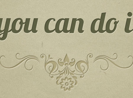
The Final Result

Tutorial Details
- Software Used : Photoshop
- Version : CS5 Extended
- Time : 5 min. each
Resources
- old paper texture by klimek.
- Brush Pack-Horizontal Dividers by MouritsaDA-Stock.
Effect 1: Drop Shadow and Gradient Overlay
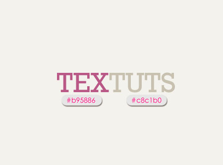
The example used is the current TEXTUTS header. The Background color is #f4f2ed, and the text color is #b95886 but you can use any colors you want.
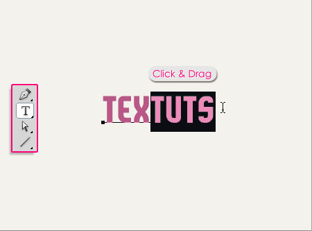
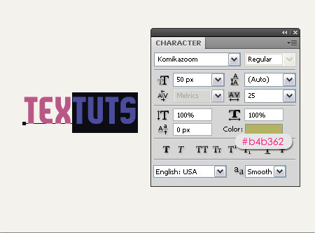
If you want to add more than one color to the text, you can use the Type Tool to select the characters you want to add a different color to, then click the color box in the Character panel (Window > Character) to choose the color.
Here, the color used is #b4b362.
To achieve the result in the header, I duplicated the text layer first then changed the colors, so that I had two layers, one with the first color and one with the second color, then, I rasterized both layers, and deleted the second half of the layer on the top.

Double click the text layer to apply the following Layer Style.
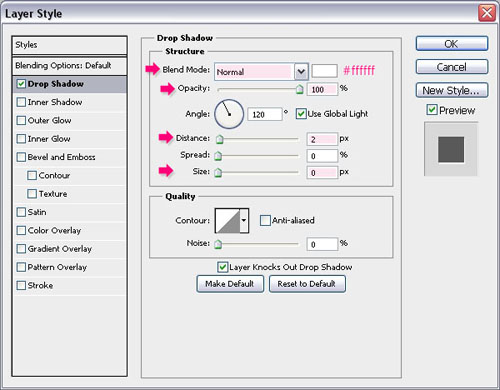
– Drop Shadow
- Blend Mode : Normal
- Color : Should be a bit lighter than the Background color. In this case, it is
White(because the Background is very light). - Opacity : 100%
- Distance : 2
- Size : 0
The shadow should look more like a “Stroke” rather than an actual shadow, so it shouldn’t be so far from the text, and it shouldn’t be blurry as well.
This should create a subtle elegant effect, giving the text some depth.

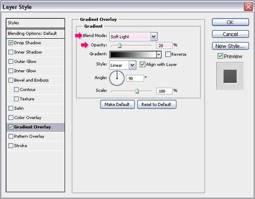
You can also go ahead and add a Gradient Overlay:
– Gradient Overlay
- Blend Mode : Soft Light
- Opacity : 20%
And that’s pretty much it, super easy yet a really cool effect.

Effect 2: Drop Shadow and Stroke
The example used is the previous TEXTUTS header (which I’ve got a couple of requests to do a tutorial for 🙂 ). The Background color is #f4f2ed as well, and the text colors are #b95886 and #c8c1b0.
Double click the text layer to apply the following Layer Style:
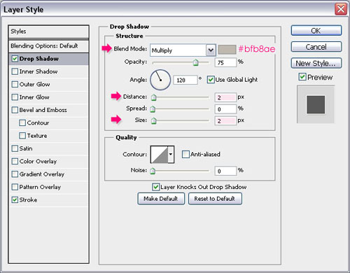
– Drop Shadow
- Color : Should be a couple of shades darker than the Background color, in this cas it is
#bfb8ae. - Distance : 2
- Size : 2
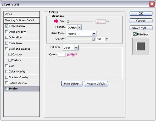
– Stroke
- Size : 1
- Color : Should be a couple of shades lighter than the Background color, in this case it is
#ffffff
This effect adds a subtle 3D look to the text.

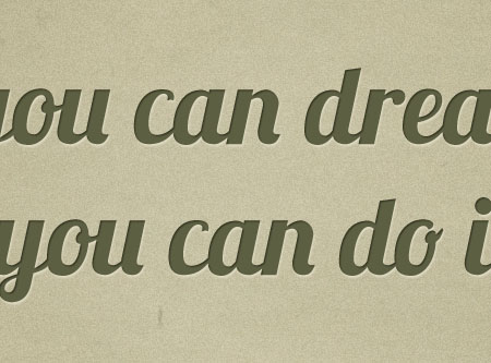
Effect 3: Drop Shadow and Inner Shadow
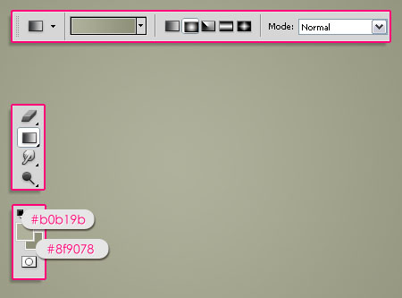
For the last effect, we are going to create a very simple vintage looking poster. So set the Foreground color to #b0b19b and the Background color to #8f9078, then create a Radial Gradient from the center of the document to one of the corners.
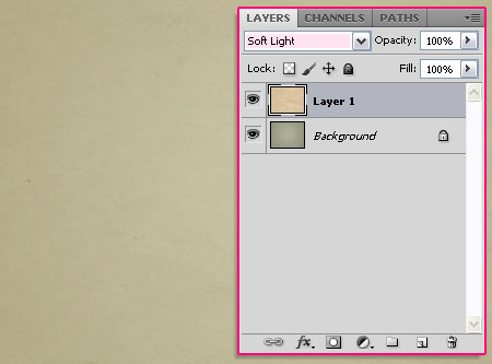
Place the old paper texture image on top of the Background, resize it if needed, and change its Blend Mode to Soft Light.
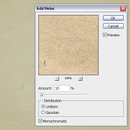
Go to Filter > Noise > Add Noise, and set the values as shown below:
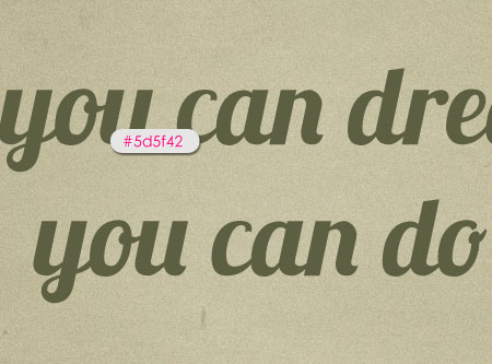
Create the text using the color #5d5f42. The font used is Lobster and the Size is 100 px.
Double click the text layer to apply the following Layer Style:
– Drop Shadow
- Blend Mode : Normal
- Color : Should be a bit lighter than the Background color. In this case, it is
#ddd8c2 - Opacity : 100%
- Distance : 2
- Size : 1
(Note that bigger font sizes might need bigger Layer Layer Style’s values.)

– Inner Shadow
- Color :
#50513b(a darker shade of the text color) - Distance : 1
- Size : 1
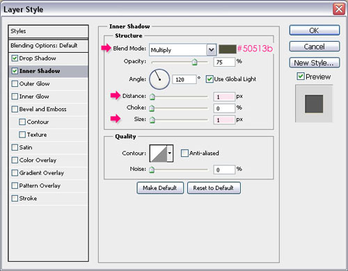
This adds a very nice depth to the text, making it look like it’s engraved into the Background.
Add a new layer on top of the text layer, and change its Blend Mode to Multiply. Set the Foreground color to #b1a77e, and use the Brush Pack-Horizontal Dividers to add some nice decorations.
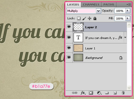
Again, double click the layer to apply the following Layer Style:
– Drop Shadow
- Blend Mode : Normal
- Color :
#ddd8c2 - Opacity : 100%
- Distance : 2
- Size : 1
(This is basically the same Drop Shadow applied to the text layer.)

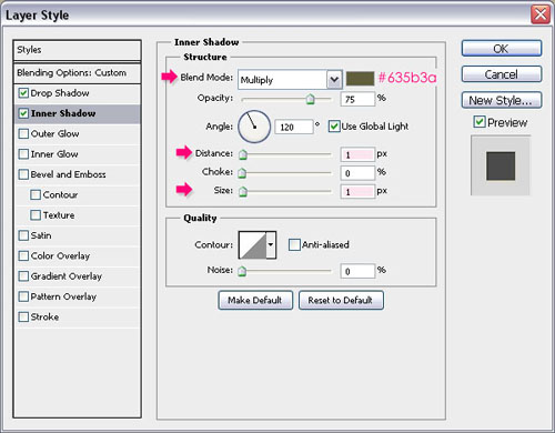
– Inner Shadow
- Color :
#635b3a(a darker shade of the brush color) - Distance : 1
- Size : 1
And that’s it! Look how awesome the effect is!
Hope you found the tutorial useful. If you have any more requests please send them through the contact form.
Did you enjoy this post? Please consider donating to help us cover our server costs.


Nice Tutorial…
Thank you.
Thanks for useful technic. Simple text have more dimension
You’re welcome.
Thanks for the comment.
Love the simplicity of your tutorial, thank you!
Glad you do!
Thanks for the comment.
Thanks, very useful…
You’re welcome 🙂
thanks for you simple tutorial
You’re welcome 🙂
Thanks for the comment.
Great tutorial! loved it
Glad you did!
Thanks for the comment 🙂
kul tutorial thanks for the new technik to me.thanks a lot.
simple but amazing
Glad you found it useful.
Thanks a lot for the comment 🙂
Nice Tutorial…
Thanks 🙂
Dear textuts Nice Tutorial… but will you please tell me that which font you are using in Effect 1 ?
Sure, it is Komikazoom, and you can download it for free here.
Thanks for the comment 🙂
thanx a lot sir ,,,
You’re welcome 🙂
I’m a girl though ^_^
Thanks for useful technic.
You’re welcome.
Thank you for the comment.
dont have any word to Descrip u just king 🙂
Thank you so much! 😀
what the name font,in “if u can dream it,u can do it” ? or u can send me in email? 🙂
It is Lobster. You can download it here.
thankie.. so much.. 🙂
You’re welcome 🙂
What The Font Used In Effect 2: Drop Shadow and Stroke
It’s called Rockwell.
Hi ! Thank you for all of your perfect tuts ! 😀
Hey! Thank you very much for the nice comment 🙂
Thank you for such a great and easy way to make really cool looking text.
Happy you liked it.
Thanks a lot for the comment.
I’m very new to photoshop and I don’t know how to use the brush pack, can someone tell me how?
After you download it from the link, you need to load it into your Brush panel. You can google “Installing Photoshop Brushes” and you’ll get tons of results on how to do that. (Here’s one from wikiHow).
Hope this helps.
Simple and powerful. I really appreciate this — thanks so much 🙂
Glad you liked the effect 🙂
Thanks a bunch for the comment.
Hey, I have a question. I am attempting to imitate the Golden Ticket (Willy Wonka) with this effect. The text needs to be black though. Is it impossible to make it look “engraved” if there is no “darker shade of text”? Thank you!
It’s not impossible, but it might be a bit tricky. Sometimes it depends on the background used as well.
So if you used the Drop Shadow effect alone and you didn’t get the desired effect, you can go ahead and play around with small Bevel and Emboss values, and even try the Pillow Emboss in the Style drop down menu. You might as well change the Angle and Altitude values.
A couple of things to try actually, and you should be able to get a very similar result.
Hope this was helpful. Please feel free to add any other queries you have.
Regards.
Brilliant, thanks!
You’re welcome.
Thanks for the comment.
wow!!!good!!!*0*
Thanks a lot 🙂
Great font – lobster.
Mine looks as though it is bleeding i.e. blurred round the edges.
I am saving it as a png file.
Any ideas how I can get it looking smooth round the edges?
Thanks
One of my favorites indeed!
The problem might be an anti-aliasing issue. You can change the Anti-aliasing method in the Character panel (Window -> Character). Try using Smooth instead of Sharp or None.
Hope this helps.
If the problem still exists, please feel free to add a reply with the screenshot.
I love it!
Thank you!
Wow! Marvelous… I’ really, really like your tuts!!
You always makes a beautiful text effects…for us
Thanks!
That’s very nice of you to say, it truly means a lot 🙂
Super glad you’re enjoying the tutorials.
Thank you very much for the kind words.
wow!! i like this!
Glad you do 🙂
Thanks a lot.
Very nice!
Thanks a lot 🙂
font user ?
The fonts used are Komikazoom, Rockwell, and Lobster.
Hope this helps 🙂