
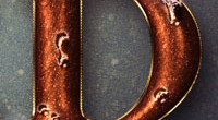
Turquoise Metallic Text Effect
This tutorial explains how to use different layer Layer Style to create a bright turquoise metallic text effect, then add a simple stroke and some pins all around it.
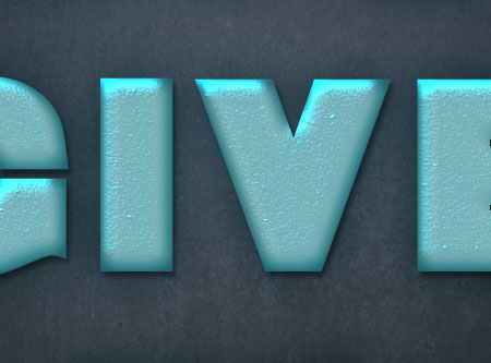
The Final Result

Tutorial Details
- Software Used : Photoshop
- Version : CS5 Extended
- Time : 0:45 – 1:25
Resources
- Baltar font.
- Texture 230 by Sirius-sdz.
- Texturetastic Gray pattern by Adam Pickering.
Step 1
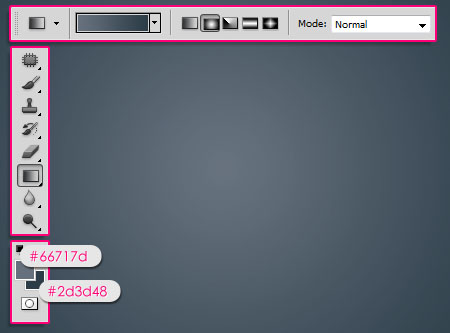
Create a new 1152 x 864 px document. Set the Foreground color to #66717d and the Background color to #2d3d48. Pick the Gradient Tool, choose the Foreground to Background gradient, and click the Radial Gradient icon in the Options Bar. Then create a radial gradient from the center of the document to one of the corners.
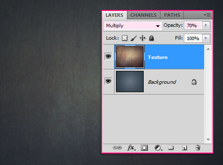
Place the Texture 230 image on top of the Background layer, then change its Blend Mode to Multiply and its Opacity to 70%.
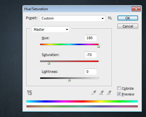
Go to Image -> Adjustments -> Hue/Saturation, then change the Hue value to 180, and the Saturation value to -70.
Step 2
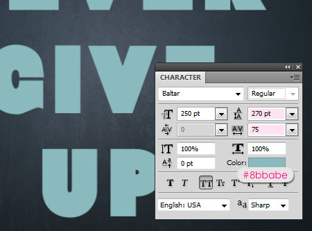
Create the text using the color #8bbabe. The font used is Baltar, the Size is 250 px, and the text is created in All Caps.
Also, you will need to change the Leading value to 270 pt, and the Tracking value to 75 pt to avoid overlapping.
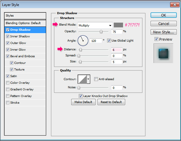
Double click the text layer to apply the following Layer Style:
Drop Shadow: Change the color to #7f7f7f and the Distance to 6.
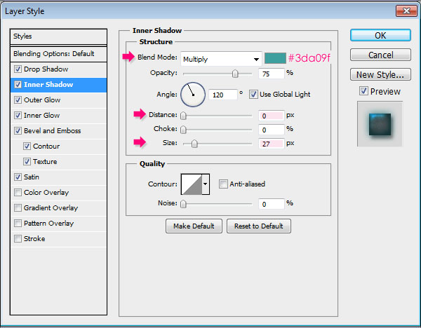
– Inner Shadow
- Color :
#3da09f - Distance : 0
- Size : 27
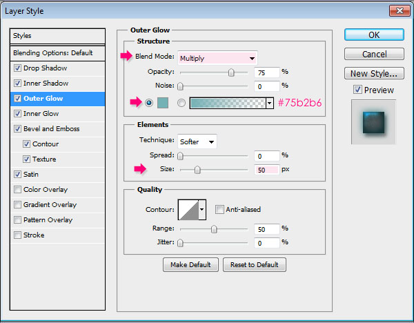
– Outer Glow
- Blend Mode : Multiply
- Color :
#75b2b6 - Size : 50
– Inner Glow
- Blend Mode : Multiply
- Color :
#54a5af - Size : 18
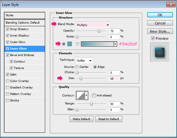
Both glow effects are used to intensify the shadow effects by changing the Blend Modes and the colors.
– Bevel and Emboss
- Size : 20
- Highlight Mode : Vivid Light
- Color :
#9df0ff - Shadow Mode – Color :
#bff3f8
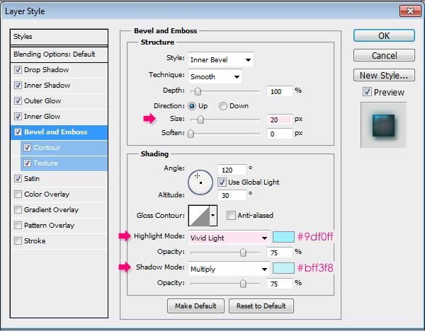
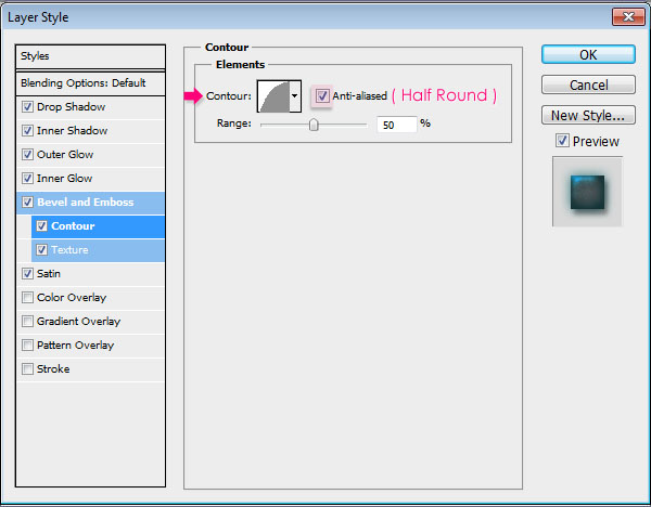
– Contour
- Contour : Half Round
- Check the Anti-aliased box.
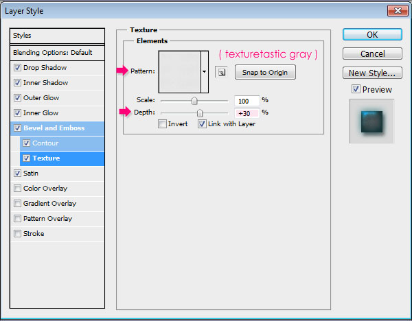
– Texture
- Pattern : Texturetastic Gray
- Depth : 30%
– Satin
- Color :
#b3e6ed - Contour : Log
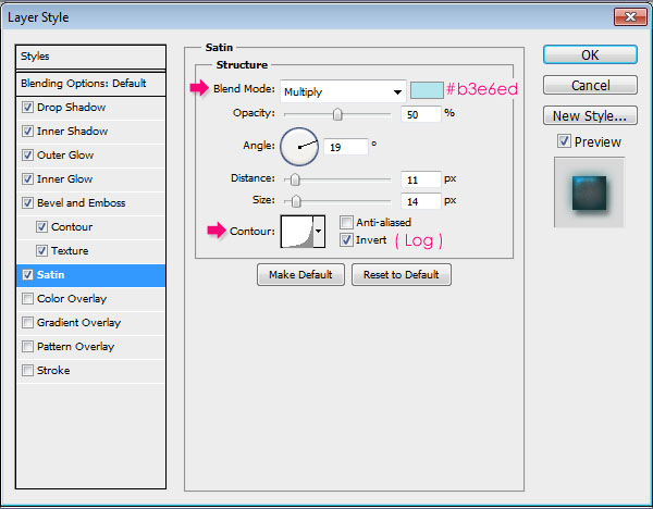
This will create the bright metallic effect.
Step 3
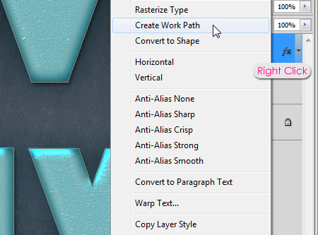
Right click the text layer and choose Create Work Path.
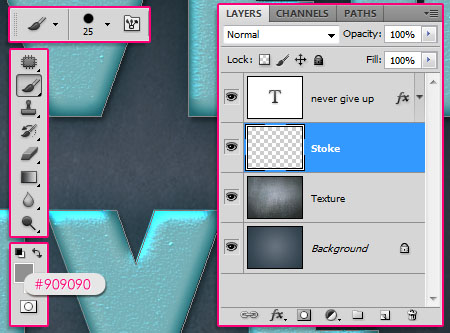
Create a new layer below the text layer and call it Stroke. Then choose a hard round 25 px brush, and set the Foreground color to #909090.
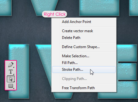
Pick the Direct Selection Tool and right click the work path, then click Stroke Path.
Choose Brush from the Tool drop down menu, and make sure that the Simulate Pressure box is un-checked.
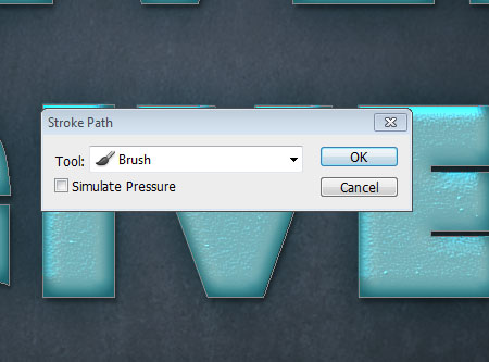
This will add the stroke. Hit Enter to get rid of the work path.
Ctrl/Cmd + cClick the text layer’s thumbnail to create a selection, then press Delete to get rid of the inner parts of the stroke.
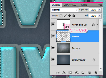
Go to Select -> Deselect to get rid of the selection.
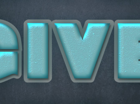
Step 4
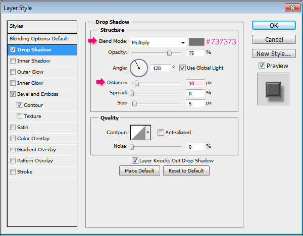
Double click the Stroke layer to apply the following Layer Style:
– Drop Shadow
- Color :
#737373 - Distance : 10
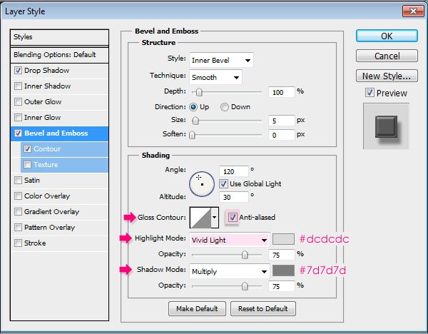
– Bevel and Emboss
- Check the Anti-aliased box
- Highlight Mode : Vivid Light
- Color :
#dcdcdc - Shadow Mode – Color :
#7d7d7d
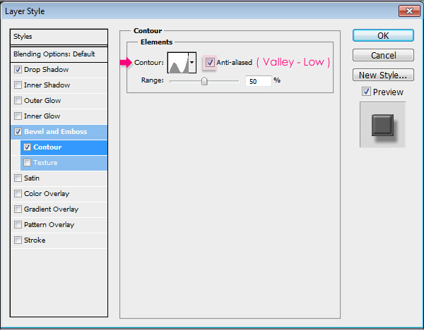
– Contour
- Contour : Valley – Low
- Check the Anti-aliased box.
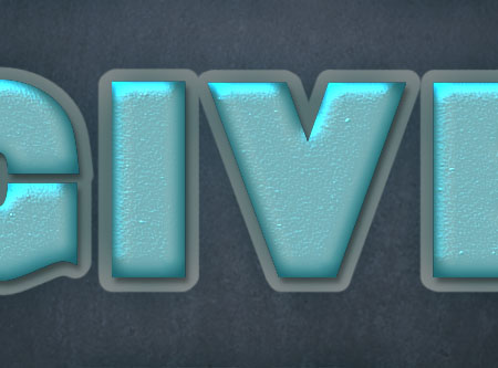
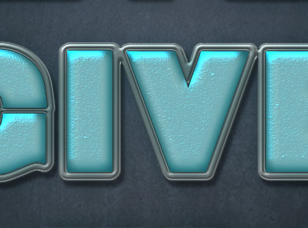
This will give the stroke an iron-like effect.
Step 5
Create a new layer on top of all layers and call it Pins.
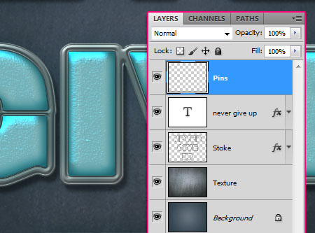
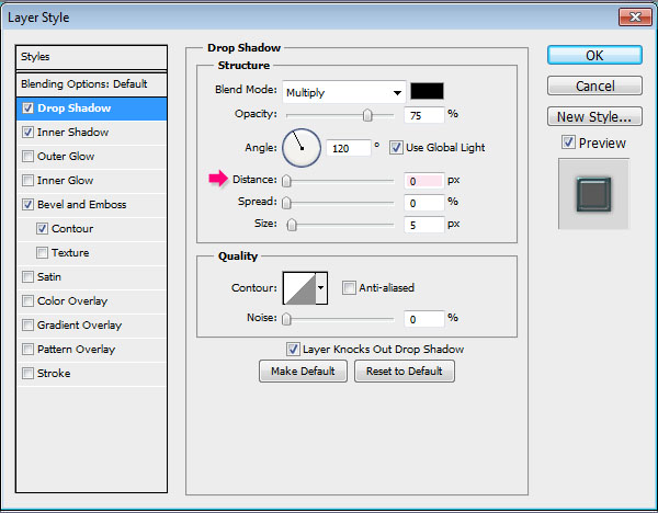
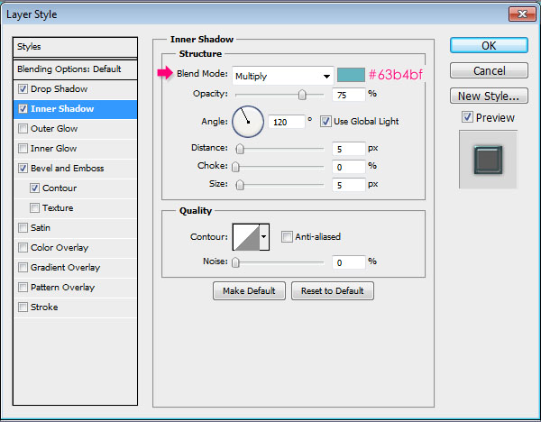
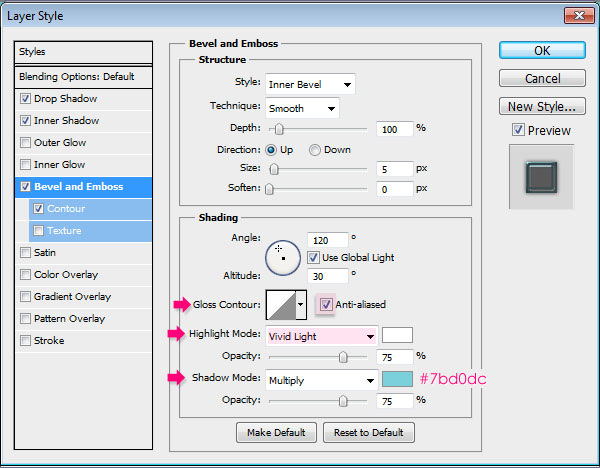
Double click the Pins layer to apply the following Layer Style:
– Drop Shadow
- Distance : 0
– Inner Shadow
- Color :
#63b4bf
– Bevel and Emboss
- Check the Anti-aliased box
- Highlight Mode : Vivid Light
- Shadow Mode – Color :
#7bd0dc
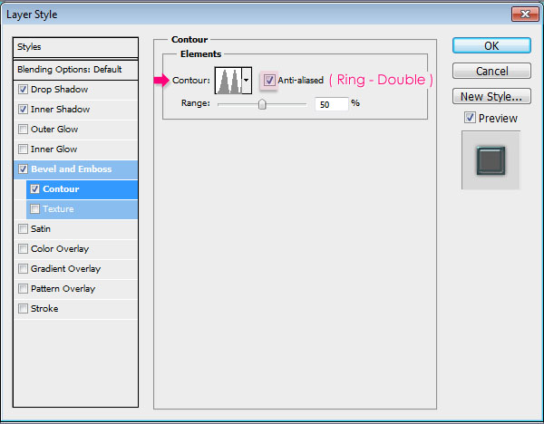
– Contour
- Contour : Ring – Double
- Check the Anti-aliased box.
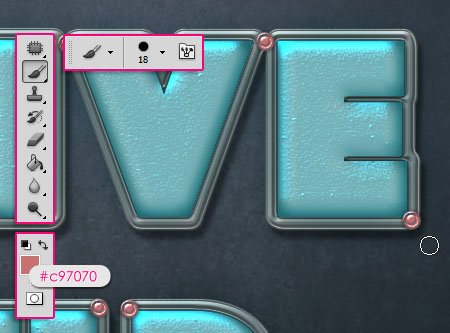
Now set the Foreground color to #c97070, and use a hard round 18 px Brush to add some pins on the corners of the stroke. Try not to add too many pins.
Step 6
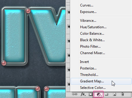
Finally, click the Create new fill or adjustment layer icon down the Layers panel, and choose Gradient Map.
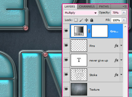
Make sure the Gradient Map layer is on top of all layers, then change its Blend Mode to Multiply and its Opacity to 70%.
Click the Gradient box to create the Gradient used.
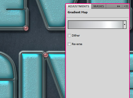
The Gradient values are:
(clickce below the gradient bar to add a color stop)
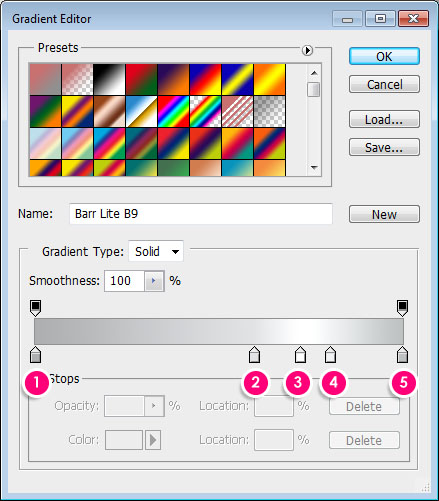
Color – Location
- 1 –
#adafb1– 0 - 2 –
#e1e3e5– 60 - 3 –
#ffffff– 72 - 4 –
#f0f2f3– 80 - 5 –
#bec1c2– 100
The gradient map will intensify the colors and add more contrast to the final result.
That’s it.
Did you enjoy this post? Please consider donating to help us cover our server costs.


The metallic shine and texture is so eye catchy – I want to try with different color and font (similar to yours)- Never played with Contour and Texture like above . Great job
Thank you so much, I’m really glad you liked it.
Would like to see the result you come up with as well 🙂
Thanks once again for the comment.
Awesome design making in Photoshop. Presentation of this tutorial is understandable. Thanks editor for sharing this type of tutorial.
Glad you liked the tutorial and found it useful.
Thanks a lot for the comment.
superb tutorial, thank for your tutor i very glad. thank you
Glad to know that 🙂
Thanks a lot for the comment.
Hola , soy un usuario en español y bueno no entendí mucho ya que uso el traductor en esta parte:
– Elija la herramienta Selección directa y haga clic derecho del trazado, a continuación, haga clic en Trazar ruta . No me sale esa opción [tengo photoshop cs6]
La verdad si tuvieran un tutorial o algo así , para resolver mi problema. Desde de eso todos sus tutoriales son muy buenos , saludos :D! /
Hello, I’m a Spanish user and did not understand much good since I use the translator in this part:
– Pick the Direct Selection Tool and right click the work path, then click Stroke Path. [I have photoshop cs6]
Actually if they had a tutorial or something to solve my problem. Since all the tutorials that are very good, greetings: D!
Were you able to find the option “Stroke Path”? Was it grayed out?
What exactly happens when you try to do that step? It should work fine if you are using the right tool. You just need to right click the path you created, then choose the “Stroke Path” option from the pop-up menu.
Hope this helps. But if the problem still exists please feel free to leave a reply with more details (you can use Google Translate and I’ll try my best to help).
Gracias for your kind words 🙂
nice tut, but the font is not .
everything else was fine but.
You can use any font you like, as long as it is a bold one.
I just try to use as many different fonts as possible for the tutorials, but once you get the idea, you can use any other font.
Thanks for the comment.
Hi, First of all thank you for such greattttttt tutorial,step by step. Thanks a lot.
However, even after you taught so well…I was unable to get the strokes 🙁 and buttons of pink colour. I think I must have missed a step. But thanks anywayonce again 🙂
Thank you for the kind words, really appreciate it 🙂
What goes wrong when you try to apply the stroke? Do you get the options or are they grayed out?
As for the buttons, did you make sure to use the exact same Layer Style values? The issue seems related to the values.
Please feel free to leave a reply and I’ll try to help as much as possible.
Thanks once again 🙂
Hi,
See below what I tried…didn’t got the stroke n buttons…but got the metallic effect.
my work >> thanks
Amazing outcome!
Thank you for the comment and for sharing your work 🙂
Hello Friends My Name is Lalit Sharma ………My work
Cool result!
Thanks for sharing your work and for the comment 🙂
my work !!
it’s awesome 🙂
Nice outcome!
Thanks a lot for the comment and for sharing your work 🙂
You are welcome 🙂
but mine is less bright 🙁
I think you’re using a different font size, and a different pattern for the Bevel and Emboss Texture, which causes a difference in the final result. Did you make sure to follow the exact values please?
I made ??it on my creations.
And maybe that’s what makes the difference in the final result. But I will admit your tutorial was amazing.
Good job. Enhance your creativity 🙂
It’s actually really nice to see different variations of the effect, and yours looks great!
Thanks a lot for the lovely reply 😉
Amazing tut… thanks… this is my work…
Wonderful result!
Thanks a lot for the comment and for sharing you lovely work 🙂
Thank you for your great tutorials
You’re very welcome 🙂
Nice version of the effect.
Thank you once more 🙂