
Chocolate Bar Text Effect
This tutorial explains how to create a simple pattern, then how to use it along with a couple of Layer Layer Styles to make a chocolate bar like text effect. It then explains how to modify a simple brush to add a nice filling to the text, and finally, adding some adjustment layers to complete the effect.
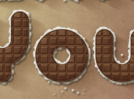
The Final Result

Tutorial Details
- Software Used : Photoshop
- Version : CS5 Extended
- Time : 0:45 – 1:45
Resources
The tutorial explains how to create the pattern to show some useful tips and tricks, but the pattern is also included in the Resources section if you want to skip that part.
- PicoBlack font.
- Pattern used.
- Yellow Vintage Paper Texture from the Colored Vintage Paper: Texture Pack
Bows Set 2 by ro-stock. Edit: The deviation has been deleted. Here are two alternatives Bow 2 PSD, or Christmas Bows 7.
I always love to hear from you, so if you’ve got anything you’d like to say or suggest, just go ahead and send me a message through the contact form.
This text effect is a simple “Thank You”, so hope you like it 🙂
Best regards,
Rose
Step 1
Create a new 1250 x 800 px document. Set the Foreground color to #fece01, and the Background color to #e8661b, and create a Radial Gradient from the center of the document to one of the corners.

Place the Yellow Vintage Paper Texture on top of the Background layer, scale it down till it fits properly in the document, and change its Opacity value to 50%.
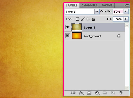
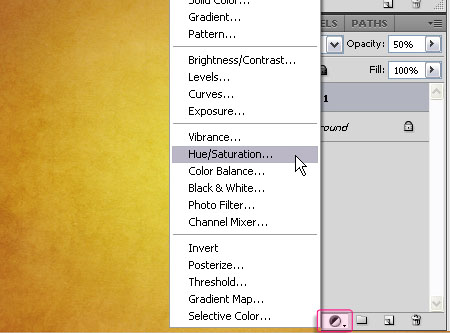
Click the New Adjustment Layer icon at the bottom of the Layers panel, and choose the Hue/Saturation adjustment layer.
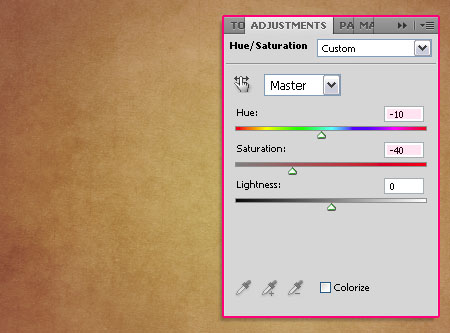
Change the Hue value to -10< and the Saturation value to -40.
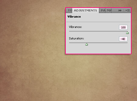
Click the New Adjustment Layers icon once again, but this time, choose the Vibrance adjustment layer.
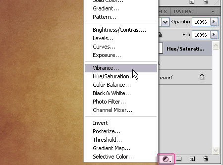
Change the Vibrance value to 100 and the Saturation value to -40.
Step 2
We are going to create the Pattern right now. So create a new 30 x 30 px document with a White Background. You can zoom in until the document is big enough to work with.

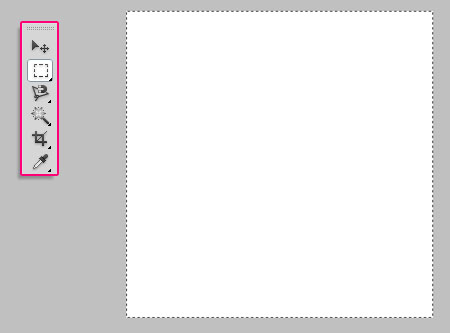
Using the Rectangular Marquee Tool, draw a square that selects the whole document.
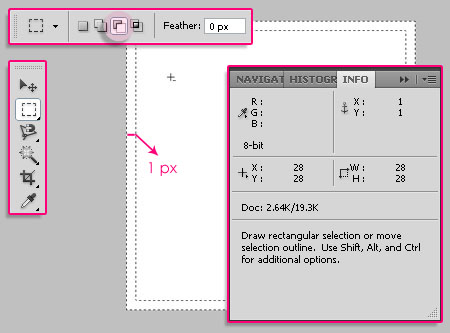
Click the Subtract From Selection icon in the Options bar, and draw another rectangle that is 1px smaller than the first one.
You can open the Info panel (Window > Info) to check the dimensions.
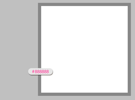
Fill the selection with the color #888888.
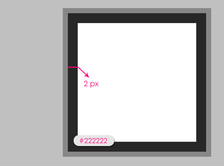
Press Ctrl/Cmd + D to get rid of the selection, then, repeat a similar process, but this time, draw the first rectangle so that it selects the white area only, and the other one should be 2px smaller. Fill the selection with the color #222222.
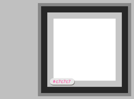
Once again, draw another border that is 2px wide, and fill it with the color #c7c7c7.
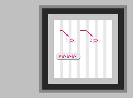
Finally, we are going to create vertical lines that are 1px wide, leaving a space of 2px between them. Use the Rectangular Marquee Tool and click the Add to Selection icon in the Options bar to create all the lines’ selections together. Fill the lines with the color #e9e9e9 and get rid of the selection (Ctrl/Cmd + D).
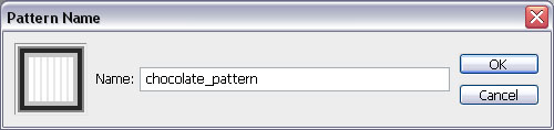
Now, go to Edit > Define Pattern, and type in a name for the pattern.
Step 3
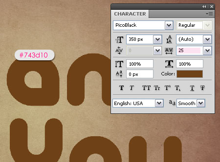
Back to the original document, create the text with the color #743d10. The font used is PicoBlack, and the Size is 350 px. Also, set the Tracking value to 25 to avoid overlapping. (You can get the Character panel from Window > Character).
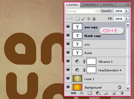
Duplicate the text layer(s).
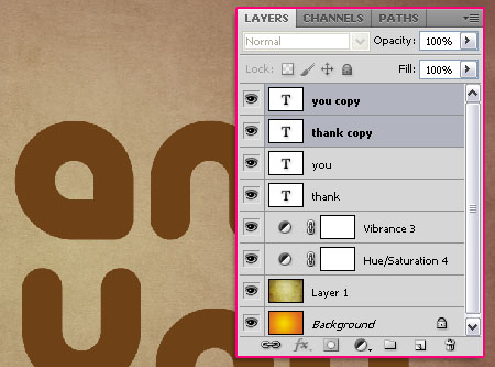
If you have multiple text layers, select all of the duplicated ones, then go to Layer > Merge Layers, or simply press Ctrl/Cmd + E. If you have only one text layer, the right click it, and choose Resterize Type.
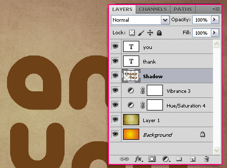
Drag the merged/ rasterized layer so that it becomes under the original text layer(s), and rename it to Shadow. We are going to use this later to create a shadow using the Motion Blur filter.
Step 4
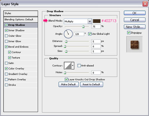
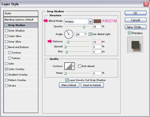
Double click the original text layer to apply the following Layer Style:
– Drop Shadow
- Color :
#402713
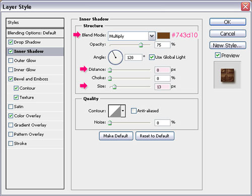
– Inner Shadow
- Color :
#743d10 - Distance : 0
- Size : 13
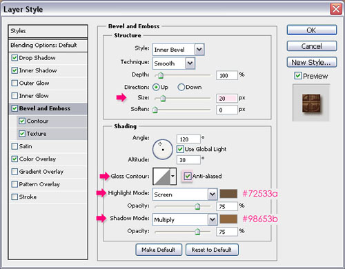
– Bevel and Emboss
- Size : 20
- Check the Anti-aliased box
- Highlight Mode – Color :
#72533a - Shadow Mode – Color :
#98653b
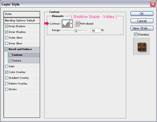
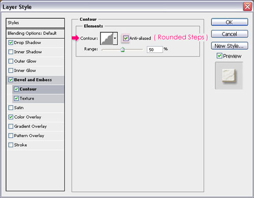
– Contour
- Contour : Shallow Slop Valley
- Check the Anti-aliased box.
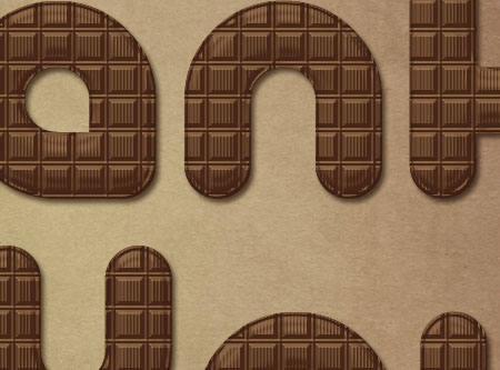
This will create a simple border around the beveled text, so that the text won’t look flat at the edges.
– Texture
- Pattern : Using the pattern created in Step 2
- Check the Invert box.
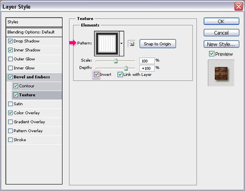
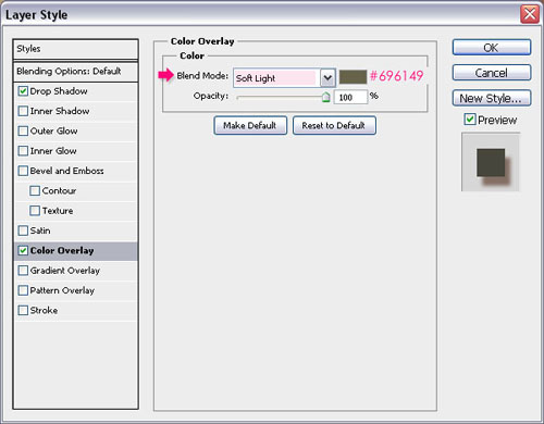
– Color Overlay
- Color :
#673d26
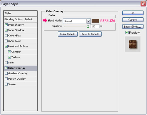
Click OK to get out of the Layer Style box. Check out what we’ve got!
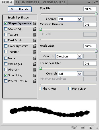
Step 5
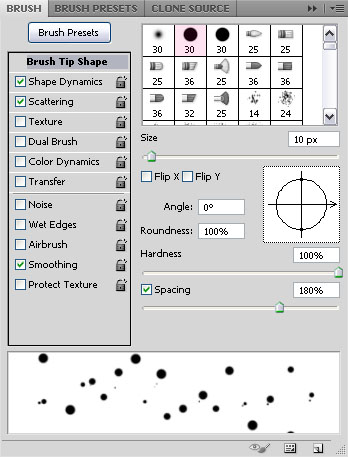
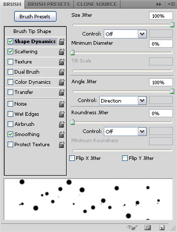
Open the Brush panel (Window > Brush), choose a hard round brush, and modify its Settings as shown below:
Brush Tip Shape
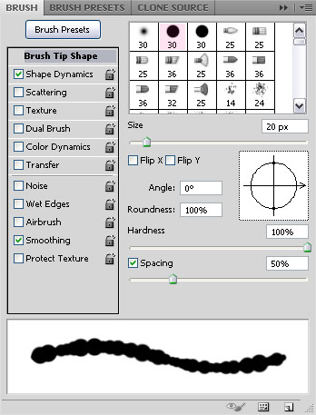
Shape Dynamics
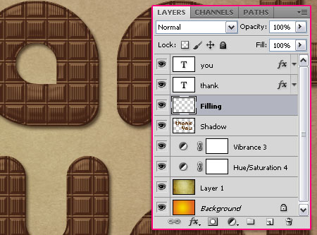
Create a new layer on top of the Shadow layer and under the text layer(s), call it Filling.
Right click the text layer, and choose Create Work Path.
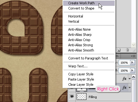
Select the Filling layer so that it is the active layer, then, pick the Direct Selection Tool and set the Foreground color to White. Right click the path and choose Stroke Path.
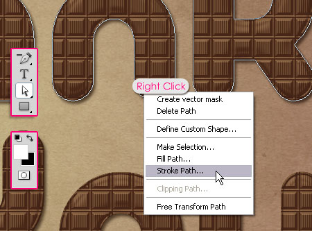
Choose Brush from the Tool drop down menu, and un-check the Simulate Pressure box.
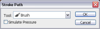
This will stroke the path with the brush. Hit Enter/Return to get rid of the path.
Step 6
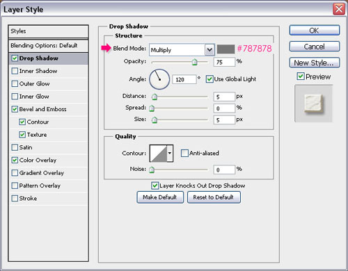
Double click the Filling layer to add the following Layer Style:
– Drop Shadow
- Color :
#787878
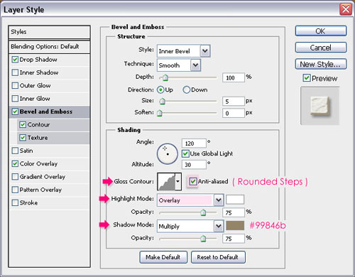
– Bevel and Emboss
- Gloss Contour : Rounded Steps
- Check the Anti-aliased box
- Highlight Mode : Overlay
- Shadow Mode – Color :
#99846b
– Contour
- Contour : Rounded Steps
- Check the Anti-aliased box.
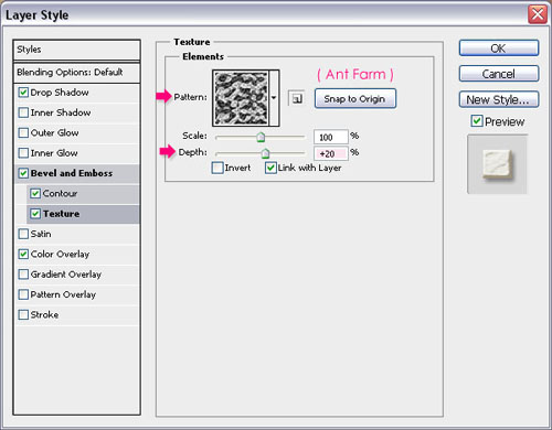
– Texture
- Pattern : Ant Farm
- Depth : 20%
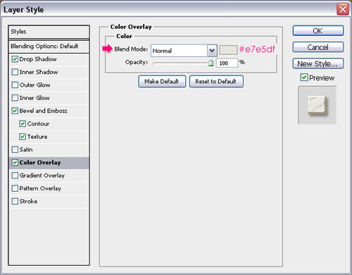
– Color Overlay
- Color :
#e7e5df
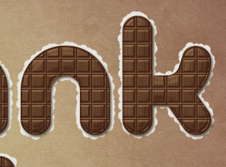
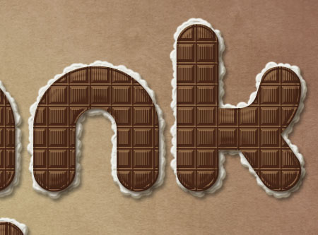
This is what the filling should look like.
Step 7
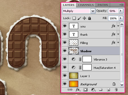
Select the Shadow layer we created earlier, and go to Filter > Blur > Motion Blur. Change the Angle to -30 and the Distance to 100.
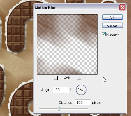
Move the shadow around (using the Move Tool) so that it starts at the top edge of the letters, and spreads away diagonally. Change the Shadow layer’s Blend Mode to Multiply, and the Opacity to 50%.
This should give the text more depth.
Step 8
Go back to the Brush panel, and using the same hard round brush, modify the Settings as shown below:
Brush Tip Shape
Shape Dynamice
Scattering
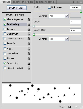
Now, start painting some scattered dots on the Filling layer, as if the filling is a bit scattered around the text.
Step 9
Open a bow form the Bows Set, and place it on top of all layers. Resize it and move it or rotate it till you like how it looks, and place it on top of one of the letters.

Double click the Bow layer to apply the following Layer Style:
– Drop Shadow
- Color :
#805748 - Size : 11
– Color Overlay
- Color :
#696149 - Blend Mode : Soft Light
This should enhance the color of the bow and give it more depth.

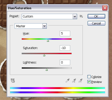
Go to Image > Adjustments > Hue/Saturation, change the Hue to 5 and the Saturation to -10.
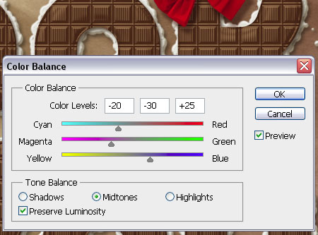
Go to Image > Adjustments > Color Balance, make sure that the Tone Balance is set to Midtones, and change the Color Levels values as shown below:
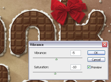
Finally, go to Image > Adjustments > Vibrance, set the Vibrance to -5 and the Saturation to -10.
Step 10
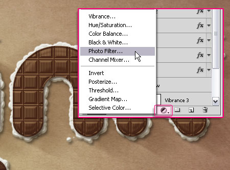
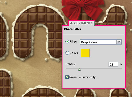
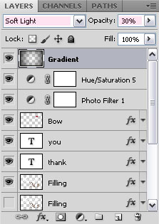
The last thing we’re going to do is add some adjustment layers to make everything blend well. So click the New Adjustment Layer icon, and choose Photo Filter.
Choose the Deep Yellow Filter from the drop down menu.
Add a Hue/Saturation adjustments layer, and set the values as below:
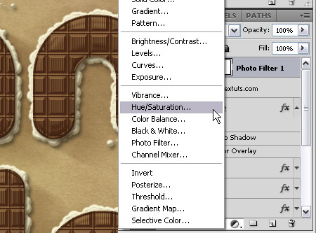
You might as well need to adjust the colors of the Bow. The only adjustment made here is changing the Saturation (Image > Adjustments > Hue/Saturation) value once again, to make the colors a bit less bright.
Finally, set the Foreground color to Black, create a new layer on top of all layers and call it Gradient, then, create a Foreground to Transparent Radial Gradient. Change the layer’s Blend Mode to Soft Light, and its Fill value to 30%.
And that’s it!
Did you enjoy this post? Please consider donating to help us cover our server costs.


I’m curious, from where are coming all these weird ideas of yours? I mean, it’s awesome, and the execution is outstanding, allright, no doubt about this. But, never in my life I would have thought such a thing! Chocolate bar text effect! Come on! ;D
Congratulations for your baby’s birthday, and many many (and many more) thanks for sharing all these awesomely talented tips and tricks.
Wow! This has to be one of the nicest comments I’ve ever read! Thank you so much 🙂
I actually try to be inspired by whatever is around me, in an attempt to come up with something new, and I’m glad you find it useful 😀
Thank you so very much once again for your kind words.
Cheers 🙂
By the way, soon it will be my daughter’s birthday (well, one of my daughters indeed), and I completed the tut (result here: http://tinypic.com/r/qnvcyh/7) because she’s a huge chocolate fan (beside we live in Mexico where chocolat comes from).
P.S. You don’t have to thank me for my previous comment, you deserve it. For the record, I’m designing since 30 years now and I can see when something is well done, and what you do is very well done, and not “easy”. Challenges are indispensable in our job.
Saludos.
I really am speechless! This really means a lot.
A very Happy Birthday to your daughter, hope she has a great one! 🙂
Muchas gracias.
tnx :X
I will translate it into persian …
Thanks a lot, pouria.
Please don’t forget to link back 😉
Happy birth day to txtuts.com and thank you for this explosive post. I loved it very much.
Thanks a lot Rikon, glad you liked it 🙂
hi . this is one of the greatest tutorials ever seen!!! so clear, everything explained, wow , im so impressed,!!! fantastic , Thank you!!
Oh thank you so very much! I really appreciate it 🙂
So glad you liked it.
Thanks a lot for the comment 🙂
Nice tutorial and nice effects:)
In step1 i think its
“Set the (Foreground) color to #fece01, and the Background color to #e8661b”
not
“Set the (Background) color to #fece01, and the Background color to #e8661b”
Oops! Fixed it 😉
Thanks a lot for the comment and the note 🙂
thanks a lot for sharing ! I love it so much !
You’re welcome.
Thanks for the kind words 🙂
Thanks again for the nice tutorial 🙂
here’s my work
http://i55.tinypic.com/141r8y.jpg
Awesome result! Well done indeed 😉
Thanks for the link 🙂
I love this texture <3 Thanks for the tutorial 😀
Glad you do.
Thanks for the comment 🙂
great tutorial ! thanks i,ll try it
!
Glad you will.
Thanks for the comment 🙂
What an awesome tutorial !!! Made me hungry for chocolate !! Check out how mine came out !!!!
Thank you so much, glad you liked it 🙂
Would you please post a link for your outcome?
Cheers!
Woooow you rocks!!!! happy birthday to textuts (sorry i’m late)
Awesome tutorial, i like it very very very much.
Thank you so very much Hayde 🙂
Really glad you liked it.
Cheers!
Why my brush in step 5 look like this? http://i389.photobucket.com/albums/oo339/Tamara_75/lunialbum/Clases/PS/PincelChocolate.jpg
Did you make sure to change the Size Jitter under Shape Dynamics to 100%? (As shown in the second image under Step 5).
¬¬ that was de problem =/ thanks a lot
You’re welcome 🙂
Hi there, I am new to the world of photoshop! But I must say this is such a lovely work! A quick question… can I do the above in CS3?
Hey Jennifer,
Thank you for your kind words.
Of course you can do it in CS3, and if you have any questions please leave a comment, and I’ll try my best to help.
Oh, and welcome to the Photoshop world, you’ll love it 😉
Cheers 🙂
I would like to say , how much I enjoyed doing your tut. I am a brand new PS owner & user. Heck, I’m still learning what tool does what LOL. Someone in my group gave us this link for the text effect tut and I just had to try it. And I must say, that it was very easy to follow, even for me. I know once I learn the program better, I can really do something. But I just wanted to say that I enjoyed doing your tut. TY
Hello Donna,
Thank you so much!
Glad you found the tutorial easy to follow. Hopefully the other tutorials will be as easy and useful as well 🙂
Cheers!
Wow! Super helpful tutorial! Never thought that making chocolate letters was that complicated. Thanks for this wonderful website of yours, I will be looking forward for new tips!
Thank you so much Michelle, this really means a lot 🙂
Glad you enjoyed the tutorials.
Cheers!
can i download a psd file?
I’m really sorry, but PSD files are not available for download.
If you have any questions about the tutorial please leave them in a comment, and I’ll try my best to help.
Awesome!!! You explained it sooo well!! I didnt have any problem to understand you. It is a great job!! applause!
Thank you so much, I really appreciate it 🙂
I’m having some trouble with the stroke path. It comes out sort of beige instead of white – as if it’s not opaque, and the colors beneath it are showing through. I can’t figure out what I’ve done wrong.
Help?
Hello Ariella,
You might need to check the layer’s Opacity and/or Fill values (in the Layers panel), or the Opacity and/or Fill values in the Brush Options bar at the top of (when the Brush Tool is selected). All values must be 100%.
Hope this helps.
That’s awesome, my result : http://files.getwebb.org/view-cre659su.html
Love it!
Amazing! Great job indeed.
Thanks for the comment and the link 🙂
Where can I get the contours you use?
For example the Shallow Valley – Slope, I don’t have it preloaded in my photoshop and I could not find it online.
Same about other contours.
(Great tutorial, thank you so much!)
You can check this image to see how to load the contours.(This is mentioned in the bold part under the third image in Step 4).
Hope this helps 🙂
Thanks for the comment.
Cheers!
Silly me. :p
Thank you for the lightning fast answer!
Keeps me inspired.
No problem 😉
Nice tut.
Easy and fast to do.
Here you go, my (uninspired) try:
http://i54.tinypic.com/8xk4ee.png
Amazing outcome,well done 🙂
Thanks for the comment and the link.
Thanks!
When you want to translate them to dutch, with dutch pics as well, just ask me.
When you want me to do it, please tell a mail address where I can have contact with you:)
If there is somewhere you’d like to publish this in Dutch you can do that, just please link back to the original tutorial here.
Thanks once again 🙂
Your instructions are so easy to follow and it’s such a fantastic concept! loved the filling idea
Had the best fun writing my name in chocolate! I’m such a girl at times…:D
Thank you so much!
Aww thanks a lot!
Really glad you had fun, thanks for the comment 🙂
it’s very very nice
thank you for nice design.
Thank you for your kind words.
Cheers 🙂
Thank you so much!Great tutorial!
You’re welcome 🙂
Thanks for the comment.
OMG This is awesome. I never thought that you can make such a great effect by stork the brushes. Its just so cool, Thanks for sharing.
Glad you liked it.
Thanks a lot for the nice comment 🙂
Nice tut
🙂
Thanks!
thank you, this is my result
http://i599.photobucket.com/albums/tt79/hongtinct/hocdohoa/20-10hdh.jpg
Cool! Nice execution of the tutorial.
Thanks for the comment and the link 🙂
This was just plain fun. Thank you so much for taking the time to write it. Here is what I came up with. http://losingsarah.deviantart.com/art/Chocolat-Rich-264236166
Glad you had fun doing it, and your result looks amazing as well!
Thank you for the comment and the link 🙂
SUPERRRBBBB TUTORIAL..!! THANK U SOO MUCH….
Glad you liked it 🙂
Thanks a lot for the comment 😀
wow i’ve just finished mine and i looks so professional couldnt have done this without your clear and concise guides i look forward to the next project
thanks again
Ps could this be set up as an atn file?
thanks
That’s awesome to know!
Thank you very much for the nice comment.
I haven’t actually tried creating an action for this, but I think it should work.
Thanks once again.
Cheers 🙂
What a brilliant tutorial! Absolutely loved it.
I’m still a newbie and would really love to do a similar thing with fruits but haven’t got a clue. Guess i’ll have to just do a bit of trial and error.
Thanks again!
Hello Kay,
Thank you so much for the comment 😀
Try collecting some images to help you understand the details of what you’re trying to create, then try using the different elements to achieve that. Experience will definitely make this a lot more easier, but trial and error is one way of becoming more experienced 🙂
Hopefully you’ll create a nice effect.
Thanks once again.
Thank you very much, it’s beautiful & pro.
Thanks a lot for the nice comment 🙂
Hi, I love your tutorial! But I tried this with Photoshop Elements 8, and Elements doesn’t have everything CS5 has, so halfway through I got lost and the result came out nowhere near the final product. I was just wondering, do you think I could still do it with Elements 8? Thanks!
Thanks a lot for the comment 🙂
I’m not really that familiar with PSE, but I think that there are some missing parts that would make the result a bit different.
Can you please tell me exactly where did things start getting different? Or what exactly is not found or missing?
Regards.
Thanks for the tuto 😀
You’re welcome.
Thanks for the comment 🙂
Hi, textuts. I love this site as well as loving other sites. Thanks for the tutorial.
By the way, let me ask you a question: I want to be reminded of these tips and download via email. How do I do?
(Sorry for my bad English, I’m Vietnamese)
Thank you so much for your comment, glad you do.
As for your question, if you mean that you’d like to receive an email whenever a new post is published, then you can enter your email address here, and you’ll get the updates via email.
If you mean something else, please feel free to add a reply.
Best regards,
Rose
hi there,, i rili love this tuts cause its about chocolate,, and i made one for myself only,, 🙂 i like to try great ideas whenever i am free 🙂 thanks again and BLess you 🙂
here it is 🙂
https://www.facebook.com/photo.php?fbid=2978727761107&set=a.2731342576632.132147.1649288235&type=3
That’s lovely 🙂
So glad you enjoyed it 😀
Thanks a lot for the comment.
Hey! This tutorial looks really great, but I have a problem… The chocolate pattern? Where can I get it…? I use photoshop CS5.1, and I am new to it, but I dont know if I am a fast learner or if its your amazing tutorials!! Thank you so much 🙂
Thank you so much for your kind words 🙂
As for the pattern, it is available for download under the Resources section at the beginning of the tutorial. Just unzip it and load it (Edit -> Preset Manager -> Choose Pattern from the Preset Type drop down menu -> Click the Load button to the right, then navigate to where you saved the pattern file, click Load -> Done), and now the pattern will be available when you apply the Layer Style.
Hope this helps.
Thanks once again 🙂
Thanks alot! This really helped! I’m so silly, I was looking and looking, even searched on google, but I couldnt find the pattern! Thanks again, will start on my attempt at amazing chocolate tut!
Have a nice day, love your edits!!
No problem, glad I could help.
Thank you, and have a nice day too 🙂
Hello again, I have another problem… And I dont really know if you can help me out… :/
The bows set, right? I got the link and everything, its just, my computer has a saftey program thingy, which means I cant view that webpage O.O
Do you know anything else I could use? like another bow from somewhere else? 😀
thanks again for all of your help!
Hey 🙂
Try this direct download link please here.
If it doesn’t work, please add another reply.
wow, thank you so much! It worked! Its really nice of you! Yaay, now I can finish my edit and finally leave you alone 😛
Thanks again, have a nice day… Screw that, have a nice YEAR! 😀
Glad it did 😀
You can leave comments whenever you like, I’m just glad I could help 🙂
Thank you and have a nice year too 😉
i love this !!
it’s gimme an inspiration for my course.
thanks a lot ! :3
Glad to know it did!
Thanks for the comment 😀
Thank you for sharing !!!
This is very beautiful and I fully agree with Mr. or Mrs. egiova
This is my result
http://afmrp.deviantart.com/#/d4pwxt8
Awesome! Beautiful outcome 🙂
Thanks a lot for the nice comment and the link 🙂
Hi! i love your tutorial and i would love to do it, but when I try to download the font from the link you shared, it sends me to a page that says the font isnt available anymore 🙁 can you help me?! 😀
Did you try googling the font’s name? If that doesn’t work please feel free to leave a reply.
Thank you so much for your kind words 🙂
yes 🙁 i tried to google it but it shows me one that its different, i hate that cuz i cant continue doing it haha 🙁
Try this link please.
😀 thank youu! it worked
Your welcome 🙂
Can you update the bow link?
Try this direct download link please here. The original deviation is not available though, so I can’t update its link unfortunately.
Hope this helps.
So nice Tutorials Thanks for Teach
Happy you like it 🙂
Thanks for the comment.
thank you for the tutorual 🙂 i’ve tried. here my result //lailatuliklima.deviantart.com/art/love-chocholate-290567156
Very beautiful outcome, I like the little heart as well, very well done 😀
Thanks a lot for the comment and the link 🙂
Uh hey at Step 5.7, when I click “Stroke Path” why the white stuff at the back of the letters is SO lightt? here is the image: http://i39.tinypic.com/rlgs4k.jpg
Select the Brush tool, and make sure that the Opacity and Flow values in the Option bar (at the top) are set to 100%.
Hope this helps.
If the problem still exists, please feel free to add a reply.
Thank you so much!! that worked! Now I can continue my work. 😀
No problem, glad I could help 🙂
i like your work !! 😀 it’s really nice 😉 good job !
Thank you very much, I really appreciate it 🙂
this is cool.
Thank you!
I am just speechless. What a design! Soon i will make such design. Thank you very much and i will come this site everyday.
Again thanks a lot.
Thank you so much for your kind words, I really appreciate them.
Glad you found the tutorials useful.
Thanks once again for the support.
guys can you pls upload a copy of the bows? i cant download it seems the creator deactivate hes account.
Please check this comment, I think the direct link still works.
Hope this helps.
Hi,
I have a question on chocolate-bar-text-effect,
Could you please send the psd file source,
Regards,
You can buy the PSD source file for $3 here.
Hope this helps.
i’m already stuck on step 2, whe i color in the edge with the color 88888 it gets a checker pattern?
it’s not one color it has fine white lines :/
When you pick the Paint Bucket Tool, make sure that the fill type in the Options bar (at the top) is set to Foreground not Pattern.
Hope this helps, but if the problem still exists please feel free to add a reply.
I’ve been doing these tuts for a while now, and I must say that this was one of the best:
Create Work Path, Motion Blur for for a shadow, the Emboss contours – some really great techniques…
Thanks!
So glad to know you found it useful.
Thanks a lot for the comment, I appreciate it.
Thank you for such a brilliant tutorial – it’s easily one of the best PS tuts on the internet. Somewhat advanced in scope but done in such a fashion that I’d imagine anyone could do.
Two questions I had when doing mine –
1) When creating the chocolate pattern, I didn’t see how to create the vertical lines in the middle of the pattern to complete the look. I just added more pixel wide selections but perhaps because I had ‘Add to Selection’ on it didn’t come through in the finished pattern.
2) I had trouble on the filling layer where you create the stroke path with that customized brush. I think I followed the steps correctly but when I finished creating the stroke path after the other steps it worked fine but the result was barely visible. I checked that my opacity was 100% and I don’t think I changed the blending mode from Normal so I’m not sure why it came out hardly visible. Anyways, I just duplicated the layer a few times and arrived at a similar product so all good.
Thanks again for a GREAT lesson!
Thank you so much for your kind words, they really mean a lot. I’m glad you found the tutorial useful.
As for the lines, it seems like the step that explains how to create them was missing for some reason! (Sorry for that). But I fixed it now, and as you mentioned, you just need to use the “Add to Selection” to create the rectangles and fill them.
Thanks again for the comment.
^^^ Nevermind my 2nd question above – I had only looked at the layer opacity not the actual brush opacity. Fixed and looking better than ever – thanks again!
Thankyou.V.nice design
But what is the need of step 2?
Step 2 is for creating the pattern that is used later to create the chocolate bar (with the layer styles).
Thanks for the comment.
hi man 🙂 : i have a problem in step 6 ( texture ) i don’t have this pattren or i don’t know the way to have it !!
can u upload it for me ?
please help me
thank u man 😀
The pattern should be loaded first. To do so, go to Edit -> Preset Manager, and choose “Patterns” from the “Preset Type” drop down menu. Then, click the little arrow to the right of the Preset Type drop down menu, and click “Patterns” near the bottom of the pop-up menu. When the dialog box appears after that, just click Append, and you’ll get the pattern.
Thanks for the comment.
I’m a girl though 🙂
and my letter not like your letter .. why ?!! O.o
http://i.imgur.com/R5E81.jpg
… As for the letters, I guess you mean the smaller ones. When you use smaller font sizes you should use smaller values for all the layer styles too. An easy way to scale a layer style down is to right click the “fx” icon on the right side of the layer, and choose Scale Effects…. In the Scale Layer Effects dialog box, you can scale the Layer Style up to 1000% or down to 1%. So scale it down until it looks good.
Hope this helps.
If the problem still exists please feel free to add a reply.
first i’am sorry my lady 😀
then the second commen i don’t understand it .. if can i have your fb e-mail to chat 🙂
thanks a lot ^_^
No problem ^_^
As for scaling layer styles, please check this article I wrote for inspirationfeed.com, Tip 5: Scaling Layer Styles. This will help you understand what I mean.
If it doesn’t, please leave a comment with the point you found unclear.
It is better to leave comments here so that everyone can benefit, especially those who are facing the same problem.
Regards.
thank u very much 🙂 i want your facebook e-mail to connect with you
You’re very welcome.
You can use our Contact form to contact us.
Hi, this is actually a very outstanding tutorial, and I really like it. But the link for the bow set 2 is somehow broken and the file could not be found, so can you check the link again, thank you and again, great tutorial.
Thank you for your kind words.
I posted a direct link to the set but it also doesn’t seem to work anymore, as the deviation has been deleted.
But you can use any other bow such as this one, or this set.
Hope this helps.
Thanks once again.
Hi,
Thank you so much for the wonderful tutorial. The steps are explained so clearly. I have just started learning Photoshop and I’m very proud that I could complete this tutorial. Thank you so much!
<3 from India:)
That’s amazing. Glad you were able to follow it easily.
Thanks a lot for the comment 🙂
Thank so mutch for this works, i like it, i stay yours fan. I love Photoshop and i believe that with you i can do many thinks or become a great on creations. again thinsk, God bless you, your society and all your equipe.
I’m really happy to know that. Your words and support mean a lot.
Thank you very much for your precious comment, it certainly made my day 🙂
Wish you all the best.
Regards.
This is amazing, but all of the pictures seem be broken? They aren’t showing up, I followed along to the best of my ability without them for a while but it seems I can’t grasp without the visual descriptions I’m used to haha regardless, great tutorial 🙂
They are showing fine for me 🙁
I haven’t received any notes regarding the images not showing. Did you check your browser settings (no images browsing)? Can you see the images in the header and the sidebar?
I really wish I can help but the images do show up for me and in different browsers, so hopefully you’ll be able to find a way to see them as well.
Thank you for the comment 🙂
right now, I cant find the bow set 2 ur using.. any help with that? thank you
Unfortunately, the user deleted the set.
Please check this reply for alternative sets.
Regards.
I think i’ve follow your tutorial correctly.. but i wonder why there’s a small circle in chocolate patern :/
http://i1358.photobucket.com/albums/q767/AryaEfraim/Untitled-2_zps26bad401.png
It seems a pattern related problem. Are you sure you didn’t add or delete any part of the pattern before defining it?
Nice result nonetheless 🙂
I got up to the bow. Too bad it’s missing. I’ll have to find another bow!
Please check this reply for alternative sets.
Hope this helps.
Thanks so much for all. I love your tutorial, i’m new with photoshop but like the way we can do your tutorial easily . Really love them, thanks. (ps : sorry for my bad english, i’m french lol!!)
That’s great to know! Glad you’re enjoying the tutorials and finding them easy to follow.
Merci beaucoup for the kind comment 🙂
Thank you for this Effect Text!
My realization:
http://www.chez-mireilled.com/article-joyeuses-paques-2013-116663787.html
Great execution! Nice additions as well 😉
Thank you very much for the comment and the link.
Can you update the bow link?
The original set isn’t available anymore.
I added some suggestions in a reply above, but will add those to the main article now.
Hope this helps.
nice work man.realy like it.ty 🙂
Glad you like it!
Thanks a lot for the comment.
(I’m a girl though)
Wow…!!! What an amazing idea and execution..Also this is an equally amazing tutorial.. For past a week or so I used to cross paths to this tutorial, and every time I thought that — “Naaah… this must be way too complicated. It’s not for a beginner like me”.. And then I finally started going through the tutorial, and I must say that maybe executing this was hard for you to do for the first time, but going through this tutorial and creating the effect with so detailed and yet so simple tutorial was a piece of chocolate ( I will say piece of Cake when you do a tutorial on that :P)..
Anyways, great tutorial and great result..This world is beautiful because of creative people like you… Don’t let anything stop you..
My result
http://s1.postimg.org/qgxod25e7/chocolate.jpg
That’s one wonderful comment!
The world won’t be that beautiful without the amazing people like you as well 🙂
Your words and support mean a lot!
Very nice outcome indeed, in both tutorials.
It’s always a special thing to check out the readers’ take on the tutorials. So thank you very much for the kind comment, and for sharing your great results 🙂
[quote]great tutorial and great result..This world is beautiful because of creative people like you… Don’t let anything stop you.. [quote]
this is an outstanding work,I am speechless.
thank u miss Rose.
can I use this tutorial for commercial using.
thanks again
your sincerely gasim
You’re very welcome!
Many grateful thanks for your absolutely kind words as well 🙂
You sure can, as long as you don’t sell the text effect (or the tutorial) itself as it is.
Regards.
I am a biginer to PS. this is beautifull and very helpfulL tutorial.very creative.!!! besides i loved,u answered every comment…and sort out the problems.thank u.:J
Really happy to know you liked the tutorial and found it helpful.
Many sincere thanks for the absolutely kind comment 🙂
Glad you like it.
Thanks for the comment 🙂
Unfortunately got completely stuck on step two trying to figure out how to fill the selection. I hate photoshop, this is so frustrating!
You just need to change the Foreground color to whatever Fill color assigned, then choose the Paint Bucket Tool, and click inside the selection to fill it with the Foreground color.
If you’re still unable to fill the selection, please feel free to leave a reply with a screenshot if possible.
Hopefully you’ll be able to solve this issue and go back to enjoying working with Photoshop 😉
Thank you!
Nicely done!
Thanks for the comment and for sharing your work 🙂
Nice work this is my sample with some differents and in Arabic language
Looks amazing!
Thanks a lot for sharing your work 🙂
Hello,
this is a really nice work.
I am an absolute beginner, but I wanted this characters for the letters on my bike, so I followed your description and, wow, I got a beautiful result. Thank you so much.
But now I have a problem which I dont know how to solve. I googled and read much, but I don’t know either what to do.
The person who has to plot my text asked me about a cutline/vector along the outer line of the filling, because as it is he can only plot the innter part.
Please, can anybody tell me what I have to do now?
Thank you in advance.
Frankie
Unfortunately, this is not a vector art effect, it is raster.
So you either need to work on bigger sizes and values from the beginning, or you need to use the Pen Tool to draw that outline.
I’m not sure what exactly is the problem with the outer part though, why can’t it be outlined?
I think it’s best to ask the person who suggested the edit, I’m sure they’ll have the answer you’re looking for.
Thank you 🙂
Thank you for tutorial.
Very well done! Great outcome.
Thank you for the comment 🙂
Here is what I just did!! I love it….. Thanks A million!!!
Awesome outcome!
Many thanks for sharing your work and for the comment 🙂