
Colorful Autumn-Inspired Text Effect
This tutorial explains how to modify some brush Settings, then use that brush with a couple of layer styles and adjustment layers to create a lovely colorful Autumn-inspired text effect.
The Final Result

Tutorial Details
- Software Used : Photoshop
- Version : CS6 Extended
- Time : 0:30 – 0:45
Resources
- ETH (ETH Sans > EthRomainEthon.ttf) font.
- Leaves Brushes MEGA PACK
- asphalt stock by waxsphere-stock.
- Leaves Brushes MEGA PACK by hawksmont.
Step 1
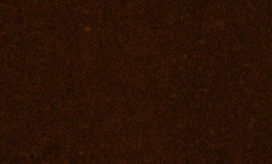
Create a 1125 x 864 px document, then place the asphalt stock image on top of the Background layer.
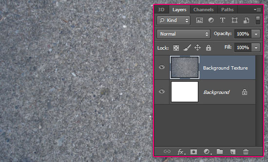
Double click the texture’s layer to apply a Color Overlay effect:
– Color Overlay
- Blend Mode : Multiply
- Color :
#572306
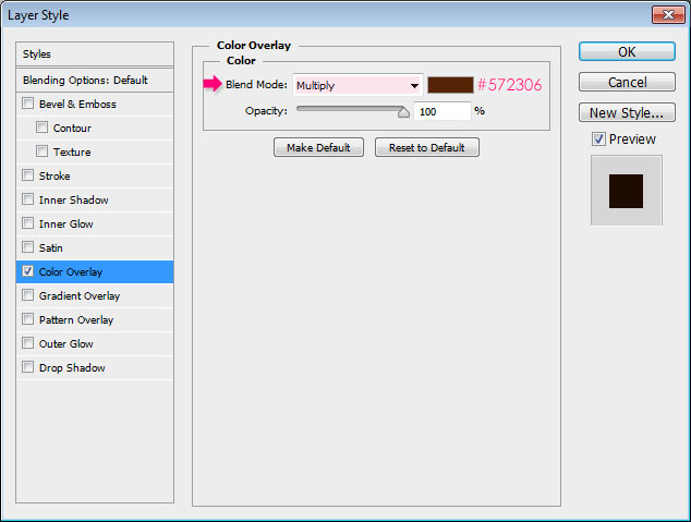
This will darken the texture and give it a brown color, which suits the text effect better.
Step 2
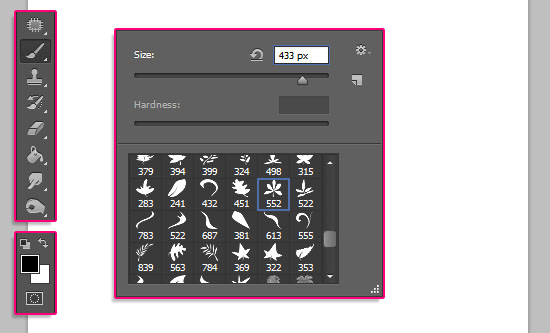
Create a new 500 x 500 px document, download the Leaves Brushes MEGA PACK, and load it to your Brush‘s preset.
We are going to use two versions of one of the pack’s brushes: The original brush, and a slightly modified one.
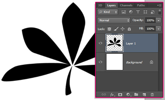
Pick the Sampled Brush #33 brush, which is the brush that will be used to create the text effect, but you can try a different one if you like. And set the Foreground color to Black.
Create a new layer on top of the Background layer, and click once to add the leaf.
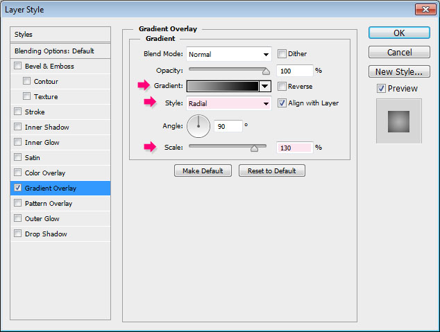
Double click the leaf’s layer to apply a Gradient Overlay effect:
– Gradient Overlay
- Style : Radial
- Scale : 130%
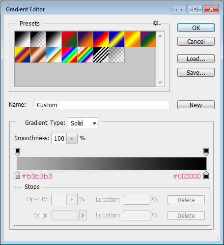
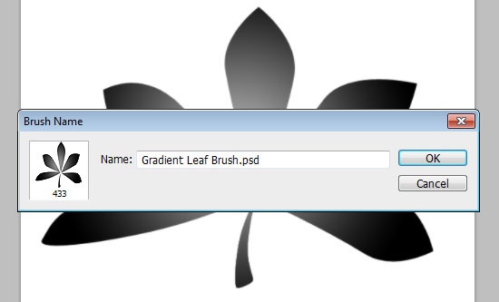
- Click the Gradient box to create the gradient
The gradient colors are #b3b3b3 to the left, and #000000 to the right.
This is how the brush should look like.
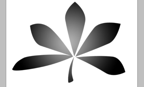
Go to Edit > Define Brush Preset, and type in a name for the brush.
Close the document (you might as well save it if you like), and go back to the original document with the brown background.
Step 3
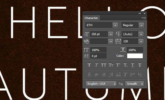
Create the text in White using the font ETH. The font Size is 250 pt, and the Tracking value is set to 130 to avoid any overlapping of the leaves.
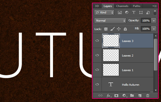
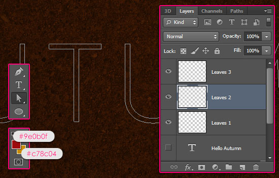
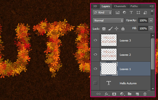
Create three new layers, and name them Leaves 1, Leaves 2, and Leaves 3 from bottom to top. The naming is important to follow the rest of the tutorial.
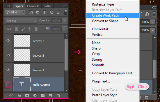
Make the text layer invisible by clicking the eye icon next to it, then, right click the text layer and choose Create Work Path.
Step 4
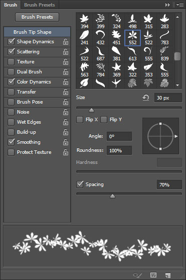
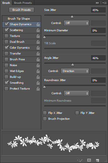
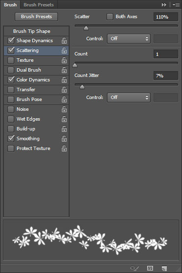
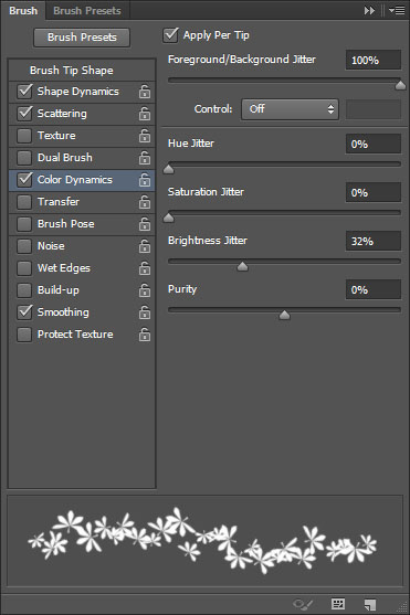
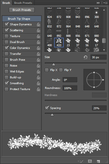
Open the Brush panel (Window > Brush), and pick the Sampled Brush #33 brush again, then modify its Settings as shown below.
Brush Tip Shape
Shape Dynamics
Scattering
Color Dynamics
The Foreground/Background Jitter will add color variations for the brush depending on the Foreground and Background colors, while the Brightness Jitter adds brightness variations for those colors. (Don’t forget to check the Apply Per Tip box as well if you are using CS6).
Step 5
Set the Foreground color to #9e0b0f, and the Background color to #c78c04, and pick the Direct Selection Tool. Make sure you still have the Work Path created in Step 3, and select the Leaves 2 layer so that it is the active layer.
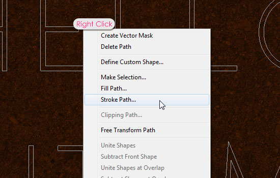
Right click the work path and choose Stroke Path.
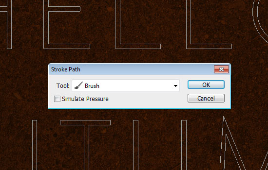
Choose Brush from the Tool drop down menu and make sure that the Simulate Pressure box in un-checked.
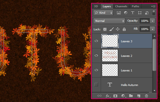
This will stroke the path with the first layer of colorful leaves. Don’t get rid of the work path yet.

Select the Leaves 3 layer so that its is the active layer, then stroke the path once again. This will add another layer of leaves. Two separate layers are used so that we can add a Layer Style for each one of them later on.
Step 6
In the Brush panel, and it’s important to be in the Brush panel to keep the previous Settings, under the Brush Tip Shape tab, just choose the radial gradient brush created in Step 2, and change its Size to 30. All the other Settings should be the same as the ones used for the original brush in Step 4.
Select the Leaves 1 layer, then stroke the path one last time with the gradient brush. This will add more density to the leaves.
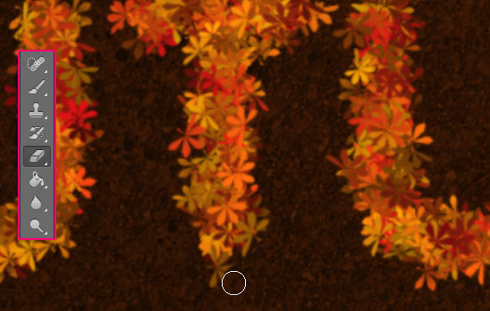
Now is a good time to use the Eraser Tool to get rid of any unwanted parts in any of the three leaves layers.
Step 7
Double click the Leaves 3 layer to apply the following Layer Style:
– Inner Shadow
- Color :
#5c2e0f - Distance : 0
- Size : 2
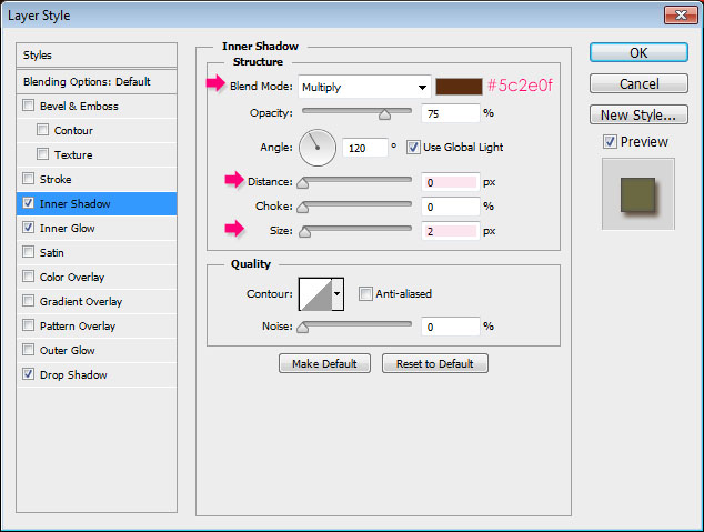
– Inner Glow
- Blend Mode : Soft Light
- Color :
#b0ac3a - Source : Center

– Drop Shadow
- Color :
#472b0f
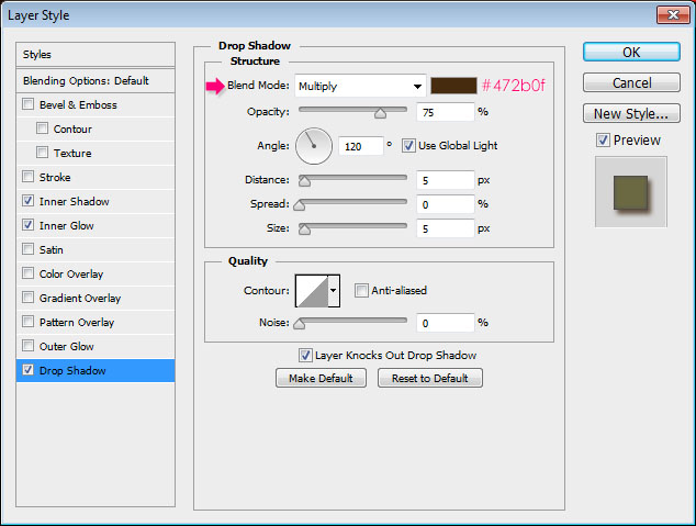
This will add some depth to the leaves, making them look more 3D.
Apply the same Layer Style to the Leaves 2 layer. (Right click the Leaves 3 layer, choose Copy Layer Style, then right click the Leaves 2 layer, and choose Paste Layer Style).
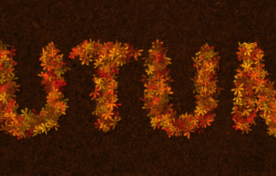
You can manually add some more leaves wherever needed in any layer. Just take some time to perfect your lovely leaves ^_^
That’s it for the main effect. The next step is optional, as we are just going to modify the coloring a bit.
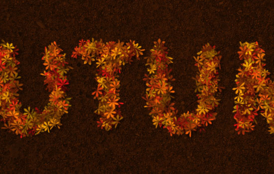
Step 8
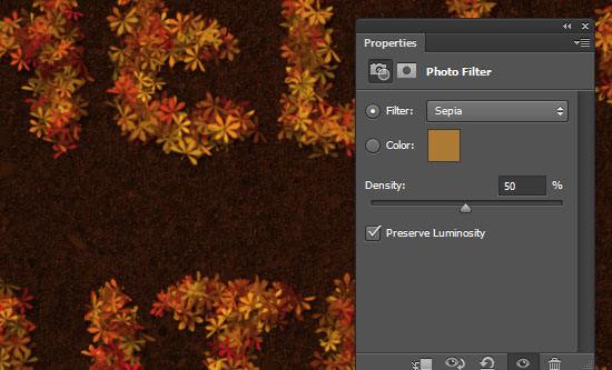
Click the Create new fill or adjustment layer icon down the Layers panel and choose Photo Filter. Make sure that the adjustment layer is on top of all layers.
Choose the Sepia filter, and change the Density to 50%.
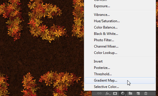
Click the Create new fill or adjustment layer icon again and choose Gradient Map this time.
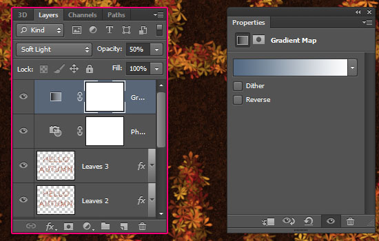
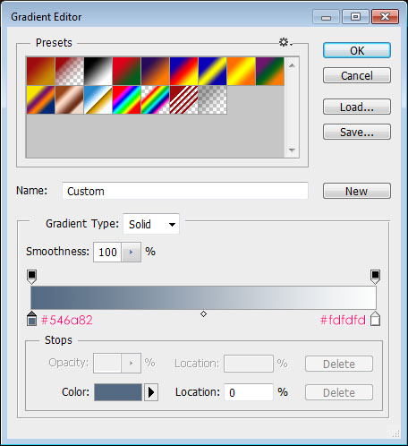
Change the layer’s Blend Mode to Soft Light and its Opacity to 50%, then click the Gradient box to create the gradient used.
The gradient colors are #546a82 to the left and #fdfdfd to the right.
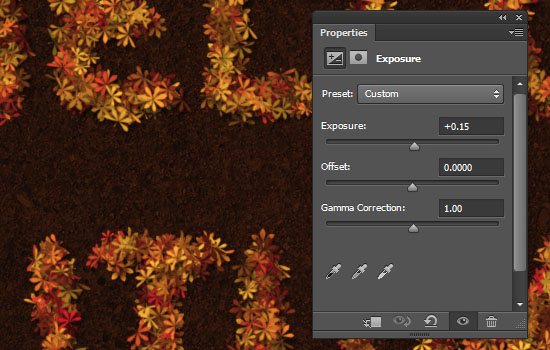
Click the Create new fill or adjustment layer icon one last time, and choose Exposure.
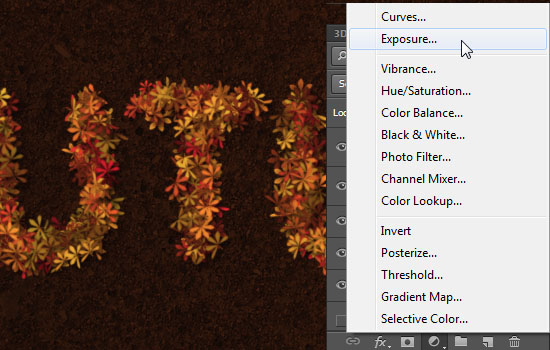
Change the Exposure value to 0.15. This will brighten up the colors and add more contrast.
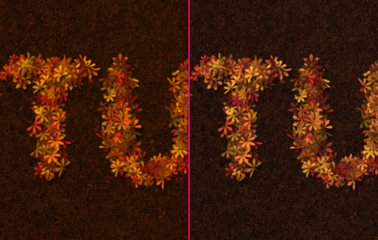
This is the “Before and After” using the adjustment layers. You can use any other values or adjustment layers you want.
Hope you had fun creating your autumn-inspired text. Have a beautiful Autumn everyone! 🙂
Did you enjoy this post? Please consider donating to help us cover our server costs.


Another inspiring tutorial -thanks so much for making them! I always learn a ton.
This was quick & dirty, I didn’t have time to adjust the leaf layers to finesse the shading as in your tutorial though. I want to do this lesson again:
http://www.flickr.com/photos/wp-crickett/8039907398/in/photostream/
I definitely adore the work you do with the effects. So fresh indeed!
Would like to see the version with the shadows applied whenever you do one as well 🙂
Thank you very much for the comment and the link.
Oh my gosh. I can have the roughest week but when I come in here I have soooo much fun! It’s ~always~ nice playing at your place :))))
Wow … This is very special!
Your kind words just totally made my day 😀
Thanks a lot for the awesome comment 🙂
a verry lovely tutorial. I’m in the mood for it
Thanks
Awesome!
Thank you for the kind comment 🙂
Beautiful. I love it.
Thank you very much 🙂
Yes, yes, yes I did 😀
Thak you so much for sharing this. You rocks!! I love your tuts
http://i389.photobucket.com/albums/oo339/Tamara_75/TextoOtoo.jpg
Lovely! The outcome looks very neat and well done.
Thank you very much for the comment and the link 🙂
I have a question about the font ETH.
There are different ETH fonts and i wonder which one of them you have in your tutorial.
These are in the zip file with the ETH font:
ETH SANS – Eth black ethon and Eth Romain Ethon
ETH SANS LARGE – Eth black extended and Eth extended
Hello Bitte,
I updated the font link to another one from dafont.com, so that it’s easier to define the one used.
It is the one called “ETH Sans/EthRomainEthon.ttf”, which is in the file called “EthRomainEthon.ttf” inside the folder “ETH Sans”.
Hope this helps 🙂
Thank you so much.
You’re welcome.
Great tutorial – I’m impressed with the result and also with the preparation and presentation – keep it up! 🙂
Thank you very much, this means a lot 🙂
Thx, awsome tuto !!
http://i1275.photobucket.com/albums/y458/DZDreamer/CANADA.jpg
Amazing! I like how you added leaves all around it as well.
Thanks a lot for the comment and the link 🙂
Not sure how to select the work path.
You don’t need to select it. Just right click anywhere on or near the work path, and you’ll get the menu.
Hope this helps.
Please feel free to leave any other queries you have.
Amazing ! I Like it (y) and Thanks for this tutorial
Happy to know that!
Thanks a lot for the comment.
This was so helpful and point-on with each step. Thank you!
Very glad you found it so 😀
Thanks a lot for the kind comment 🙂
I’m having a problem with the step where we choose the color dynamics for the brushes. My Color Dynamics option is locked and I can’t find a way to unlock it. Please help
Are you sure that the Brush Tool is selected and not the Mixer Brush Tool? There shouldn’t be a problem if you have the right tool selected.
Please check that out and feel free to leave a reply if the issue still exists.
Oh right. I selected the Brush tool and now it worked. Thank you very much.
Awesome! you’re very welcome 😉