
Glossy Candy Text Effect
This tutorial will help you create a really simple, but awesome glossy candy text effect in Photoshop.
The Final Result

Tutorial Details
- Software Used : Photoshop
- Version : CS5 Extended
- Time : 0:35 – 1:00
Resources
- Fontleroy Brown NF font.
Step 1
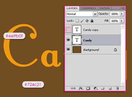
Create a new 2000 x 1500 px document, and fill the Background with the color #724c21.
Create the text using the font Fontleroy Brown NF, the Size 1000 px, and the color #ee9b0f.
Duplicate the text layer, and make the copy invisible (by clicking on the eye icon next to it).
Step 2
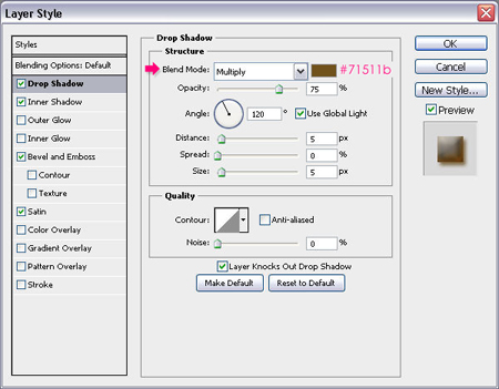
Double click the original text layer to apply the following Layer Style:
– Drop Shadow
- Color :
#71511b
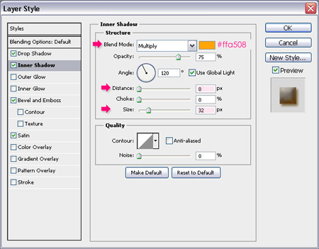
– Inner Shadow
- Color :
#ffa508 - Distance : 0
- Size : 23
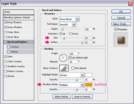
– Bevel and Emboss
- Size : 26
- Soften : 16
- Shadow Mode – Color :
#ef9508
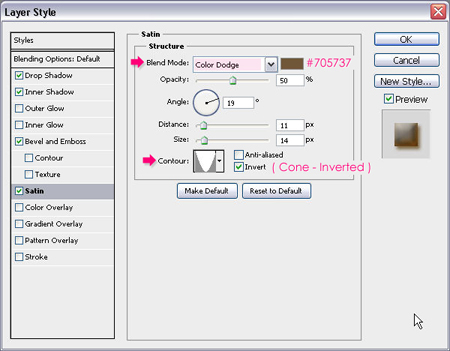
– Satin
- Blend Mode : Color Dodge
- Color :
#705737 - Contour : Cone – Inverted
Step 3
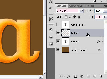
Ctrl/Cmd + Click the original text layer’s thumbnail to create a selection.
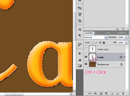
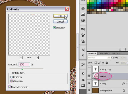
Create a new layer on top of the text layer and call it Noise. Fill the selection with the original text color #ee9b0f and make sure that it’s the Foreground color as well, and set the Background color to White. Then go to Filter > Noise > Add Noise. Change the Amount to 150, make sure that the Distribution is set to Gaussian, and check the Monochromatic box.
Step 4
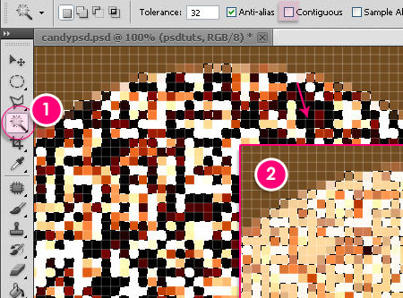
With the Noise layer still active, zoom in (Ctrl/Cmd + ‘+’) until you are able to see the pixels clearly. Pick the Magic Wand Tool, un-check the Contiguous box in the Options bar (this will let all the pixels of the same color range be selected, whether they are adjacent or not), and select the darkest pixel or group of pixels. Then, hit Delete.
Change the Noise layer’s Blend Mode to Soft Light, and its Fill value to 50%.
Step 5
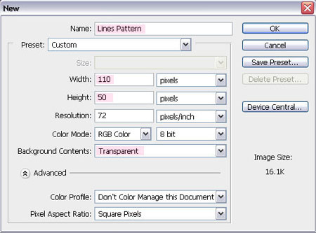
Create a new 110 x 50 px document, and set the Background Contents to Transparent.
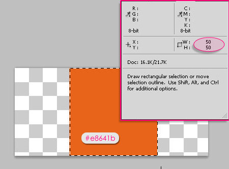
Draw a 50 x 50 px square using the Rectangle Marquee Tool. You can open the Info panel (found under the Window menu) to help you make sure that the rectangle’s width and height values are 50 px.
Place the square at the center of the document, then fill it with the color #e8641b.
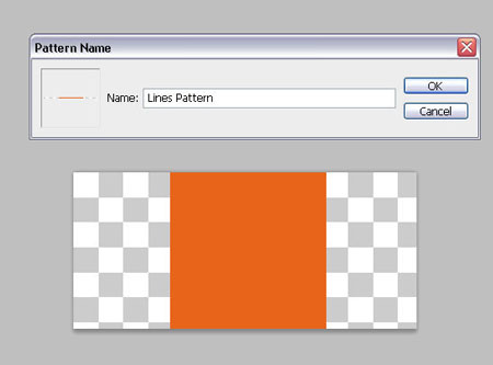
Go to Select > Deselect, then go to Edit > Define Pattern and type in the name of the pattern.
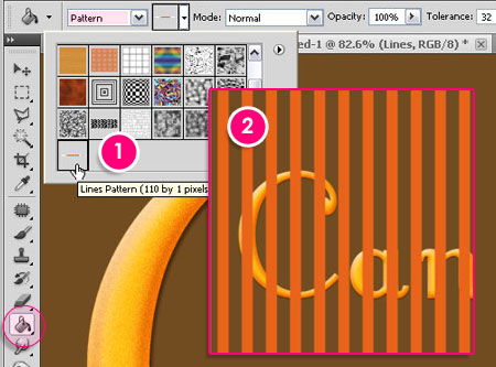
Step 6
Go back to the original document, create a new layer on top of the Noise layer, and call it Lines.
With the Paint Bucket Tool selected, change the Fill type to Pattern, and choose the pattern you’ve just created.
Fill the Lines layer with the square pattern.
Step 7
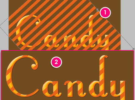
Go to Edit > Transform > Rotate to rotate the lines until you think the result is good. Hit Enter/Return to accept the changes.
Then, Ctrl/Cmd + click the original text layer’s thumbnail to create a selection. Make sure that the Lines layer is selected, then go to Select > Inverse, and hit Delete.
Press Ctrl/Cmd + D to get rid of the selection.
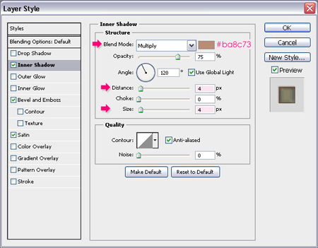
Step 8
Double click the Lines layer to apply the following Layer Style:
– Inner Shadow
- Color :
#ba8c73 - Distance : 4
- Size : 4
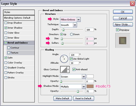
– Bevel and Emboss
- Style : Pillow Emboss
- Size : 3
- Soften : 1
- Shadow Mode – Color :
#ba8c73
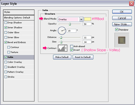
– Satin
- Blend Mode : Overlay
- Color :
#fff8ad - Contour : Shallow Slope Valley
You’ll end up with something like this:

Step 9
Go back to the duplicated text layer created back in Step 1, and make it visible once again.
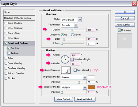
Change its Fill value to 0, and double click it to apply the following Layer Style:
– Bevel and Emboss
- Depth : 450
- Size : 10
- Uncheck the Use Global Light box
- Angle : 100
- Altitude : 30
- Gloss Contour : Log
- Shadow Mode – Opacity : 0%
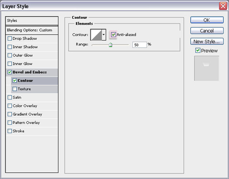
– Contour
Just check the Anti-aliased box.
Step 10
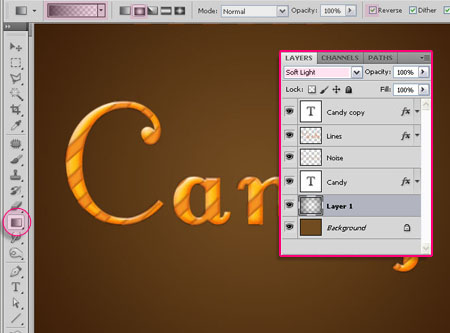
Add a layer on top of the Background layer, set the Foreground color to Black, and with the Gradient Tool, choose the Foreground to Transparent fill, click on the Radial Gradient icon, and check the Reverse box.
Starting from the center of the document, click and drag to one of its corners to create the gradient fill. Change the Blend Mode of the layer to Soft Light.
And this is the final result once again.
Hope you enjoyed the tutorial.
Did you enjoy this post? Please consider donating to help us cover our server costs.


Very useful and attractive
Thanks
Thank you for your comment.
Wonderful tutorial.
Many thanks.
Many thanks for your comment as well.
Enjoyed doing this text tut. The directions were very easy to follow. Thanks for including the color selection numbers. Going to try out your other tuts. Shalom Lilly
Hello Lilly,
Thank you so much for your comment,
hope you enjoy the other tutorials as well.
its very very beautiful
Glad you liked it.
Thank you.
Wow! I usually hate text tuts but this was amazingly simple yet with an amazingly gorgeous result! Thanks for this, I learned a bunch. 🙂
I really appreciate your kind words.
Thanks for your comment.
nice one too
Thank you.
wow! this will be my go to for girly projects!
this tutorial was easy, fun and so useful
Thank you.
PS: this is my version haha
http://i156.photobucket.com/albums/t13/stevo292/girly_text.jpg
Thank you so much for your kind words 🙂
I really like your version as well! It’s nice to see the concept applied in different ways.
Thanks again.
Thank’s It IS very useful to me
With god’s
Bless
Glad you found it useful.
Thank you so much for the comment.
Just followed your tutorial on text and came across your note pappers at footer, do you have a tutorial about them?
many thanks
Sam
Hello Sam,
Thank you for the comment. Actually I don’t currently have a tutorial, as the site is dedicated for text effects tutorials. But I used rectangle shapes and added some anchor points to create the note papers, then added some textures and shadows!
You can contact me through the contact form if you’d like to ask about any details.
Thanks once again.
Thanks this one was so simple to do with a very good looking result ,, That’s my outcome .. I don’t know why I used the word Chaos but it looks good 😀
http://i56.tinypic.com/10gz5v4.jpg
Thanks again for your great tutorials 🙂
Nice! Glad you like it.
Thanks for the comment 🙂
I have one word for it. WOW !
I am just starting to learn photoshop and this is one tutorial which is not only wonderful but also easy to follow and understand. and most importantly doable. Not like other tutorials which seems like they were made just to promote photo stock websites. I might use this for smokencherry.com. you may want to visit sometime to see how I did 🙂
Thank you so much, this really means a lot 🙂
I’ll definitely check soon 😉
Cheers.
Hi,
Love the tutorial! Thank you. I’ve featured it in a list along side other Candy Photoshop Tutorials
http://www.psd-dude.com/tutorials/resources/candy-photoshop-tutorials.aspx
Thanks a lot! I appreciate it 🙂
I love all your tutorials, there are really well explained & super useful to learn more about all the posibilities of CS5! You’re the best !!
And of course, THANK YOU for sharing them with us.
XOXO, from France.
Thank you so much for your kind words, they really mean a lot 🙂
I’m so glad you found the tutorials helpful.
Thanks a lot once again for the comment.
Thank you very much. Great teaching.
You’re very welcome.
Thank you for the comment.