
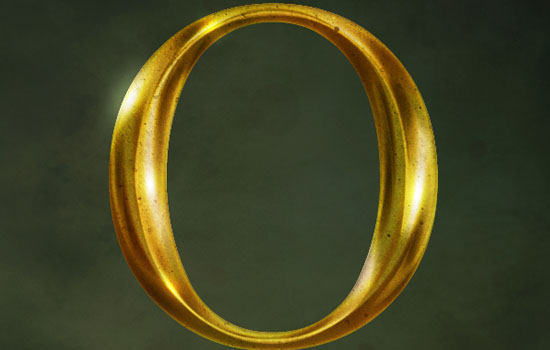
‘Oz The Great and Powerful’ Inspired Text Effect
This text effect is inspired by Disney’s Oz the Great and Powerful movie poster text. It’s a beautifully textured, vintage looking, metallic text effect.
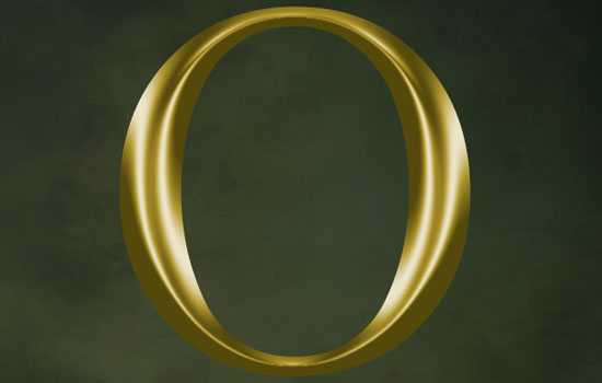
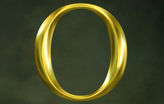
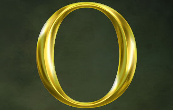
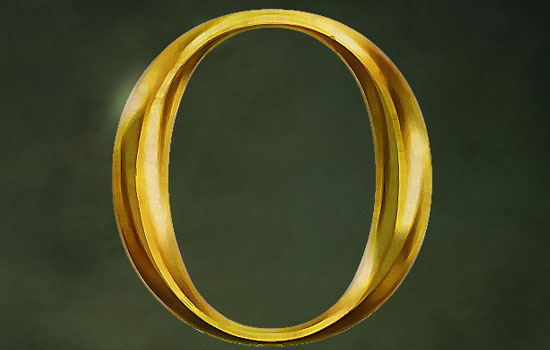
This tutorial aims to create an effect similar to the main “O” effect. The other parts of the text have a slightly different effect, which can still be achieved using the basic steps, but with some different values.
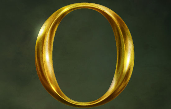
The Final Result

Tutorial Details
- Software Used : Photoshop
- Version : CS6 Extended
- Time : 0:45 – 1:30
Resources
- FreeSerif
- Random Texture by MGB-Stock.
- Darker Shadows Texture Stock by redwolf518stock.
- gradient-shapes for Photoshop by ilnanny.
Note: You might need to load the Contours used in the tutorial, so check this image to see how to do so.
Step 1
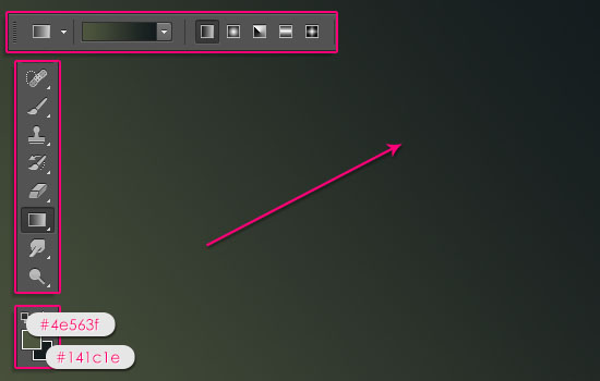
Create a new 960 x 752 px document. Set the Foreground color to #4e563f and the Background color to #141c1e. Pick the Gradient Tool, choose the Foreground to Background, Linear Gradient, in the Options bar. Then click and drag from the bottom left corner to the top left corner to create a simple diagonal gradient.
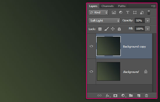
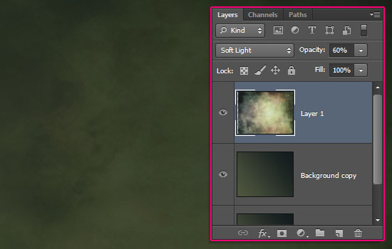
Duplicate the Background layer then change the copy’s Blend Mode to Soft Light and its Opacity to 50%.
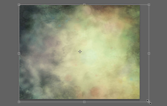
Place the Random Texture image on top of both layers, go to Edit > Transform > Rotate 90° CW to rotate the image. Then back again to Edit > Transform > Scale to resize the image until it fits within the document. Hit Enter/Return when done to accept the changes.
You can as well use the Move Tool to move the texture around if needed.
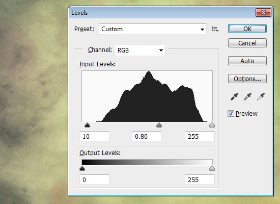
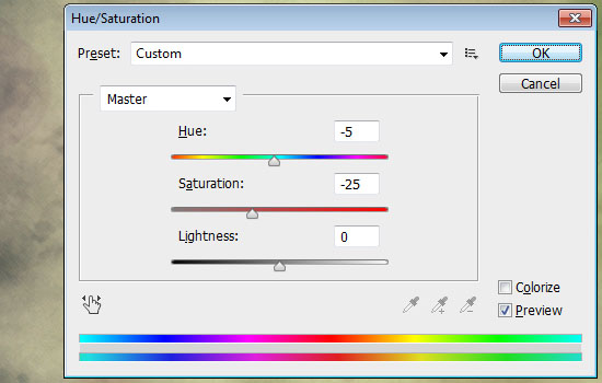
Go to Image > Adjustments > Levels. Set the Shadows value to 10 and the Gamma value to 0.80.
Go to Image > Adjustments > Hue/Saturation. Change the Hue to -5 and the Saturation to -25.
Change the texture layer’s Blend Mode to Soft Light and it Opacity to 60%.
Step 2
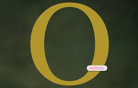
Create the text using the color #b0962c. The font used is FreeSerif, the font Size is 545, and it is in All Caps.
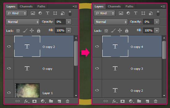
Duplicate the text layer and change the copy’s Fill value to 0. Then, duplicate the copy layer two more times.
Step 3
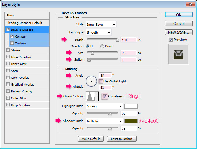
Double click the original text layer to apply the following Layer Style:
– Bevel and Emboss
- Depth : 1000
- Size : 29
- Soften : 1
- Uncheck the Use Global Light box
- Angle : 85
- Altitude : 32
- Gloss Contour : Ring
- Check the Anti-aliased box
- Shadow Mode – Color :
#4d4e00
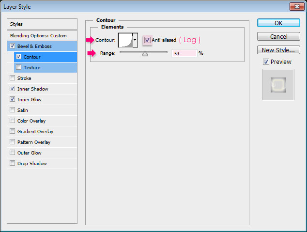
– Contour
- Contour : Half Round
- Check the Anti-aliased box.
- Range : 53%
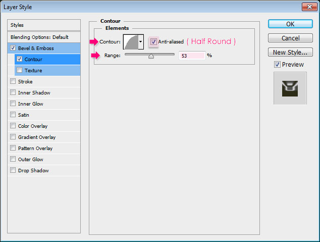
This will create the basic effect.
Step 4
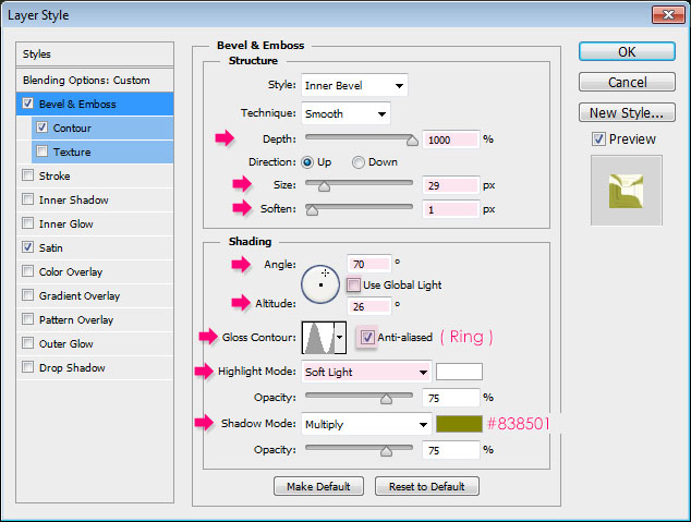
Double click the first copy text layer to apply the following Layer Style:
– Bevel and Emboss
- Depth : 1000
- Size : 29
- Soften : 1
- Uncheck the Use Global Light box
- Angle : 70
- Altitude : 26
- Gloss Contour : Ring
- Check the Anti-aliased box
- Highlight Mode : Soft Light
- Shadow Mode – Color :
#838501
– Contour
- Contour : Log
- Check the Anti-aliased box.
- Range : 53%
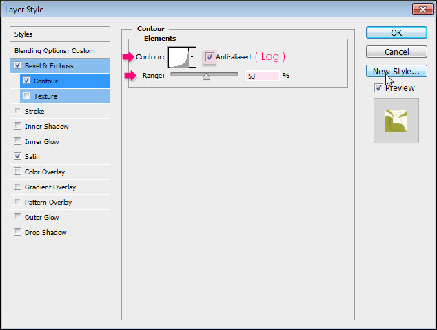
– Satin
- Blend Mode : Linear Light
- Color :
#f6de9d - Size : 76
- Contour : Ring – Double
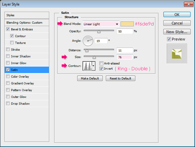
This will build upon the effect, adding more colors and details.
Step 5
Double click the second copy text layer to apply the following Layer Style:
– Bevel and Emboss
- Depth : 1000
- Size : 16
- Soften : 1
- Uncheck the Use Global Light box
- Angle : -104
- Altitude : 48
- Gloss Contour : Ring
- Check the Anti-aliased box
- Highlight Mode : Overlay
- Shadow Mode :
- Color :
#dadada - Opacity : 0%
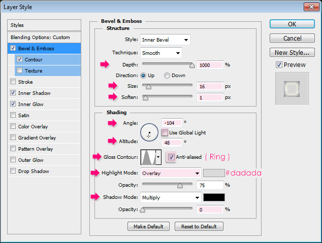
– Contour
- Contour : Log
- Check the Anti-aliased box.
- Range : 53%
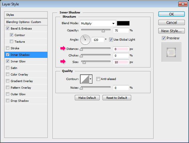
– Inner Shadow
- Distance : 0
- Size : 10
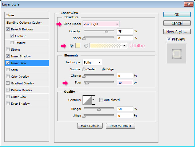
– Inner Glow
- Blend Mode : Vivid Light
- Color :
#fff4be - Size : 10
This will add more shadows and highlights.
Step 6
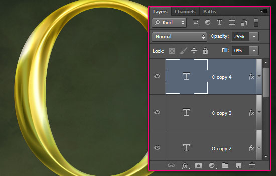
Double click the third copy text layer to apply a simple Gradient Overlay effect:
- Blend Mode : Color
- Opacity : 70%
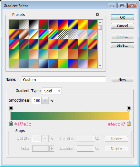
- Click the Gradient box to create the gradient
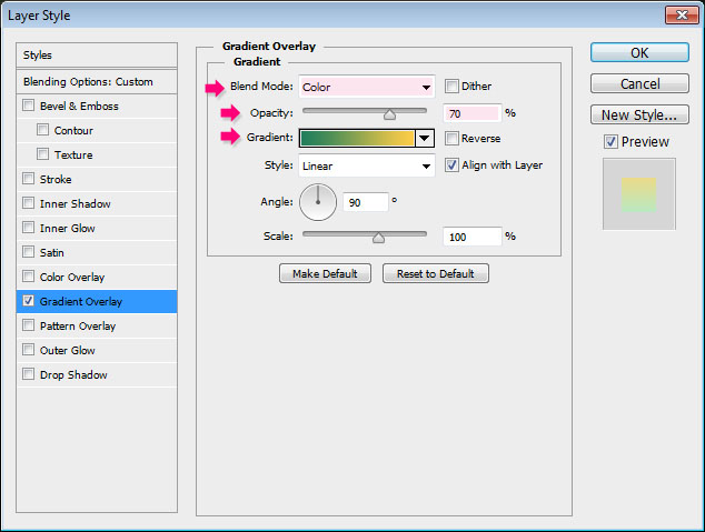
For the gradient, we’ll use two colors: #1f7e5b to the left, and #fecc47 to the right.
This will apply the gradient to the text.
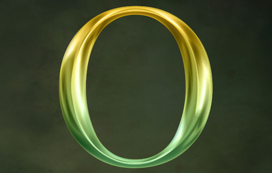
If you check the original poster, you’ll notice that the gradient is more obvious on the words “Great and Powerful”. Whereas it’s not that strong on the “Oz” part. So adjust the Opacity of the gradient layer as you like. Here its is set to 25%.
Step 7
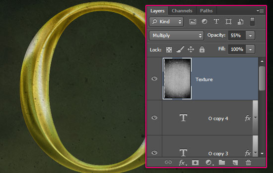
Place the Darker Shadows Texture Stock image on top of all layers, then change its layer’s name to Texture, its Blend Mode to Multiply, and its Opacity to 55%.
Ctrl/Cmd + click a text layer’s thumbnail to create a selection.
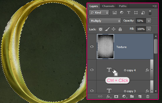
With the Texture layer selected, click the Add layer mask icon down the Layers panel. This will delete the texture outside the text, but you’ll still be able to get it back by deleting the mask.
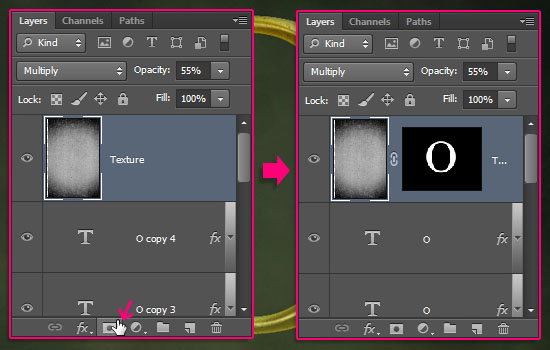
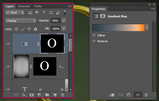
Reselect the text, then click the Create new fill or adjustment layer icon down the Layers panel and choose Gradient Map. This will create the adjustment layer with a mask.
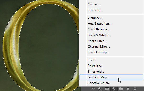
Change the adjustment layer’s Blend Mode to Overlay and its Opacity to 50%, and choose the 36th gradient from the CSP True Sky Gradients.grd file in the gradients pack.
Step 8
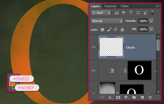
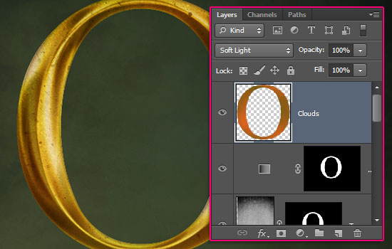
Create a new layer on top of all layers and call it Clouds. Set the Foreground color to #f26522 and the Background color to #60580f. Reselect the text, then go to Filter > Render > Clouds.
Go to Select > Deselect (Ctrl/Cmd + D) to get rid of the selection.
We’ll be using this to add some color to the text.
Go to Filter > (Filter Gallery) > Texture > Grain, and use the values below.
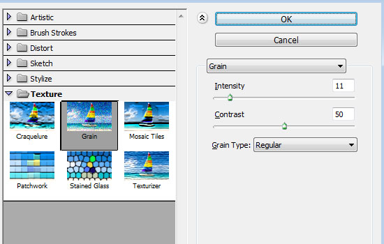
This will add subtle noise to the texture.
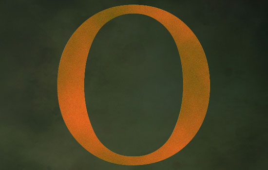
Change the Clouds layer’s Blend Mode to Soft Light.
Step 9
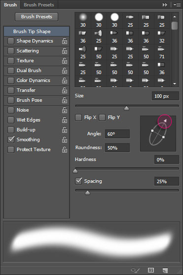
Create a new layer on top of all layers, call it Glow, and change its Blend Mode to Overlay. Set the Foreground color to White and pick the Brush Tool.
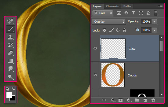
Open the Brush panel (Window > Brush), choose a soft round brush, then change its Roundness to 50%. What you’ll be doing next, is adding some glow spots over the brightest areas.
To do so with this elliptical brush, you’ll need to change the Size and the Angle of the brush based on its position.
If you don’t know the exact Angle, just click and drag the arrow in the preview box instead.
Click to add the glow on top of the brightest areas.
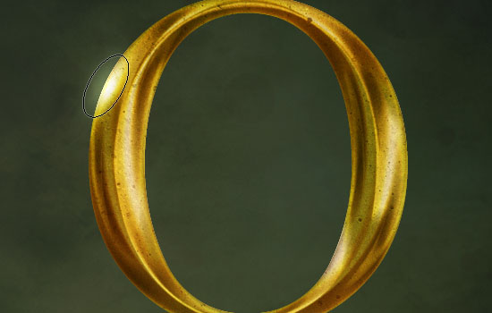
Two or three glowing spots are enough, try not to spread them everywhere.
Step 10
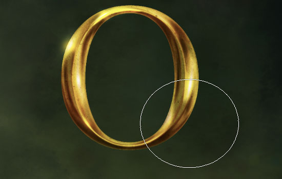
The Layer Styles create the main effect with most of the highlights and shadows needed. But you can still lighten or darken some areas if you want to add more depth.
Let’s start by highlighting the top.
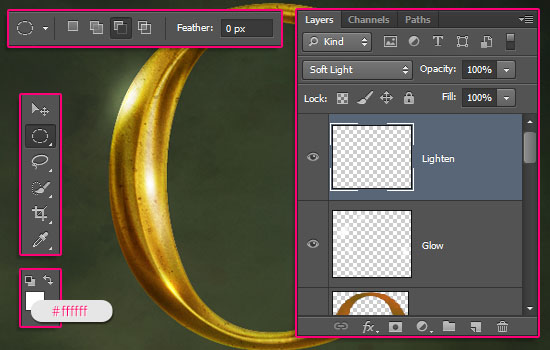
Create a new layer and call it Lighten then change its Blend Mode to Soft Light. Pick the Elliptical Marquee Tool, and click the Subtract from selection icon in the Options bar.
Make sure that the Foreground color is still set to White.
Select the text once again, then, drag a circle that excludes the lower half of the upper part.
In the image below, the selection is shown in blue, and the needed upper part is surrounded by pink.
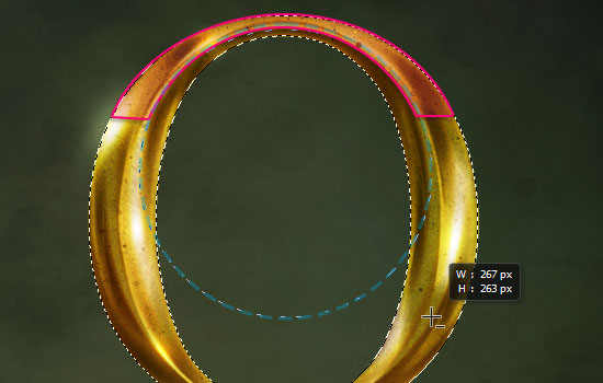
Once you exclude the lower half from the selection, pick a soft round brush, and fill in the upper part with White to lighten it.
Create a new layer, call it Darken, change its Blend Mode to Multiply, and set the Foreground color to #898989.
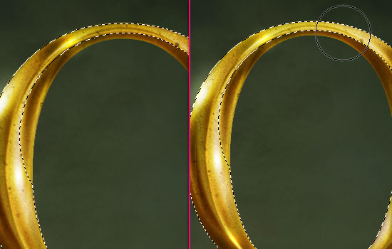
With the selection still active, exclude the upper half of the lower part.
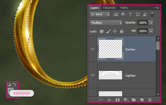
Use the brush to fill and darken the lower half of the lower part.
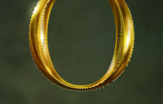
Deselect the text, and you should get a similar result.
Step 11
Next we will add more details using filters.
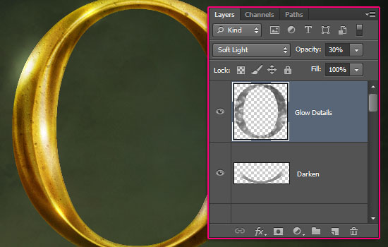
Create a new layer and call it Glow Details. Set the Foreground color to White and the Background color to #363636.
Reselect the text, go to Filter > Render > Clouds, then deselect it.
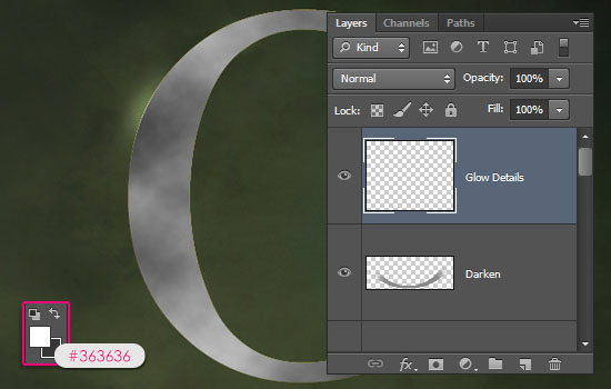
Go to Filter > (Filter Gallery) > Artistic > Plastic Wrap, and use the values below:
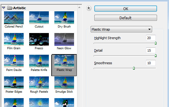
This will create more bright and dark areas.
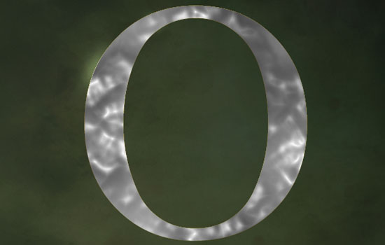
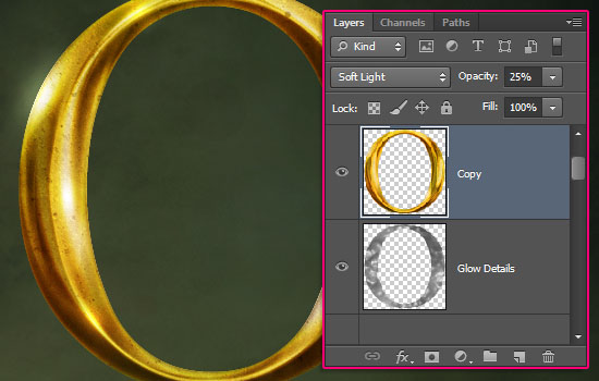
Change the Glow Details layer’s Blend Mode to Soft Light and its Opacity to 30%.
Step 12
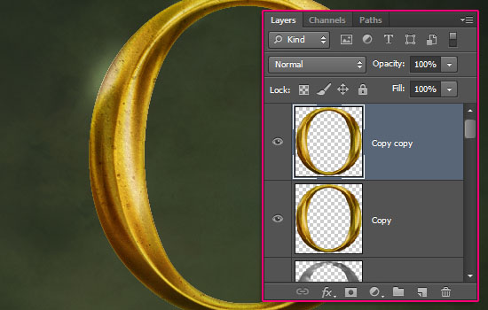
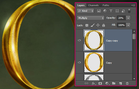
Select all of the layers (Ctrl/Cmd + click to select) except for the background layers, the background texture layer, the Glow layer, and the Glow Details layer. Duplicate the selected layers then go to Layer > Merge Layers (Ctrl/Cmd + E).
Rename the merged layer to Copy.
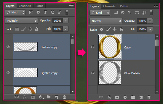
Duplicate the merged layer.
Select the Copy (original merged) layer, then go to Filter > (Filter Gallery) > Brush Strokes > Accented Edges, and use the values below:
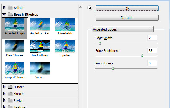
This will intensify the contrast of the colors (you’ll need to make the duplicated layer invisible by clicking the eye icon next to it to see the changes. But don’t forget to make it visible before you continue).
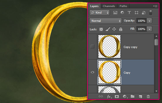
Change the Copy layer’s Blend Mode to Soft Light and its Opacity to 25%.
Select the duplicated Copy layer, then go to Filter > (Filter Gallery) > Artistic > Paint Daubs, and use the values below:
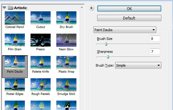
This will define the details a bit.
Change the layer’s Blend Mode to Multiply and its Opacity to 20%.
Step 13
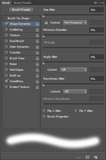
Pick a soft round 35 px brush, and in the Brush panel, under Shape Dynamics, choose Pen Pressure from the Control drop down menu.
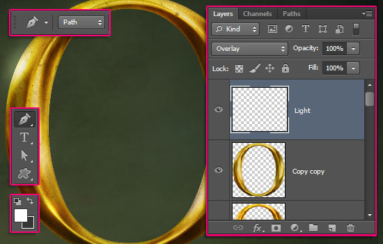
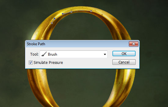
Create a new layer on top of all layers and call it Light, then change its Blend Mode to Overlay. Set the Foreground color to White, pick the Pen Tool, and choose Path in the Options bar.
Click to add points, click and drag to create curves. Use the Pen Tool to create a small curve in the center of the letter where you want to create a strong light.
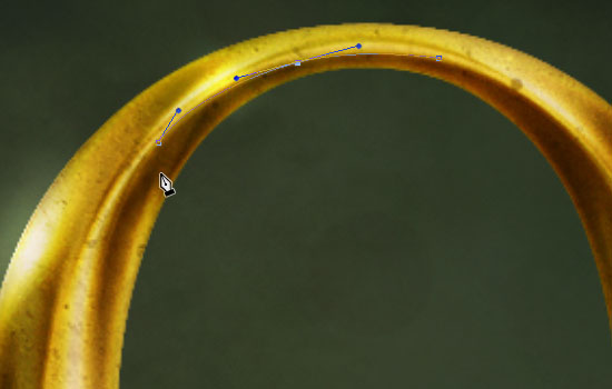
You can then use the Direct Selection Tool to select and move the points if needed.
Right click the path and choose Stroke Path.
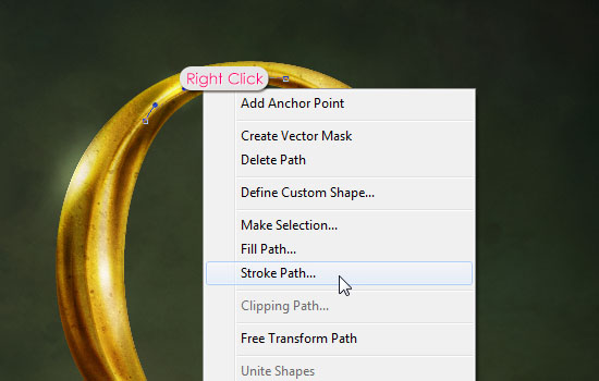
Choose Brush from the Tool drop down menu, and check the Simulate Pressure box. This will stroke the path with a glow that fades thinner from the center.
Hit Enter/Return to get rid of the work path.
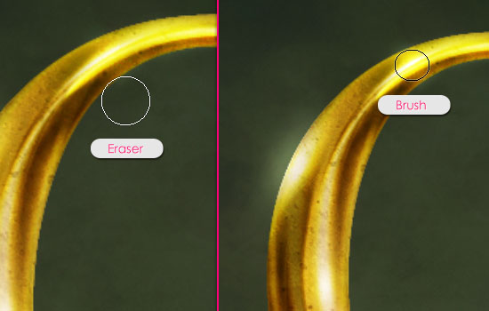
Use the Eraser Tool to remove any unwanted parts, then use the Brush Tool to add a spot in the middle of the light created.
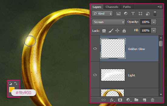
To give an illusion of a stronger glow, create a new layer, call it Golden Glow and change its Blend Mode to Screen. Set the Foreground color to #ffb900, and click, using the same 35 px brush, near the edge of the letter to add that extra glow.
You can go ahead and try different things with the highlights, shadows, and glow brushes, to add more depth and details if you like.
Step 14
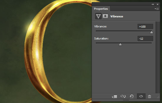
Select the text, click the Create new fill or adjustment layer icon, and choose Vibrance.
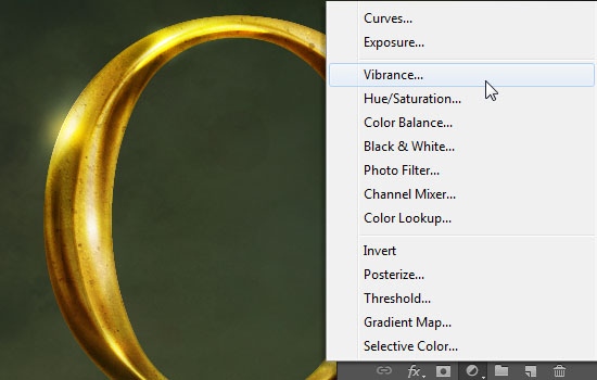
Change the Vibrance to 100 and the Saturation to -12. This will dim the strong colors creating a more vintage-like effect.
This is optional, but darkening the area behind the text will create more contrast and make the text pop.
So create a new layer right on top of the background texture layer, call it Brush, change its Blend Mode to Soft Light, and its Opacity to 70%.
Set the Foreground color to #172323, and choose a big soft round brush.
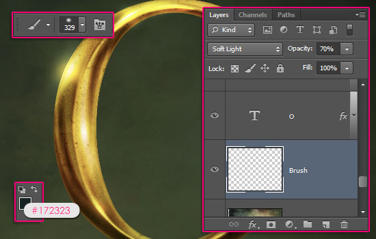
In the Brush panel, check the Transfer box, and set the Opacity Jitter to 100% and the Flow Jitter to 21%.
Click behind the text to add the dark color there.
Step 15
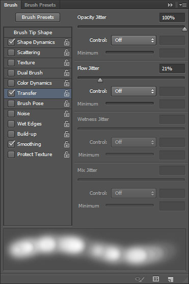
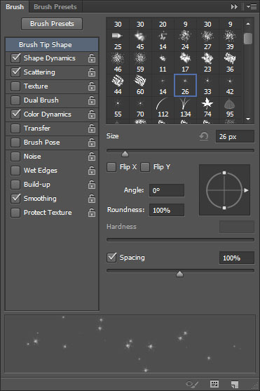
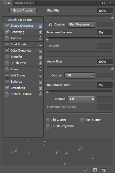
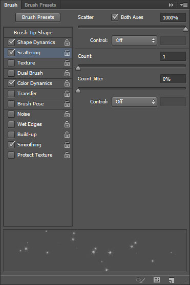
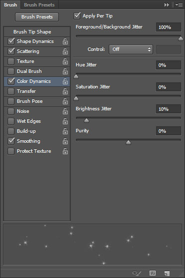
This step is optional as well, but we’re going to add some sparkles since the background is kind of empty.
Open the Brush panel, choose the Star 26 pixels brush, and change its Settings as below:
Brush Tip Shape
Shape Dynamics
Scattering
Color Dynamics
Create a new layer on top of the Brush layer and call it Sparkles, change the Foreground color to #f9f1e0 and the Background color to #e1c658.
Click and drag from the center outwards to add the sparkles.
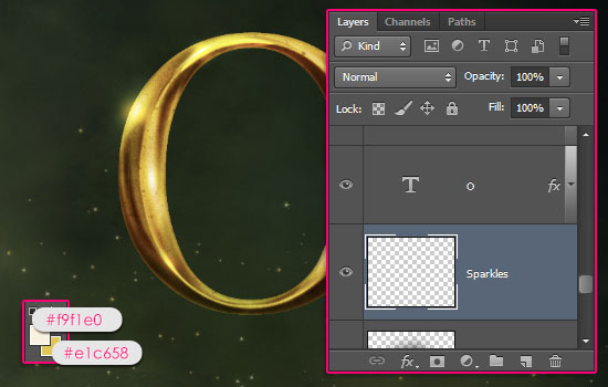
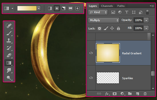
Finally, create one last layer on top of the Sparkles layer, call it Radial Gradient, and change its Blend Mode to Multiply.
Pick the Gradient Tool, choose the Foreground to Background, Radial Gradient, in the Options bar, then click and drag from the center of the document to one of the corners to create the gradient.
This will add a nice golden color to the background and blend its elements together.
And there you have it! Hope you enjoyed the tutorial and found it useful.
Did you enjoy this post? Please consider donating to help us cover our server costs.


Great gold effect, very detailed tutorial!
Thanks a lot John, appreciate it!
Hi, I just read your blog and tried to make this amazing visual. I still need some practise but the results are already great! Thanks for this great step-by-step guide! Phil
That’s great to know! Hopefully things will turn out great.
Feel free to share your result with us.
Thank you very much for the comment.
Hi, this was a great tutorial, I used it to create a silver/chrome effect title instead. Do you have any tips for how to continue the tutorial in order to create words or titles? I’m attempting it now and don’t really want to have to repeat every step for each letter. Thanks
That sounds cool, would like to see your outcome if you’d like to share it with us 🙂
You can create as many letters as you want (in the same text layer), and follow the same steps. The Layer Styles and Filters can be applied once to all the letters. The highlights and shadows, however, will still need to be added to each letter separately (but on the same layers – no need for creating new ones for each letter).
Hope this helps. Please feel free to add any other queries you have.
Thanks a lot for the comment.
Great job. I made one videotutorial in my youtube channel “ildfeonsosegura” about the Oz movie poster and I think I had a great result too as you. Congratulations again.
I checked your tutorial, and it is definitely amazing! So congratulations to you too.
The cool thing is that each design is inspired by a different variation of the original poster.
Thanks a lot for the comment and the tutorial mention.
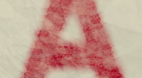
Awesome, I’ve seen a golden text effect before, but not as detailed as this one.. Gonna try it with letter ‘A’.. Thank’s a lot
Very glad you like it.
Please feel free to share your result with us 😉
Thank you very much for the kind words.
How do you add the image over all the layers in step 7?
You’ll need to open the image in Photoshop, then duplicate it (Layer -> Duplicate Layer) to the document you’re working on.
Hope this helps 🙂
amazing tutorial… this was a great lesson to me. Congratulations for share your skills!.
Really glad you liked the tutorial and found it helpful 🙂
Thank you very much for the kind words and for the support.
your website s totally amazing!!…it somehow makes one believe that anything is possible in photoshop…!! and the way u have shared your knowledge about different tools is very appreciable..!!
Oh wow! That’s really nice of you to say, and it means so much!
Many thanks for the wonderful comment 🙂
Sir, you are my HERO!
I looked so much for a good “Golden text effect” tutorial, until I found this. I don’t think that there is something better than what you did here sir. I may say that I owe you one because this helped me a lot!
Thank you again good Sir!
And you literally made my week!
Super glad you liked the effect and found the tutorial helpful.
I can’t thank you enough for your kind words, they truly mean so much.
Many thanks for all the support 🙂
(I’m a girl though ^_^)
omg! that is all what i want for the arabic logo ^_^
thank you so much 🙂 🙂 🙂 🙂 🙂 🙂
and the Boy Who said that “you are my hero”
He was absolutely right .
thanks 🙂
Awesome! that’s great to know!
Many thanks for the absolutely kind words, appreciate them 🙂
Wow thank you so much for sharing this very detailed tutorial!!
This is by far the best gold effect tutorial I’ve found online!
It is really helpful 😀
Thank you again!
That means a lot! It really does!
Very glad you liked the tutorial and found it helpful.
Thank you very much for the awesome comment 😀
i would like to try and make this, but my school uses lightspeed systems, so pretty much everything is blocked
🙁
Hopefully you’ll be able to somehow soon 😉
its really nice to read your tutorials 🙂 keep working like this 🙂
Very glad you enjoy them 🙂
Many thanks for the kind words.
Any chance for a psd file with this tut?
Really sorry about that, but PSD files are not available for download 🙁
Please feel free to leave a comment with any issues you have though, and we’ll try our best to help 🙂
Why PSD is not available?
Well, mostly for copyright related reasons. The files’ have been available for purchase a while ago, and we’re considering making them available for purchase again, but in multi-file-groups this time.
So hopefully that’ll happen some time soon.
WOW! Thanks a lot for this beautiful Tutorial. I loved it and used it in my dad’s Birthday card. Thanks a ton
That’s amazing to know! Happy Birthday to your Dad 😉
Many thanks for the kind comment 🙂
Amazing! Thank you 😉
Glad you think so!
You’re welcome, and thanks for the comment 🙂
Amazing Tutorial!