Delicious Bagels Text Effect
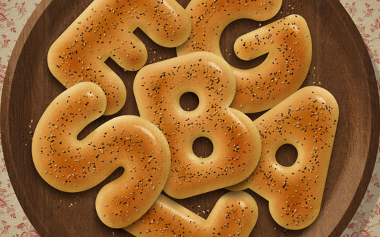
Bagels are a donut-shaped type of bread made with flour. They look absolutely amazing when well baked and shiny!
This tutorial will show you how to use the powerful Layer Styles’ capabilities in Photoshop, along with a couple of brushes and filters to create some delicious-looking bagels.
This was suggested by Luca. Thank you for the great suggestion, Luca : )
The Final Result
Tutorial Details
- Software Used : Photoshop
- Version : CS6 Extended
- Time : 1:15 – 2:30
Resources
- Franks font.
- Floral Patterns by sofi01.
- Wood Patterns pattern by Loungedy.
- Paper_2 by Atle Mo.
- White Texture by Dmitry.
- Concrete wall by Atle Mo.
Step 1
Create a new 1250 x 1250 px document (you can use any Width value you like, but make sure that the Height value is not less than 1250).
Pick the Rectangle Tool, Set the Foreground color to #d4d0c9, and draw a rectangle that extends a little bit outside the document.
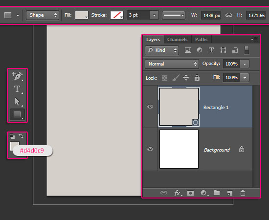

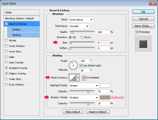
Double click the Rectangle shape layer to apply the following Layer Style:
– Bevel and Emboss
- Size : 3
- Check the Anti-aliased box
- Shadow Mode – Color :
#a89a86
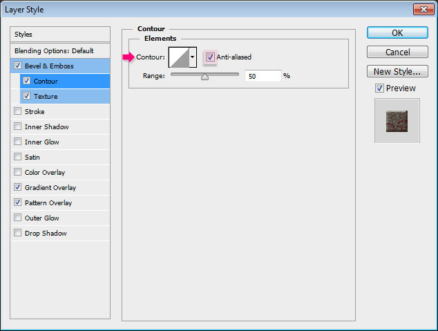
– Contour
- Check the Anti-aliased box.
– Texture
- Pattern : paper_2
- Depth : 318%
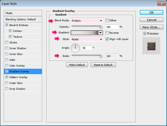
– Gradient Overlay
- Blend Mode : Multiply
- Style : Radial
- Scale : 150%
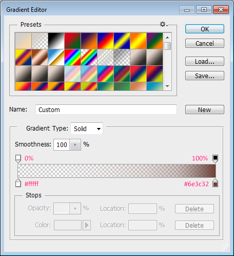
- Click the Gradient box to create the gradient.
To create the Gradient, you’ll need to click below the gradient bar to add Color Stops, and above it to add Opacity Stops.
This gradient is created using two colors #ffffff to the left, with the Opacity 0%, and #6e3c32 to the right, with the Opacity 100%.

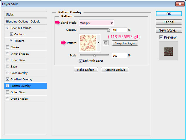
– Pattern Overlay
- Blend Mode : Multiply
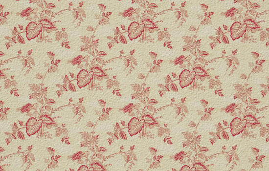
- Pattern : 1181556893.gif
This will create the main background.

Step 2
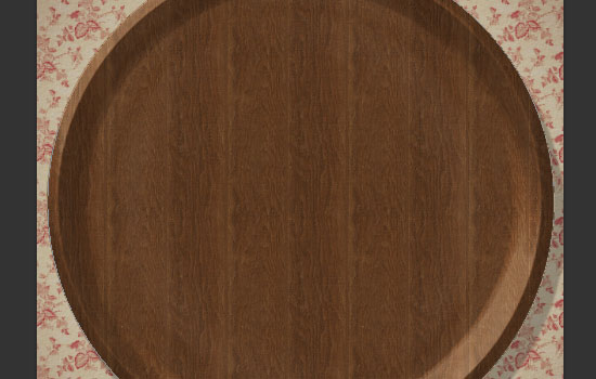
Set the Foreground color to #d8d1b9, pick the Ellipse Tool, then press and hold the Shift key, and click and drag to create a circle that fits within the document.
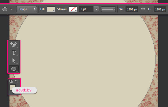

Double click the Ellipse shape layer to apply the following Layer Style:
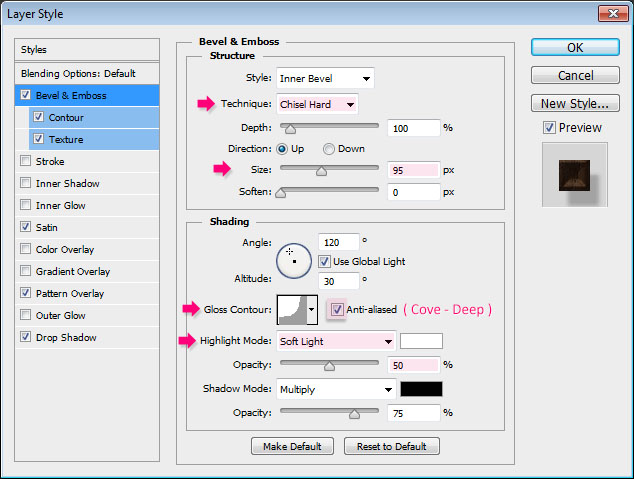
– Bevel and Emboss
- Technique : Chisel Hard
- Size : 95
- Gloss Contour : Cove – Deep
- Check the Anti-aliased box
- Highlight Mode : Soft Light
- Opacity : 50%
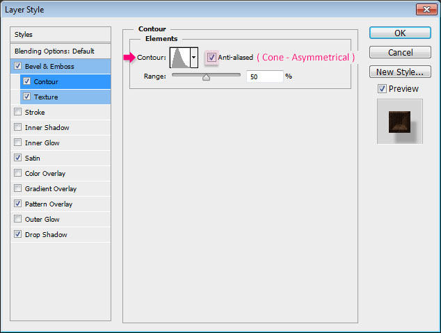
– Contour
- Contour : Cone – Asymmetrical
- Check the Anti-aliased box.
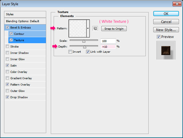
– Texture
- Pattern : White Texture
- Depth : 10%
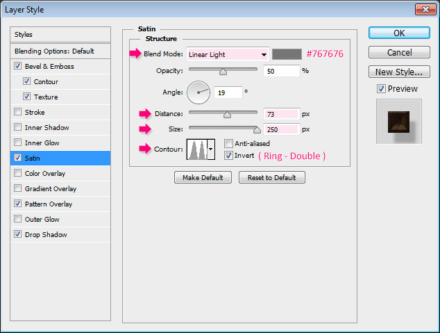
– Satin
- Blend Mode : Linear Light
- Color :
#767676 - Distance : 73
- Size : 250
- Contour : Ring – Double
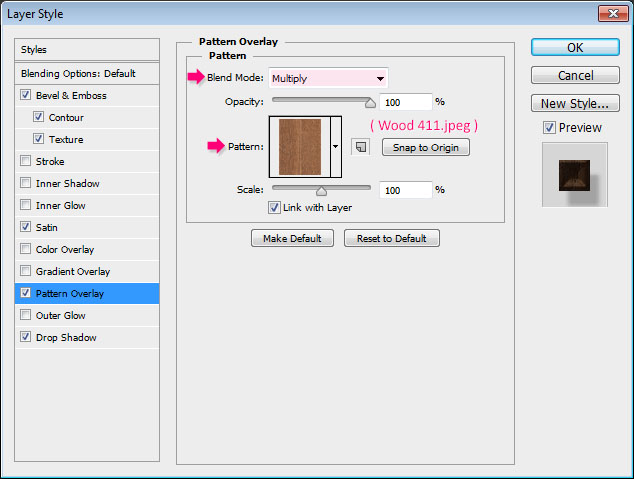
– Pattern Overlay
- Blend Mode : Multiply
- Pattern : Wood 411.jpeg
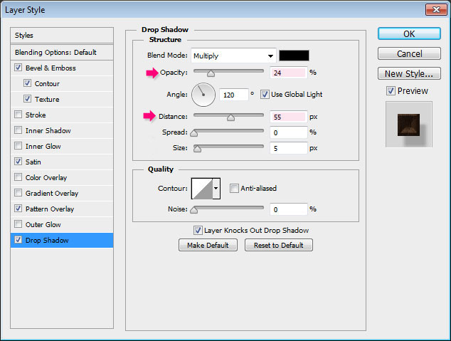
– Drop Shadow
- Opacity : 24%
- Distance : 55
This will create the bowl/dish/plate material. You can play around with the Bevel and Emboss values, or use different colors and textures if you like.

Step 3
Create the first letter of the word you want to create in All Caps, using the font Franks, the color #e3d1ab, and the font Size 570.
You can work simultaneously on all the letters, or work on each one separately. That’s totally up to you.
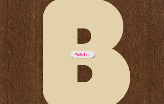

If the letter contains closed counters (holes), you’ll need to convert it to a shape to remove the sharp corners of the aperture.
To do so, right click the text layer, then choose Convert to Shape.
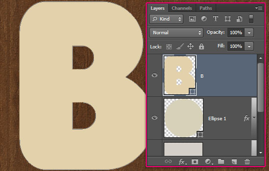

Pick the Convert Point Tool, click and drag around the sharp corner to select it, then click and drag the anchor point to convert the sharp point into a curve.
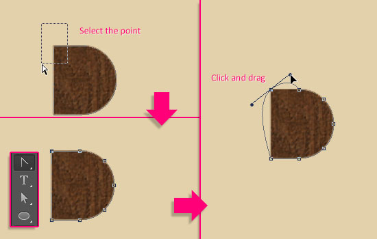

Then, you might need to pick the Direct Selection Tool, click and drag the points to move them around, or click and drag the Direction Points to widen or narrow the curve.
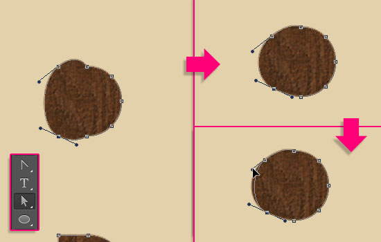

The final result doesn’t have to be perfect; in fact, it better be not.
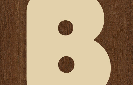

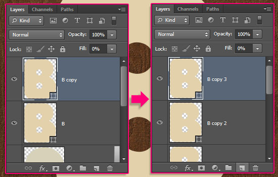
Duplicate the shape layer, change the copy’s Fill value to 0, then duplicate the copy twice. So you’ll have the original text layer, a copy, copy 2, and copy 3 layers.

Step 4
Double click the original text layer to apply the following Layer Style:
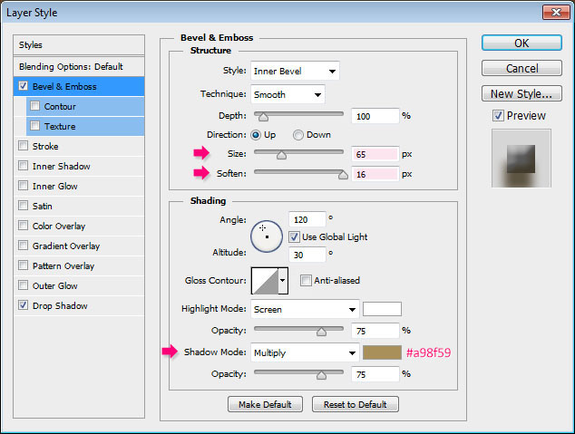
– Bevel and Emboss
- Size : 65
- Soften : 16
- Shadow Mode – Color :
#a98f59
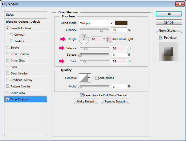
– Drop Shadow
- Uncheck the Use Global Light box
- Angle : 80
- Distance : 20
- Size : 25
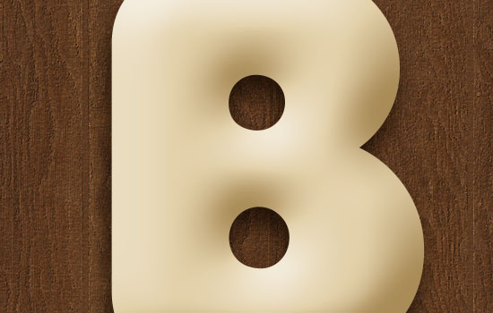
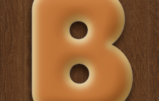
This will create the basic 3D shape of the bagel.

Step 5
Double click the copy text layer to apply the following Layer Style:
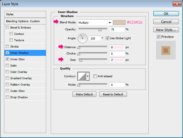
– Inner Shadow
- Color :
#533416 - Distance : 0
- Size : 7
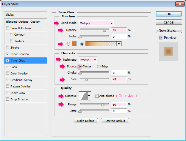
– Inner Glow
- Blend Mode : Multiply
- Opacity : 85%
- Fill : Choose the gradient fill – we’ll create the gradient in a minute.
- Technique : Precise
- Source : Center
- Size : 43
- Contour : Gaussian
- Range : 80
Click the gradient box to create the gradient.
The three colors used and their Locations are:
# – Color – Location
- 1 –
#d17a34– 0% - 2 –
#ecd8ad– 45% - 3 –
#e0c09a– 88%
As for the Opacity values:
# – Opacity – Location
- 1 – 100% – 0
- 2 – 100% – 45%
- 3 – 0% – 100%
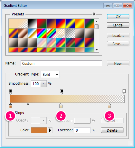

Using a gradient for the glow will help create a dark to light coloring from the center of the letter towards the edges.

Step 6
Double click the copy 2 text layer to apply the following Layer Style:
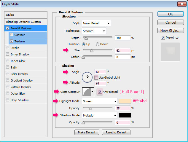
– Bevel and Emboss
- Size : 62
- Uncheck the Use Global Light box
- Angle : 68
- Altitude : 64
- Gloss Contour : Half Round
- Check the Anti-aliased box
- Highlight Mode
- Color :
#ffe4bd - Opacity : 25%
- Shadow Mode – Opacity : 0%
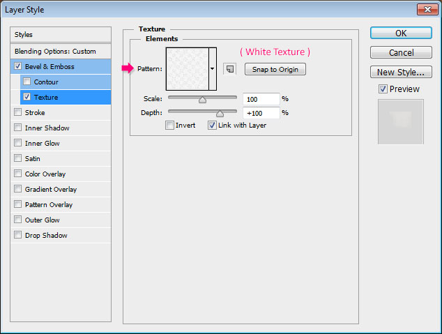
– Texture
- Pattern : White Texture
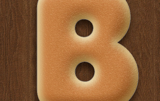
This will add some texture (bump) to the text.

Step 7
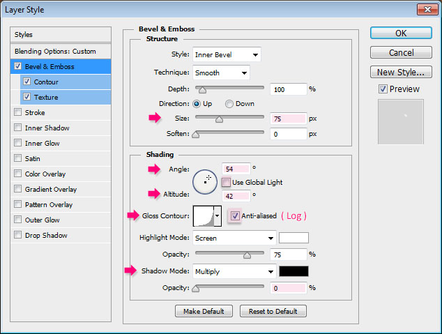
Double click the copy 3 text layer to apply the following Layer Style:
– Bevel and Emboss
- Size : 75
- Uncheck the Use Global Light box
- Angle : 54
- Altitude : 42
- Gloss Contour : Log
- Check the Anti-aliased box
- Shadow Mode – Opacity : 0%
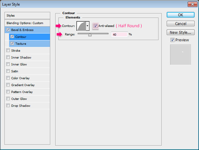
– Contour
- Contour : Half Round
- Check the Anti-aliased box.
- Range : 40%
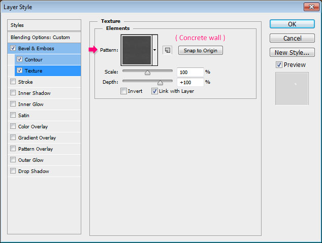
– Texture
- Pattern : Concrete wall
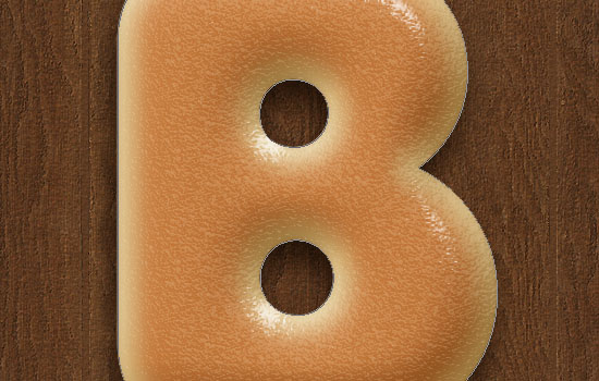
This will add some shine. The shine will change its angle when it will be rotated near the end of the tutorial, which will make it more dynamic.

Step 8
Ctrl/Cmd + click any letter layer’s thumbnail to create a selection.
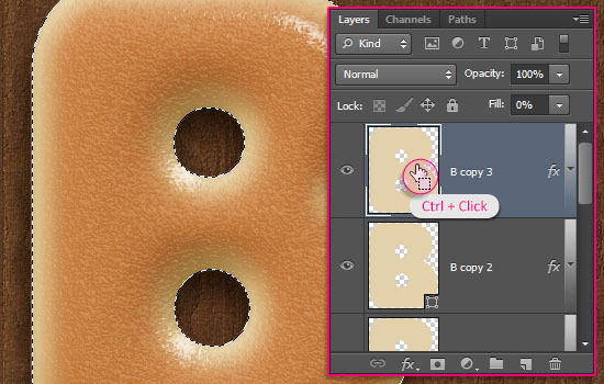

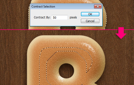
Go to Select > Modify > Contract, and type the value 50. This will contract the selection 50 px inwards.

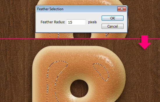
Go to Select > Modify > Feather, and type the value 15. This will soften the edges of the selection.

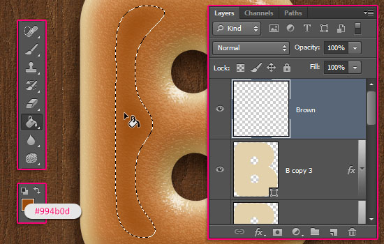
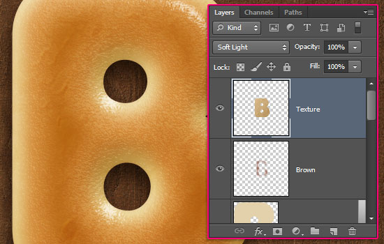
Set the Foreground color to #994b0d, pick the Paint Bucket Tool, create a new layer on top of all layers, call it Brown, and fill the selection with the Foreground color.

Step 9
Ctrl/Cmd + click any letter layer’s thumbnail to create a selection one more time. Create another new layer and call it Texture. Set the Foreground color to #e4c8a0 and the Background color to #936d2f.
We’ll apply some filters to create a simple texture that will also enhance the coloring of the letter.
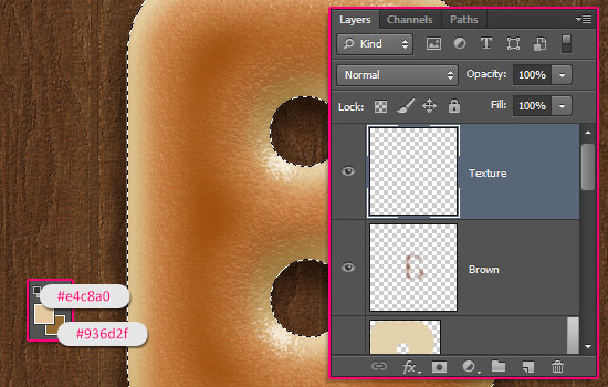

Start by going to Filter > Render > Clouds. Then Go to Select > Deselect (Ctrl/Cmd + D) to get rid of the selection.
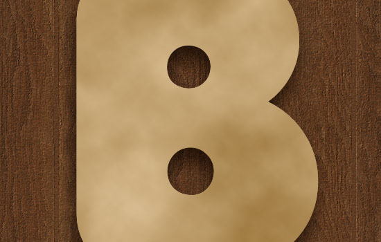

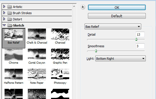
Go to Filter > (Filter Gallery) > Sketch > Bas Relief, and change the values as shown below.

This is what you should get.
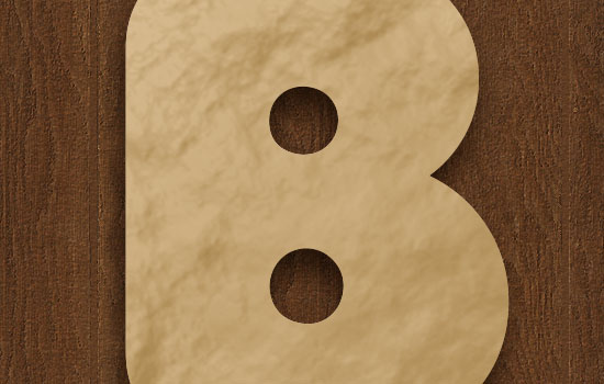

Go to Filter > (Filter Gallery) > Brush Strokes > Accented Edges, and modify the values as shown below too.
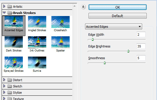

That’s it for the texture. Really simple.
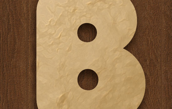

Change the Texture layer’s Blend Mode to Soft Light. You can see the difference it makes.

Step 10
Pick the Brush Tool, and open the Brush panel (Window > Brush).
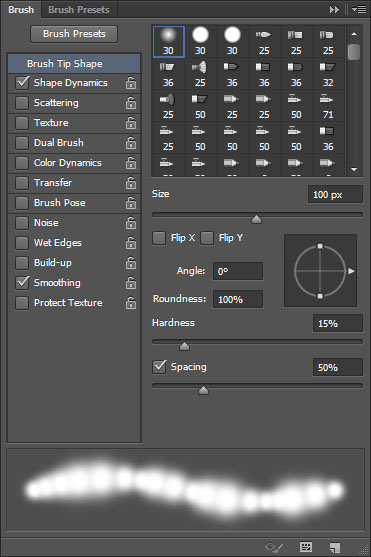
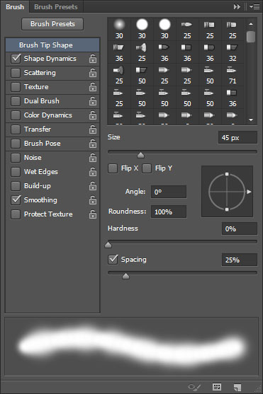
Choose a soft round brush, and modify its Settings as shown below:
Brush Tip Shape

Shape Dynamics
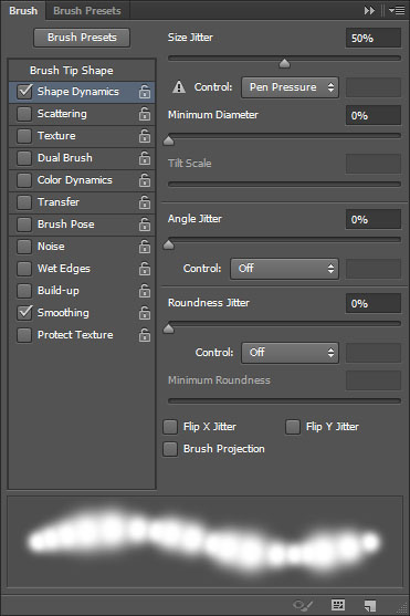

Create a new layer on top of all layers, call it Color Burn Brush, change its Blend Mode to Color Burn, its Opacity to 45%, and set the Foreground color to #cac2b7.
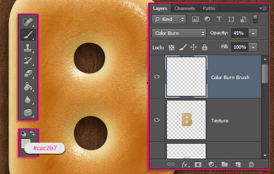

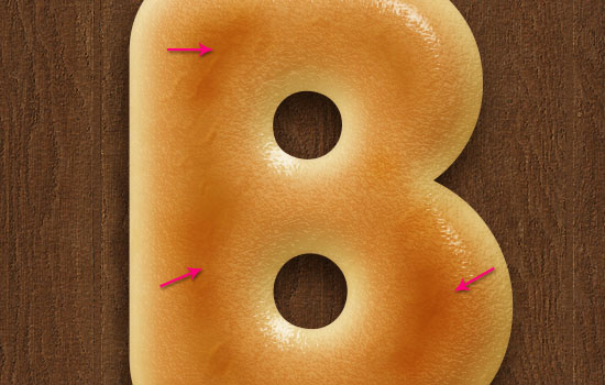
Click and drag slightly to intensify some areas on the letter. This will make the golden-brown part look more realistic.

Step 11
Create a new layer, call it Inner Shadow, and change its Blend Mode to Multiply. Set the Foreground color to #e7cf93 and reduce the Brush Size to 45 px.
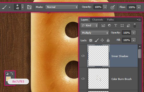

In the Brush panel, under Brush Tip Shape, set the Spacing value back to 25%.

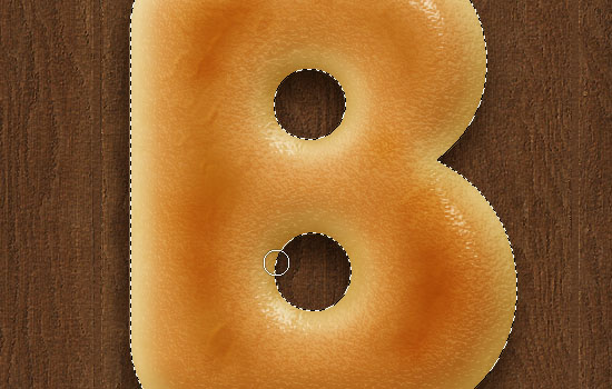
Select the text like you did previously, then paint around the counters to add more shadow.

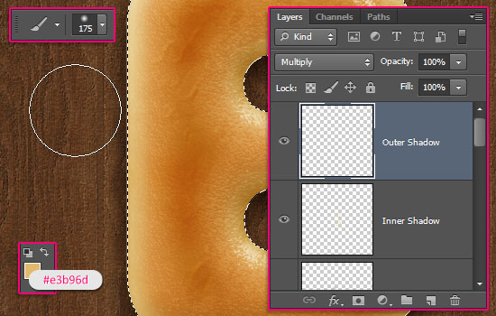
Create another new layer, call it Outer Shadow, change its Blend Mode to Multiply, set the Foreground color to #e3b96d, and increase the Brush Size to 175 px.
Click and drag a little bit far from (outside) the selection, and around the letter, to darken the edges.

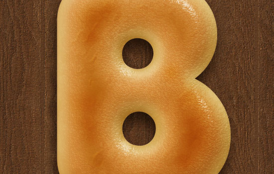
When done, deselect (Ctrl/Cmd + D).
This is the main bagel. The next steps are simple additions to this outcome.

Step 12
Pick the Brush Tool and open the Brush panel. Choose a hard round brush, and modify its Settings as below:
Brush Tip Shape
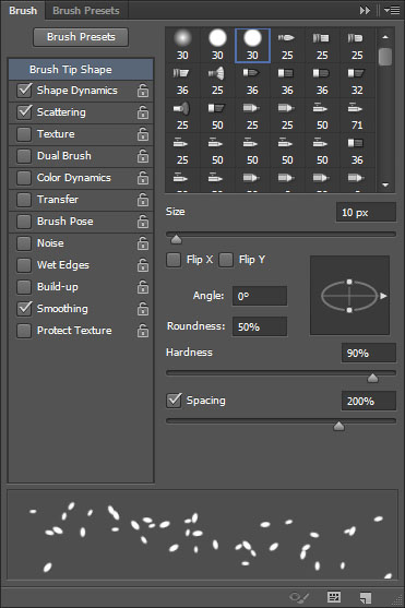

Shape Dynamics
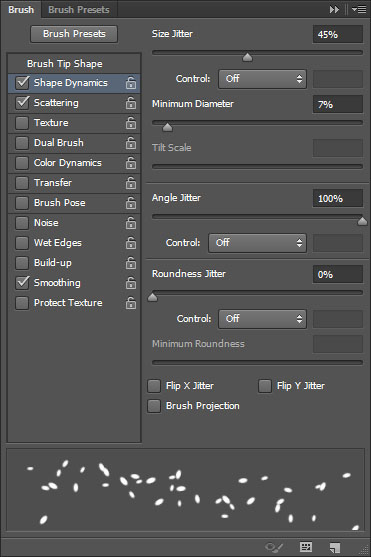

Scattering
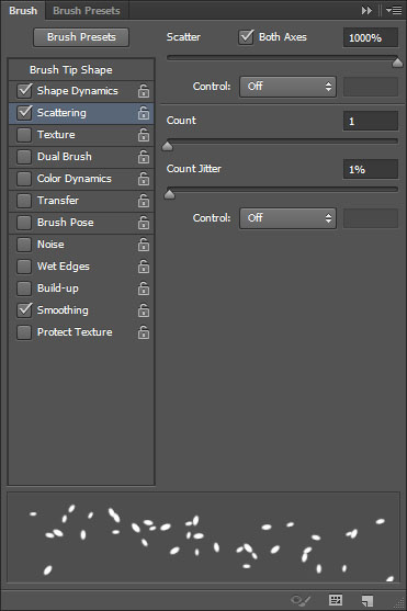

This will be the main seed brush.
Step 13
Create a new layer on top of all layers and call it Sesame.
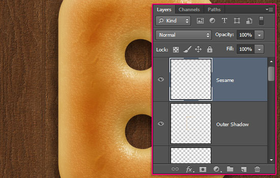

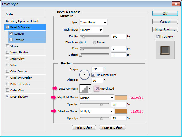
Double click the Sesame layer to apply the following Layer Style:
– Bevel and Emboss
- Check the Anti-aliased box
- Highlight Mode – Color :
#ecbe8e - Shadow Mode : – Color :
#c1803a
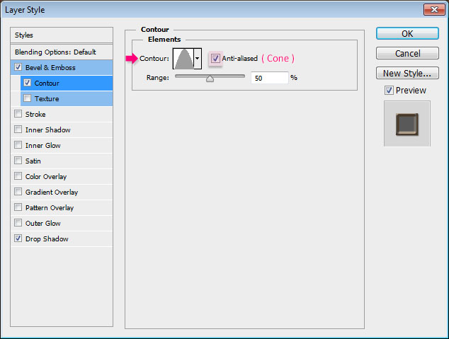
– Contour
- Contour : Cone
- Check the Anti-aliased box.
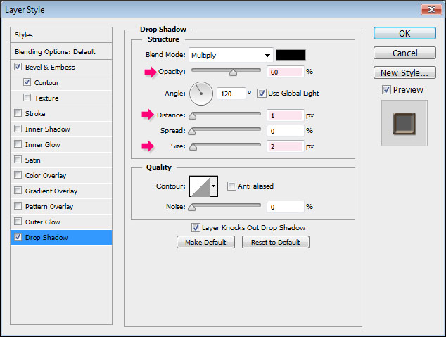
– Drop Shadow
- Opacity : 60%
- Distance : 1
- Size : 2
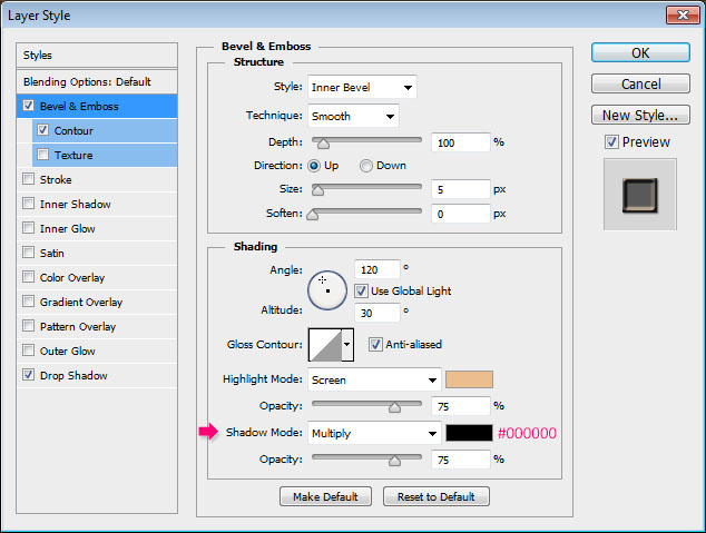
Duplicate the Sesame layer, and rename the copy to Poppy Seed.
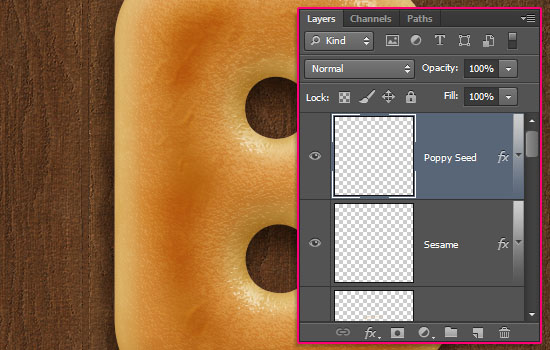

Double click the Poppy Seed layer to change the Bevel and Emboss effect’s Shadow Mode color back to Black.
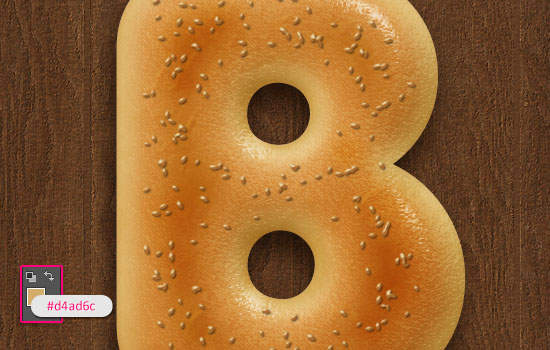
Set the Foreground color to #d4ad6c, select the Sesame layer, then click and drag over the middle part of the bagel letter to scatter the sesame.
A helpful tip would be to drag in a subtle zig-zag motion. this will help better spread the seeds much better.

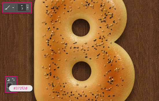
Change the Foreground color to #372f2d, decrease the brush Size to 7, select the Poppy Seed layer, then click and drag to add the poppy seeds to the bagel.

Step 14
The bagel letter is finished now. So group its layers, then go ahead and create the other letters.
When done, select each group, then go to Edit > Free Transform, to rotate and position the letters inside the bowl.
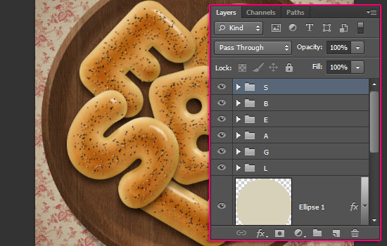

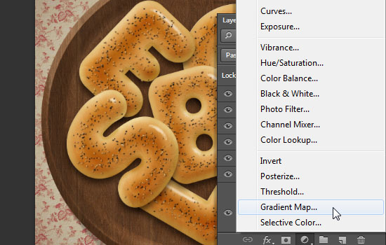
Click the Create new fill or adjustment layer icon down the Layers panel, and choose Gradient Map.

Change the adjustment layer’s Blend Mode to Multiply and its Opacity to 10%.
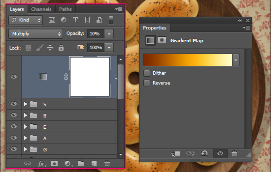

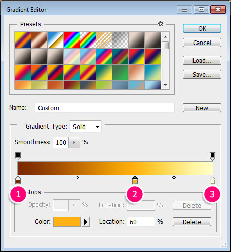
The gradient is created using 3 colors:
# – Color – Location
- 1 – #7b2800 – 0%
- 2 – #ffb211 – 60%
- 3 – #ffffc7 – 100%

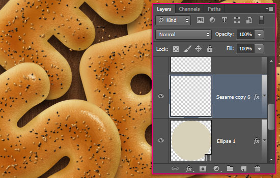
Finally, you can add two more separate Sesame and Poppy Seed layers right on top of the bowl’s layer, and scatter some seeds around to finish off the effect.

And there you have your bagels ready!
Hope you enjoyed the tutorial and found it delicious 😉
Thanks once again to Luca 🙂
If you have a suggestion or an idea, please feel free to send us an email through the Contact Form.
Did you enjoy this post? Please consider donating to help us cover our server costs.



wow good job realy. 🙂
Glad you like it 🙂
Thanks for the comment.
heloo sir…i have problem in step 4 and 5…it doesn’t look like in tutorial image…you said in the original text layer?thank you…nice tutorial by the way…maybe i just cant follow some steps…
The main reason for getting different results out of using the same Layer Style values is applying them to a text created using a different font or font size.
If that’s the case, then you might need to change the values a little bit until they look similar to the result here. If not, then can you please upload a screenshot with the issue?
Thanks for the comment 🙂
MayB
Awesome outcome!
Thanks a lot for sharing your work 🙂
Yummy – great tut – looks good enough to eat. Maybe the next tutorial can be a pack of cream cheese.. 😉
Cool! Will take that into consideration 😉
Thanks a lot for the awesome comment.
Fantastic … Simply FANTASTIC … You are the best!!
Very glad you like it.
Thank you very much 🙂
Thanks for very nice and yummy tutorial… 🙂
here my try out.. hope u like it …
http://i39.tinypic.com/2gyd0qt.jpg
Awesome! Well done as always.
Many thanks for the comments and for sharing your work with us 🙂
I love the Photoshop tutorials here, they are so well explained and I get no error when follow the steps, congrats for the site, keep this way.
That’s great to know!
Thank you very much for the kind words and for the support.
Oh….
Can’t believe..
you make Plate/Bowl in one layer…
That’s Amazing
Beautiful Tuts…
Thaks for Share with us
The power of Layer Styles!
Thank you very much for the awesome comment.
Most Welcome Sir..
I’m Waiting for new Tuts…
hello and welcome!
A problem has been occured during the step no “1” while I am loading
the “Texture Pattern PAPER-2″ .I cannot do this step, ” Loading paper-2 pattern in my document”.
please tell me the proper way “how to load paper-2 patern.
In order to add (load) the pattern to your preset manager, you’ll need to open the “paper_2.png” image (found inside the “paper_2” folder) in Photoshop, then go to Edit -> Define Pattern, and click OK.
Hope this helps.
Please feel free to leave any other queries you have.
Thanks for the comment.
I don’t known how to do “click and drag over the middle part of the bagel letter to scatter the sesame” can you help me!
You need to place the mouse cursor in the middle of the letter, click and hold the left mouse button, and drag so that you can scatter the brush. Then you can release the button.
Hope this helps.
Please feel free to leave any other queries you have …
thank i can understood it
thank you so much
tutorial very cute and nice
very carefully
i’m looking for you have many tutorial for any beginer like me!
… Super glad you enjoyed the tutorial 🙂
Thank you very much for the kind words and for the support, they mean a lot.
Yi kan wo du zi jiu you dian e le !
You can go ahead and have some!
Xie xie for the comment 😉
It’s so nice!I want to eat!Thank you for sharing the excellent tutorial!
Feel free to eat some 😉
Glad you liked the tutorial.
Thanks a bunch for the comment.
Très bien expliqué Bravo et merci
Glad you like it.
Merci beaucop for the comment.
Awesome work ! really boosted me to do something creative
thanks for your valuable stuff
very very nice work ! good
That’s great to know!
Thank you so very much for the amazing comment 🙂
i cant not create this tutorial because 3 different layers effect is different how can i marge all layers effect
Not sure which layers are causing the problem. Can you please add the step in which you can’t achieve the shown result?
Thank you for the wonderful lesson. I even have an appetite, I’ll go to the kitchen bake something yourself.
Awesome! Hope you had a delicious meal 😉
Thank you very much for the lovely comment 🙂
Cute cookies!
Thank you!
It was so nice to share such a great tutorials with us.Thank you.
I have a question what is the properties of Contour : Cone – Asymmetrical? Is this the con-inversed or different one?
It actually is a different contour that you can load into Photoshop. Please take a look at this image to see how to do so.
Hope this helps.
Thanks a lot for the kind words 🙂
too much hard to do ..
🙁 Why is that?
What are the problems you have while trying to create it?
Very very cute, thanks!!!
Here my try out
http://car51.altervista.org/_altervista_ht/nuova/biscotto_salato.jpg
Aww! Those are some adorable mini bagels 🙂
Loving the cup addition as well 😉
Many thanks for the comment and for the link.
Very Nice
Thanks a lot 🙂
What a wonderful tutorial. Its lengthy but the end result is more than worth it. 🙂
Your instructions, especially with caps are very easy to follow. Thanks for that. I got the result I wanted but from point of comprehension I am still trying to understand how the contours or different settings in Bevel & Emboss affect the object. Could you please make something to explain that? It will help in my overall understanding of photoshop effects. So that I can use it in other projects as well on my own. Thanks again.
Also, this is the link for my work…
http://24.media.tumblr.com/8fea6ced5d540b641316a035debba422/tumblr_mv0ug36yGN1sbqy1ko1_1280.jpg
… Wonderful result! I really like how you made it a part of a scene. Absolutely awesome!
Thanks a lot for sharing your work 🙂
Really glad you enjoyed the tutorial and found easy to follow 🙂
The thing about Contours is that the more you get to use and try different things with them, the more you understand how they work.
But that sure would be a good idea for a quick tip article. So will list it down and try to work on it soon.
Many thanks for the comment once again.
I also wanted to tell you that I made that bowl, using similar technique that you used for making wooden plate and changing the settings.. 🙂 Also the soup… 🙂
Cool! Both look absolutely great!
Thanks once again 🙂
You can download all the used textures and patterns from the Resources section at the very beginning of the tutorial. Anything used will have a link there.
Hope this helps.
Thanks a lot for the kind words 🙂
In step 2, I am unable to make the ellipse of that colour even after setting the foreground colour.
Why not? Can you double click the shape layer’s thumbnail to change the color after you create it?
Please feel free to upload a screenshot of the issue if that doesn’t work.
Make sure the ellipse is the top layer.
I had the same problem
Awesome tutorial, you did a great job! I learned many techniques-thank you!!!
Very glad to know that.
Thanks a lot for the kind words 🙂
very useful and nice. thanks!
Happy to know you found it so 🙂
Many thanks for the comment.
Hi , I’m stuck on step 5 at changing the gradient colors. My gradient box only has two color locations . i don’t have the third one on the middle ….. Help?
You can click on top of the gradient bar to add an Opacity Stop, and below it to add a Color Stop. You can then select each of those to change their values as mentioned in the tutorial.
Hope this helps.
Please feel free to leave a reply with any other questions you have.
Thank you so much for the tutorial.. easy and quick, I’ve learned a lot.. I LOVE IT! makes me wanna eat bagel lol
So glad to know you enjoyed it 😀
Thank you very much for the wonderful comment 🙂
Loveeee it! 🙂 Very clear and useful tutorial. Thank you so much and it looks delicious indeed!
Very nicely done!
Really glad you enjoyed the tutorial.
Many thanks for the lovely comment and for sharing your work 🙂
Thank you very much! MIne came out a little to brown don’t know what happened xD
Maybe you overcooked it? JK ;p
I think it looks amazing, and I like the colorful sprinkles as well.
The coloring depends on the values you use for each part of the text effect, the blend modes, the effects, etc. So you might just need to check those again.
Thanks a lot for sharing your work and for the comment 🙂
me encanto gracias por el tuto
Very nice outcome!
Muchas gracias for sharing your work and for the kind comment 🙂