Sparkling Metallic Text Effect
Posted by textuts | On 9 April, 2011 | In Simple Photoshop Text Effect TutorialsThis tutorial will explain how to create a nice sparkling, kind of vintage chrome looking text effect, using layer Layer Style to give the metallic feel to the text, and filters and blend modes to create the sparkling texture.
The Final Result
Tutorial Details
- Software Used : Photoshop
- Version : CS5 Extended
- Time : 0:30 – 0:45
Resources
- Brock Script font.
- ‘Use This 52’ Texture by Inthename-Stock.
Step 1
Create a new 1024 x 768 px document. Create a Radial Gradient with the Foreground color set to #a06600 and the Background color to #342b28.


Place the ‘Use This 52’ Background Texture image on top of the Background layer, then change its Blend Mode to Soft Light, and its Fill value to 50%.
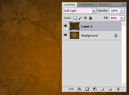

Create the text with the color #cbb99d. The font used is Brock Script, and the Size is 450 px.


Step 2
Double click the text layer to apply the following Layer Style:
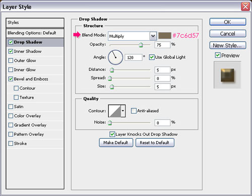
– Drop Shadow
- Color :
#7c6d57

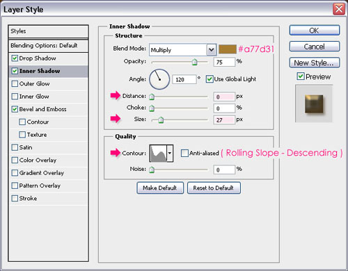
– Inner Shadow
- Color :
#a77d31 - Distance : 0
- Size : 27
- Contour : Rolling Slope Descending

– Bevel and Emboss
- Depth : 276
- Size : 10
- Highlight Mode : Vivid Light
- Color :
#f4edd3 - Shadow Mode – Color :
#e9b65f
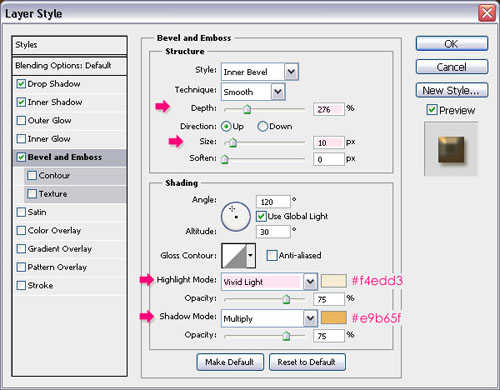

This will create the metallic look.


Step 3
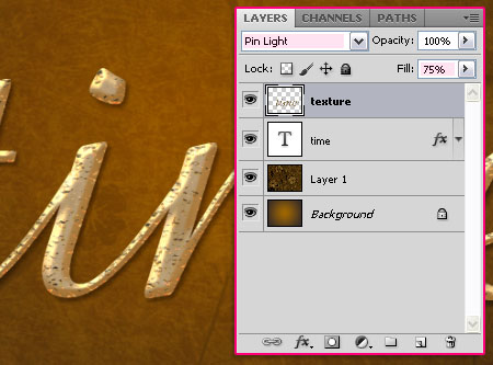
Create a new layer on top of all layers and call it texture. Ctr/Cmd + click the text layer’s thumbnail to create a selection.
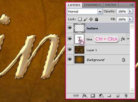

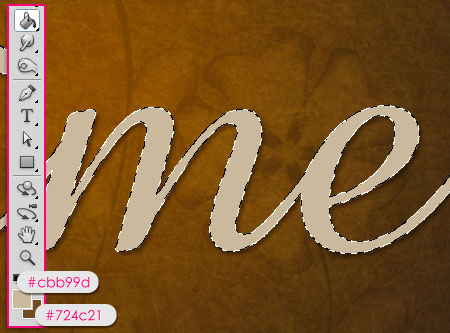
Set the Foreground color to #cbb99d and the Background color to #724c21, and fill the selection with the Foreground color.

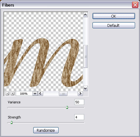
Go to Filter > Render > Fibers, change the Variance to 50, and the Strength to 4.

Press Ctrl/Cmd + D to get rid of the selection.


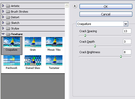
Go to Filter > Texture > Craquelure. Change the Crack Spacing to 13, the Crack Depth to 3, and the Crack Brightness to 8.



Finally, change the texture layer’s Blend Mode to Pin Light, and its Fill value to something around 75%, or whatever value you like.

That’s it! Simple and elegant!
Did you enjoy this post? Please consider donating to help us cover our server costs.





Wow, this is simple but amazing!
I’m glad you think it’s nice!
Thanks a lot.
For some reason, my text is turning out copper, not gold. The effect is still very pretty, just not gold. Thanks for the tutorial!
Hello Catherine,
Is the color different after step 2 or 3?
Did you make sure that all the colors and blend modes are as mentioned? The problem most probably is in those two.
Hope this helps.
Thanks for the comment.
It seems that many such created fonts are done with the more advanced (and more expensive) drawing/photo editing software. I use Photoshop Elements 9 and love it. Would like to see more of these tutorials using this (or similar) software. In the meantime, I intend to try and duplicate the results of this tutorial in Elements 9.
Hello Lloyd,
Thank you for your comment. The problem with PSE9 is that it lacks many Styles as well as the pen tool, which makes it harder to achieve the effects in these tutorials. I do not have PSE9 right now, but I made a small research and found those points. However, I’ll try to find a way to write some tutorials using PSE9 as soon as this is possible, and will see what kind of effects can be created.
Thanks for the feedback!
Great tutorial with easy to follow directions and back-up visuals!
Thank you.
Glad you liked it.
Thanks for the comment.
Beautiful text tut. Had to improvise a little because Photoshop 7 does not have fibers. Really liked the finished text. Toda.
Hey Lilly,
Maybe you can use (if it’s available) Filter -> Sketch -> Graphic Pen instead of the Fibers filter, if you play around with the values you might get a similar result.
Glad you liked the effect anyway.
Cheers 🙂
Never thought of using the graphic pen but yes Photoshop 7 does have it. Toda raba for the suggestion. Your site is positively addicting. Always coming back to see what new tut you have that I can try. 🙂 Shalom Lilly
Okay I went back and tried the tut again only this time I used the graphic pen. Had to play around with the settings but I came very close to your example. Again toda for the suggestion.
Shalom Tehillah 🙂
Hello Lilly,
Thank you so very much for the kind words, they really mean a lot 🙂
Glad the Graphic Pen worked.
Toda raba for the comment.
nice to follow steps for a beginner
Great!
Thanks for the comment 🙂
Could not obtain the Brock font from the link in your tutorial – maybe because the tutorial is a couple of years old? Can you tell me where I might be able to obtain it, please?
Thanks in anticipation.
Des
Is the font used Brock Script as listed in your 45 Best Script fonts – 2013? Difficult to be sure as there are no capital letters used in your example.
Des
Yes it is. I also updated the tutorial with the same link.
Hope this helps.
Thanks for pointing the issue out and for the comment 🙂
I really like the sparkling metallic text effect. I am using it on a poster for a Historical Society event. I was wondering however, can this be made into a pattern to use in layers and how would I go about making it one? It would save a lot of time and effort for use with larger amounts of copy. Appreciate all you help and the wonderful tutorials. Thank you, Jayne