
Dazzling Woven Text Effect
In this tutorial, we’ll create a dazzling woven-like text effect, using Photoshop’s Filters and Layer Styles. Because this effect is so busy and uses big bold fonts, it looks better when applied for 1 – 3 letters only.
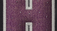
The Final Result

Tutorial Details
- Software Used : Photoshop
- Version : CS5 Extended
- Time : 0:45 – 1:15
Resources
- Bevan font.
- Woven Pattern.
Step 1
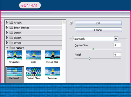
Create a new 1024 x 768 px document. Fill the Background with the color #044476, then go to Filter > Texture > Patchwork, make sure that the Square Size is 4, and the Relief is set to 8.
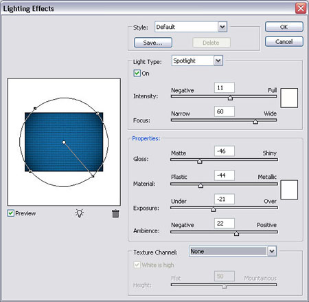
Go to Filter > Render > Lighting Effects, and use the values below:
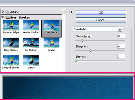
Go to Filter > Brush Strokes > Crosshatch, and change the Stroke Length to 9, the Sharpness to 6, and the Strength to 1.
Step 2
Create the text using font Bevan, the Size 480 px, and the color #00a2e5.
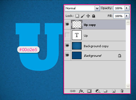
Duplicate the text layer and make the original invisible (by clicking the eye icon next to it).
Right click the copy layer, and choose Rasterize Type.
Step 3
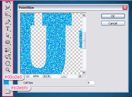
With the rasterized copy layer selected, set the Foreground color to #00a2e5 and the Background color to #b2ebfc.
Go to Filter > Pixelate > Pointillize, and set the Cell Size to 5.
Step 4
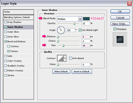
Double click the copy layer, and apply the following Layer Style:
– Inner Shadow
- Color :
#254e57 - Distance : 0
- Size : 49
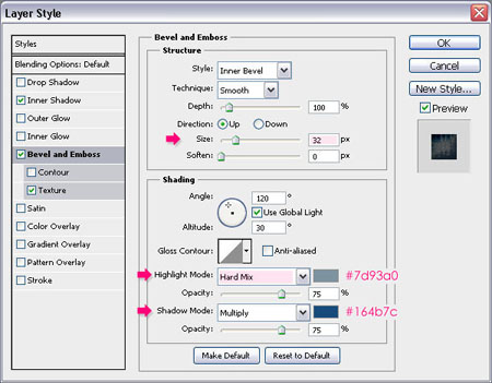
– Bevel and Emboss
- Size : 32
- Highlight Mode : Hard Mix
- Color :
#7d93a0 - Shadow Mode – Color : #164b7c
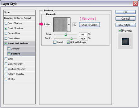
– Texture
- Pattern : Woven Pattern
This will create the texture that gives the woven-like appearance to the text.
Step 5
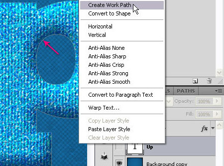
Right click the original text layer, and choose Create Work Path.
Step 6
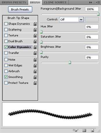
Open the Brush panel (Window > Brush), choose the Chalk 17 pixels brush tip, then change the Spacing to 50%.
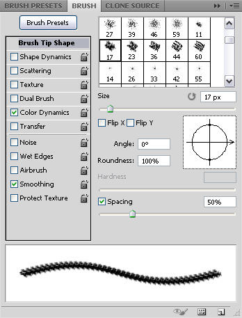
Make sure that the Foreground and Background colors are still the same as in Step 3, and check the Color Dynamics box, then set the Foreground/Background Jitter to 100%.
Step 7
Create a new layer and call it bottom, make sure that the Brush Tool is still active, then hit Enter/Return.
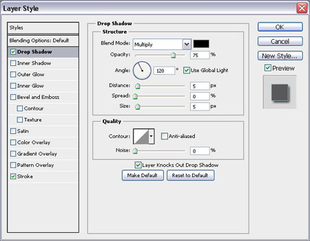
Double clickthe bottom layer to apply the following Layer Style:
– Drop Shadow
Use the default values.
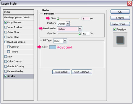
– Stroke
- Size : 1
- Blend Mode : Multiply
- Color :
#a2cae4
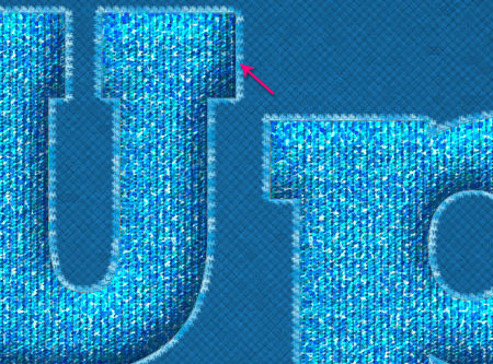
You should get a result similar to this:

Step 8
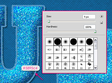
Don’t get rid of the Work Path yet.
Create a new layer on top of the bottom layer and call it middle. Choose a round hard brush and change its Size to 9 px.
Change the Foreground color to #5895c4, and uncheck the Color Dynamics box.
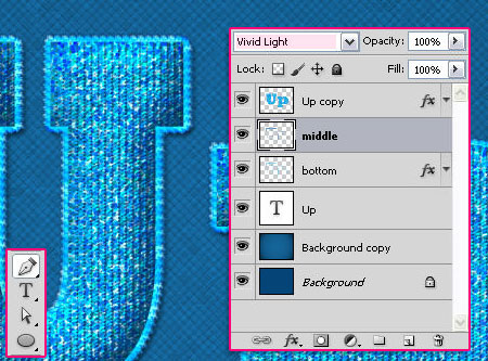
Hit Enter/Return key again to stroke the path with the new brush. Change the layer’s Blend Mode to Vivid Light.
Finally, pick the Pen Tool, then hit Enter/Return to get rid of the work path.
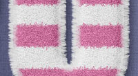
And this is the final result once again.
Did you enjoy this post? Please consider donating to help us cover our server costs.


boy this really cool tutorial and the maximum, by the way very well explained thank you.
Thanks a lot for the comment 🙂
Beautiful effect and a very good written tutorial.
Thanks a lot !
Gitte
Thank you very much 🙂
Muito bom, valeu mesmo. Paz aí.
muito obrigada.
Hii!! Great tutorial but i’m having problems with step 7.. So i create a workpath and then i create a new layer while the brush was selected.. But it creates nothing just an empty layer.. So i tried with the pen tool but i can’t select (right click) the work path but the option to stroke path is greyed out! I tried resetting the settings in photoshop but that didn’t help.. Please help. THANKYOU!!
Hello arthur,
When you “right click” on the text layer to create the work path, the text layer will be selected (become active), so make sure to select the “bottom” layer again before you right click on the path to create the stroke (using the pen method). Please feel free to add a reply if the problem still exists.
YES! it worked thank you so much!!!
Great! Thanks for your comment.
Hi there,
Amazing tutorial. Very well explained in a step by step fashion. My result was pretty close to the one displayed. This tut also helped me understand a few finer aspects of PS that I can apply to other works.
It does not matter much, but I would have loved to know the font you used for the text ‘All the way’. I have used ‘Brush script std’.
The downloads you supplied are already a part of PS CS5, though they could be useful to people using older versions. It was the Rockwell font that took time to find. Here is a free font : http://www.eaglefonts.com/download.php?action=zip&image_id=130957
Thanks, once again.
Shiva.
Hi Shiva,
Thank you so much for your comment, glad the tutorial was useful.
As for the fonts used, there are plenty of sites that provide free fonts, and you can find ones that are similar to those used in the tutorial, but I’ll try my best to use free fonts.
The other font used is “HoustonPen”.
Thank you for the feedback.
Best Regards.
AWESOME!!!!!! This is an awesome effect man. Thanks for making it
Glad you liked it!
Thanks for the comment Endre.
i like the effect….
Glad you do!
Thank you so much.
You’re welcome.
Beautiful effect and a very good step by step explaination
At the end I saw that I have forgotten to separate the U higher than the P. I’ve tried to separate it but I could not do it
Yours look better .
Thanks again
Hello omalisette,
You don’t need to separate them, as the ‘U’ is typed in upper case, and that’s why it seems higher.
Glad you liked the tutorial, and thanks for the comment 🙂
First i will give you credit for at fantastixc tutorial.
It is very useful and so easy to follow the step by step information.
I have a question abot the Dazzling Color Palette. I put the icon here:
C:\Program\Adobe\Adobe Photoshop CS4\Presets\Color Swatches.
When i am doing the tut – how do i get exactlys those colors from the Dazzling Color Palette.
Greetings from Sweden
Bitte
Hello Bitte,
Thank you so much for the comment.
As for the color palette, you can load it into your color swatches panel as shown here. Then, just click on any color to use it, instead of typing its value (code).
Hope this answers your question. If there still is any problem with the palette, please feel free to add another comment.
Thanks once again 🙂
Now i understand.
Thank you so much.
You’re welcome.
Wonderful tutorial. Very detailed and easy to follow. Here’s my version: http://i1112.photobucket.com/albums/k488/jcfreak6363/Photoshopped/woven-jcf.jpg
That’s great, very well done!
Glad you enjoyed the tutorial.
Thank you so much for the comment.
Another fantastic tut!
Thanks for the comment.
Thank you very much. you tutorial may give me oppertunity to make money with my first design. ^_^
Glad to know that!
Thanks for leaving a comment 🙂
I love your tutorial and the final result is amazing ,, but I have a problem with step 7 🙁 After I click enter the result is not as yours ,, plz check it and tell me what’s wrong 🙂
http://img710.imageshack.us/img710/3669/53296509.jpg
Hello Muhamad,
I can’t see the image, but did you try using the alternative way (right clicking)?
Please try it and tell me if it works.
I tried but it also gives me this pale blue stroke ,, that’s the image again on another uploading site
http://www.pikipimp.com/pp/pimped_photo/s/image/59/973/653/Up.jpg?ts=1316182421050
It is so pale compared to yours
Oh I see ..
Please check that you have the following values in the Brush Tool options bar (the bar at the top when the brush is selected):
– Mode: Normal
– Opacity: 100%
– Flow: 100%
The problem might exist because of one of those value. If this doesn’t work, please add another comment.
Oops 😀 It’s the opacity ,, Thanks for help your’re the best 😀
Final result : http://i55.tinypic.com/2i6gyvp.jpg
Thanks again for your help 🙂
No problem, glad it worked 🙂
Amazing outcome as well.
Thanks a lot for all of the comments and the links.
Cheers 🙂
Have a PSD example for download?
Thanks.
I’m really sorry, but psd files are not available for download right now.
You can add any questions in a comment and I’ll try my best to answer them.
Regards.
i’m stuck in the first step, when i fill my background with the color, i can’t texture it, what am i doing wrong???
Can you please go to Image -> Mode and make sure that RGB is checked?
Hello… I´m trying to do the tutorial but at step 5 it says something abour faux bold and I can´t continue… in fact, the program closses!!! what can I do? thanx
Hello Sara,
Seems that for some reason Faux Bold is applied to the text. To solve this problem, open the Character panel (Window -> Character), and un-click the Faux Bold icon as shown in this image, then try to follow Step 5 again.
Hope this helps.
Regards.
Cant i change the color of this text??
You can try adding a Hue/Saturation adjustment layer and playing with the values, or you can to choose different colors from the start.
Hope this helps.
Please feel free to add any other queries you have.
i dont have a lightning effects filter in my photoshop.. but i use cs6.. what should i do
help me please!
There still is a Lighting Effects filter in CS6, but it looks a bit different. You’ll need to use a Spot Light, and try to adjust the similar settings, then modify them a bit further until you like the result if needed.
Please feel free to leave a reply with any other queries you have.
ok, I’ll try.. thanks